Panorama Palette 1
Blazing Cream
Blazing High-chroma, high-key - the intensity of open flame or direct sunlight.
Cream Warm white - slightly yellowed, rich, the color of heavy dairy.

Palette Analysis
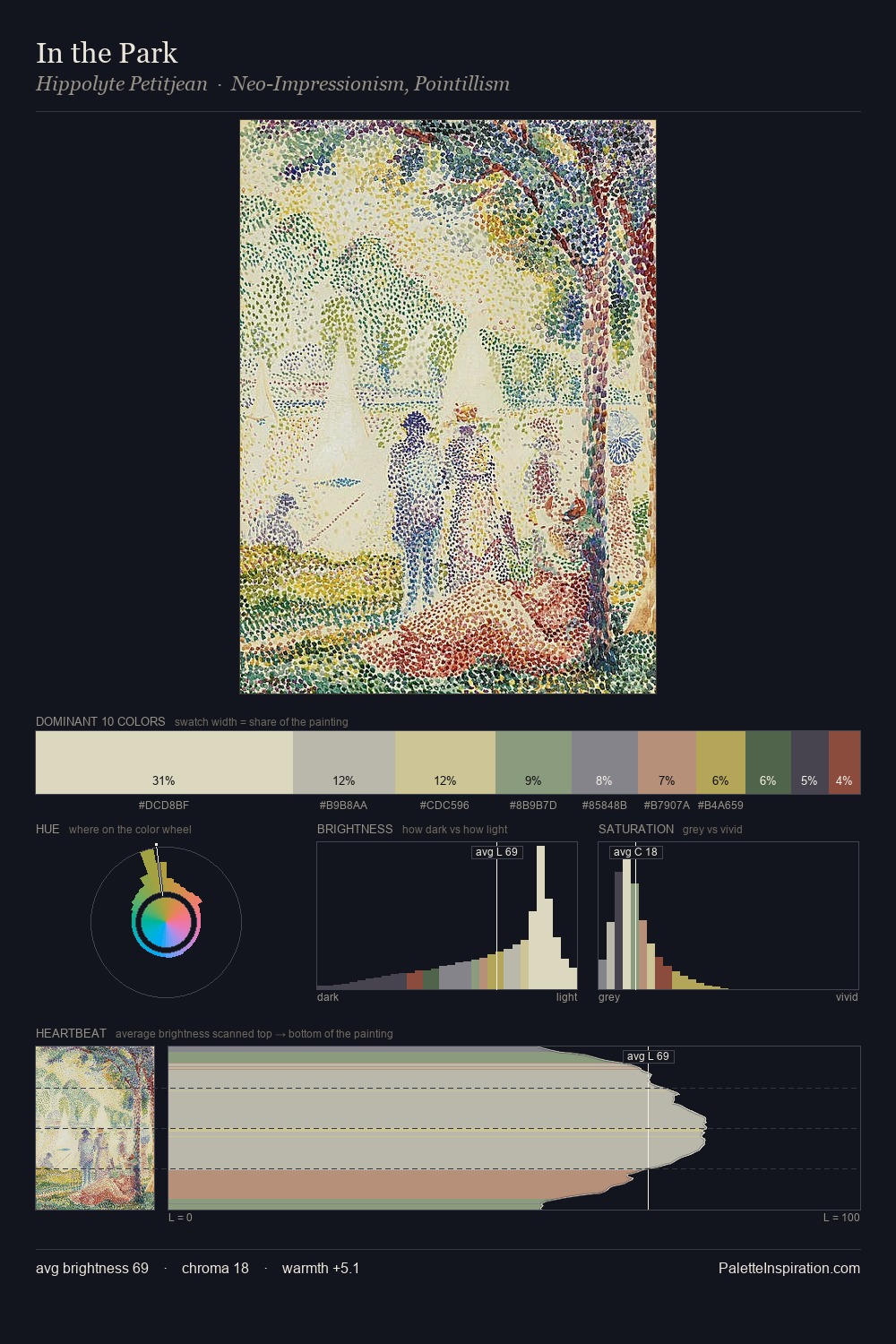
panorama is high-key - luminous, open, and weighted toward light. Blues and teal-greys govern the palette, lending it an aquatic or atmospheric quality. All colours lean toward grey, building depth through value rather than colour punch. Only 2.5% is devoted to #A87B75, yet that small allocation delivers the palette's entire chromatic tension. 39 units of value spread create a palette that is varied but unified - contrast in the service of harmony. The mid-to-high key, cool bias, and moderate chroma point to outdoor observation - sky and diffused daylight as the dominant light source.
Example use cases
- craft & artisan brands
- specialty coffee
- home goods
- lifestyle retail
- ceramics & pottery
I Love This!
Use This Palette
Copy, export, or download for your project
Copy, export, or download for your project
Copy:
Download:
Share: