P. C. Skovgaard Palette 1
Gleaming Reverie
Gleaming Bright and polished - high-key, often warm, suggesting reflective or luminous surfaces.
Reverie Dreamy pale violet - a soft, diffuse, slightly purple-gray, like a half-remembered dream.

Palette Analysis
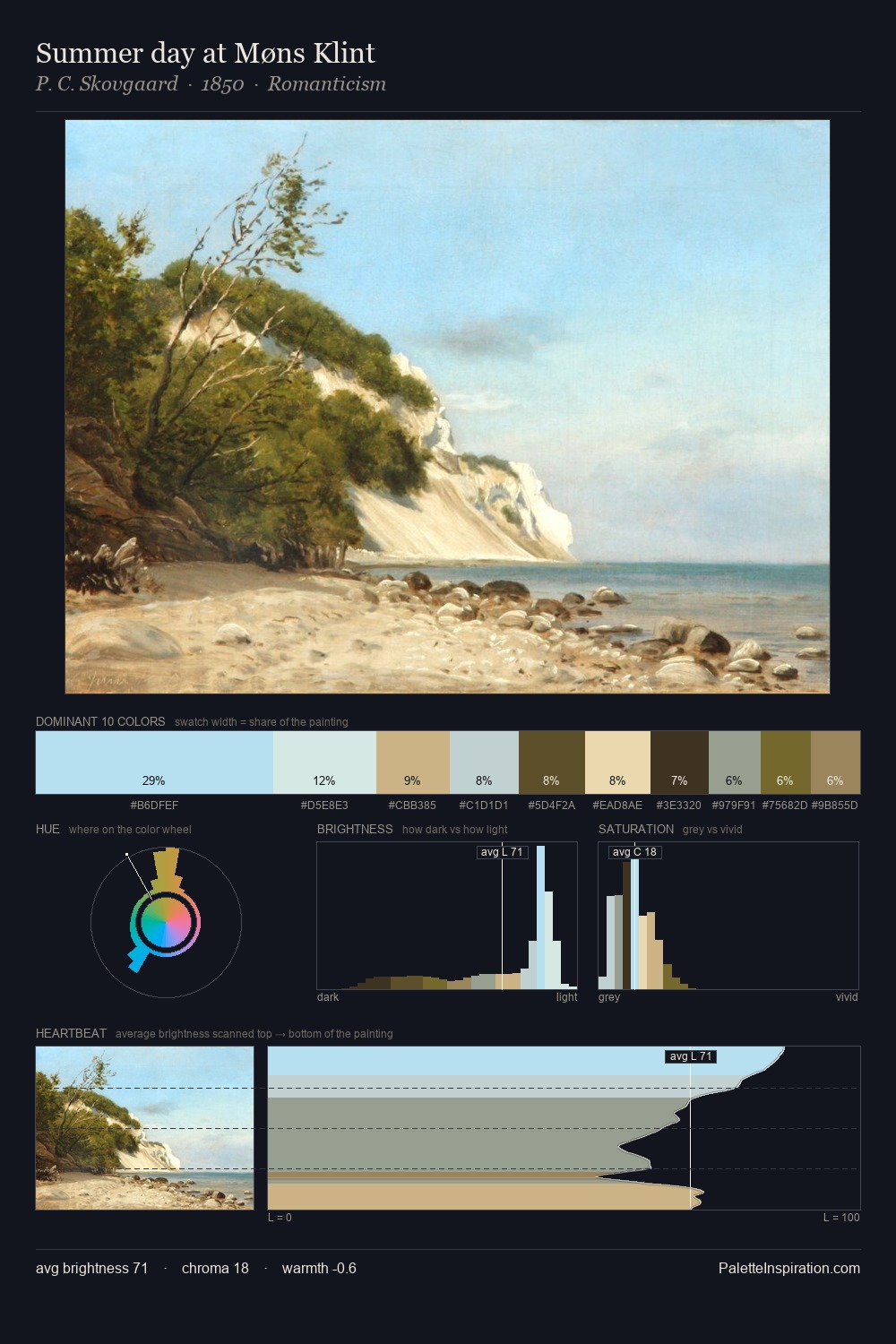
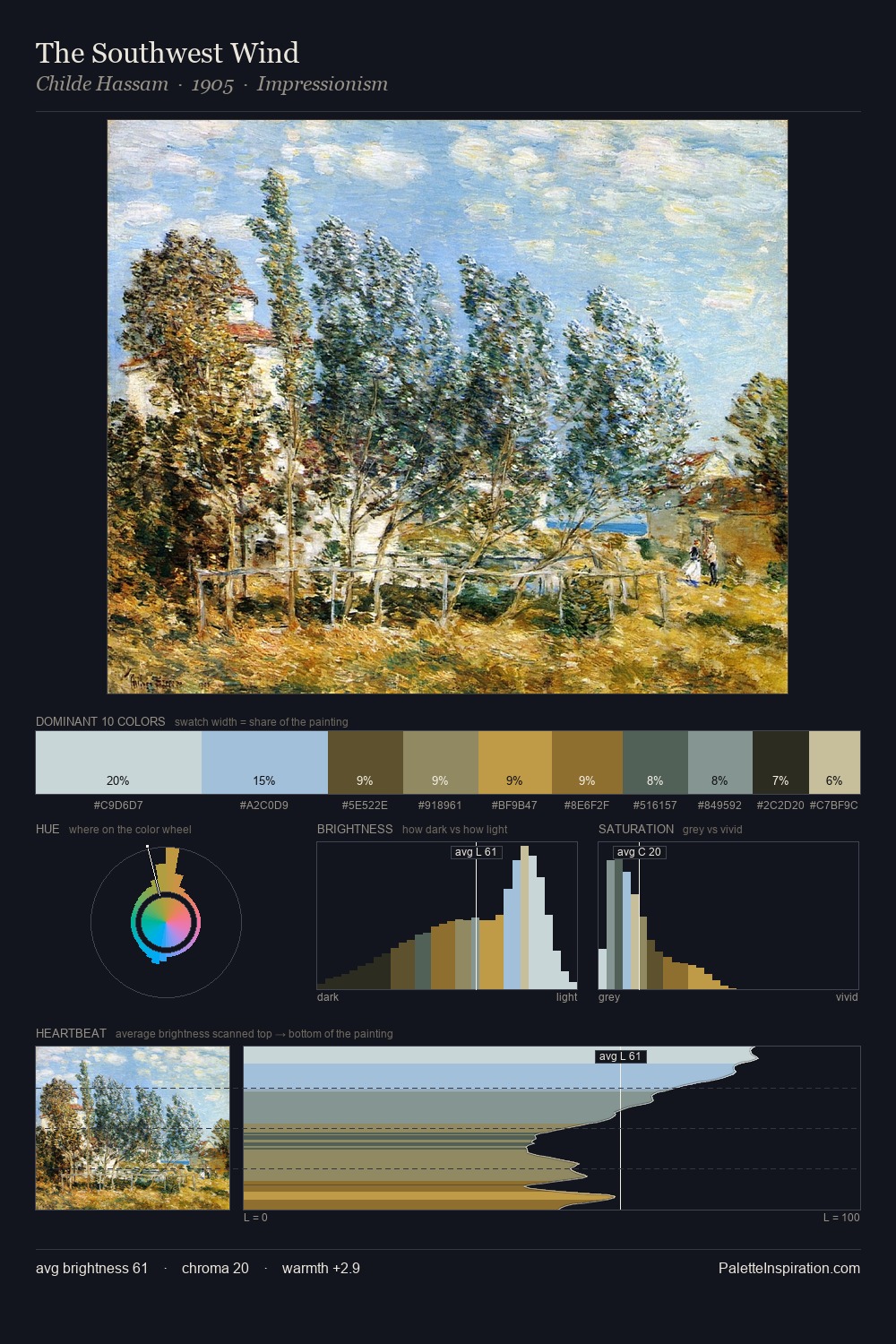
Light floods P. C. Skovgaard; the palette keeps values pale and airy across its range. Blues and teal-greys govern the palette, lending it an aquatic or atmospheric quality. The absence of saturated colour is itself an expressive choice: this is a palette of restraint and atmosphere. The highest-chroma note - #D5C093 - appears at just 8.7%, deployed as a precision accent against the quieter ground. 57 units of value range underpin the palette's structural clarity: the eye always knows where light falls. High luminosity and cool temperature suggest the plein-air condition: unfiltered daylight and open sky. In the context of P. C. Skovgaard's full range of palettes, group 1 represents one movement in an ongoing chromatic dialogue.
Example use cases
- garden centers
- natural beauty
- park & rec design
- sustainable fashion
- sustainability
I Love This!
Use This Palette
Copy, export, or download for your project
Copy, export, or download for your project
Copy:
Download:
Share: