Ottilie Wilhelmine Roederstein Master Palette

Palette Analysis
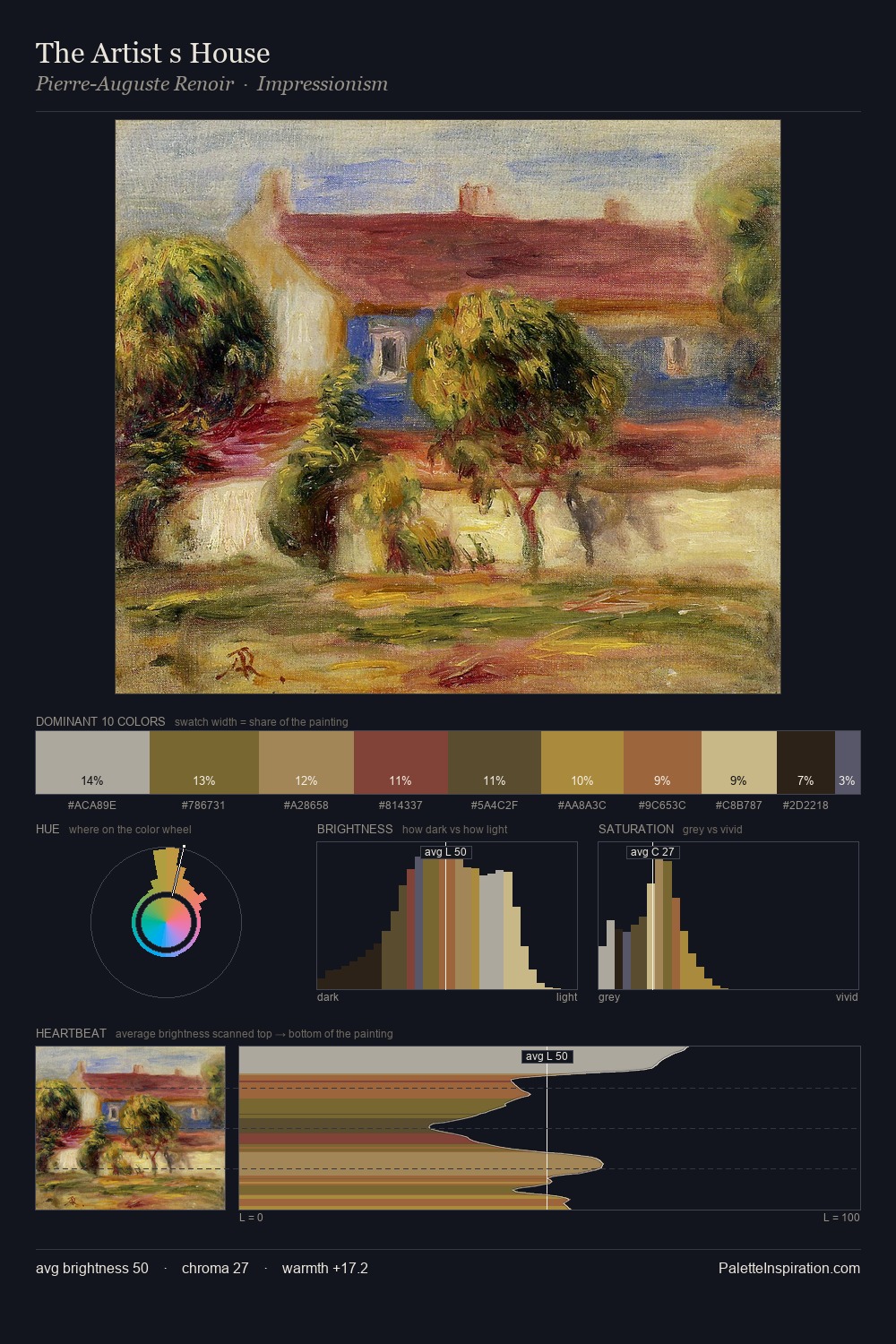
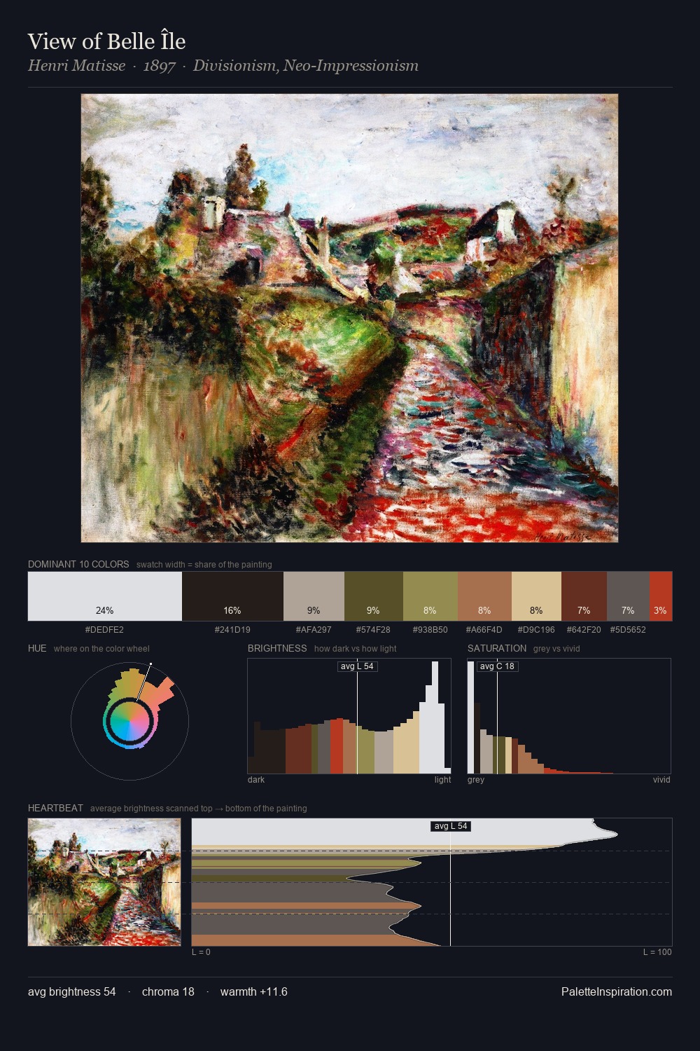
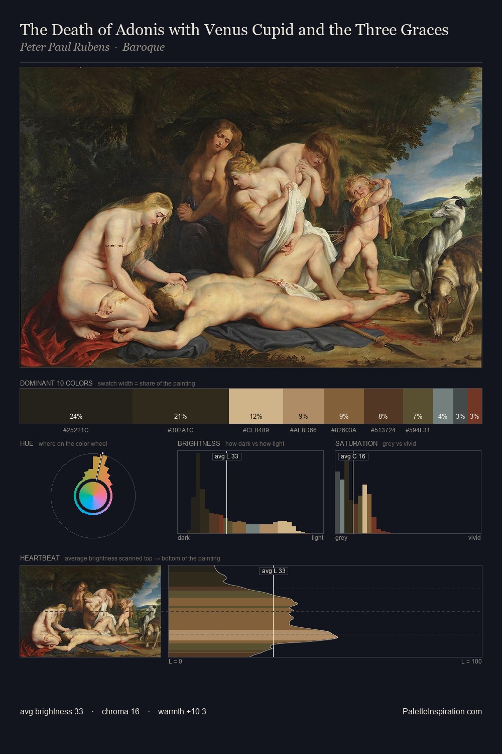
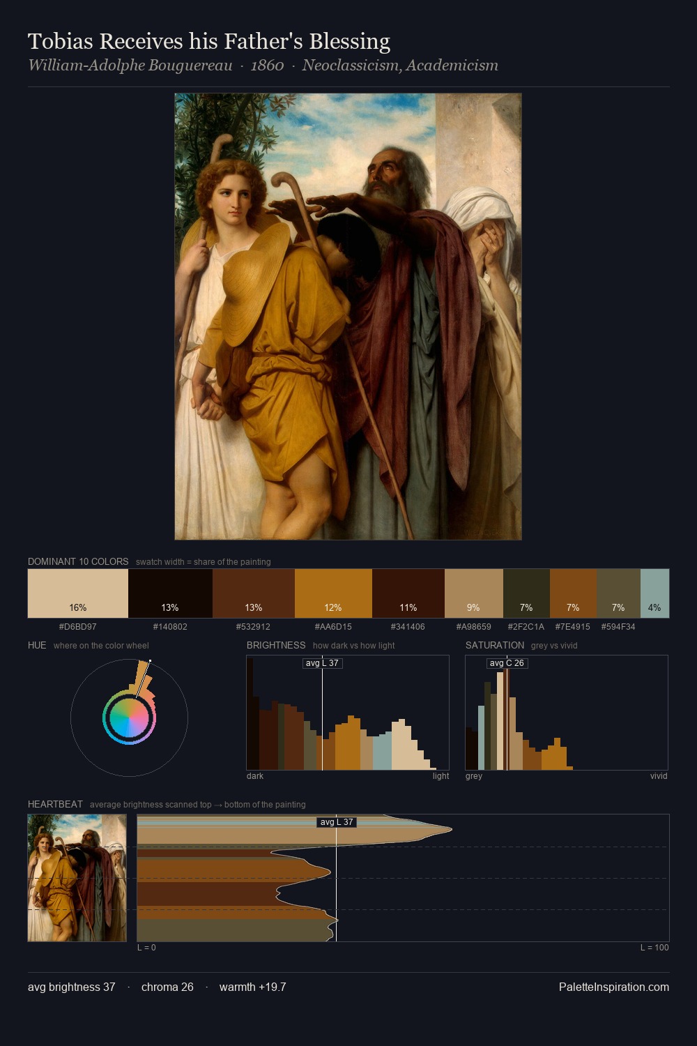
Ottilie Wilhelmine Roederstein distributes its values across the middle register, creating harmony without high contrast. The dominant temperature is warm, with earth tones and fire-hues setting the emotional key. Muted throughout, the palette achieves its effects through value and temperature rather than chromatic force. At 25.0%, #342B21 functions less as a colour accent and more as a complete atmospheric environment. At 5.0%, #C07F4E carries the palette's sharpest chromatic charge: an accent that earns its place precisely because it is withheld. Value range is moderate at 52 units - enough contrast for legibility, not so much as to fragment the tonal unity. These proportions encode Ottilie Wilhelmine Roederstein's instinctive sense of how much of each quality the eye can hold.
Example use cases
- theater design
- jewelry brands
- tobacco-adjacent retail
- event branding
- film & entertainment
I Love This!
Copy, export, or download for your project