Oskar Kokoschka Palette 3

Palette Analysis
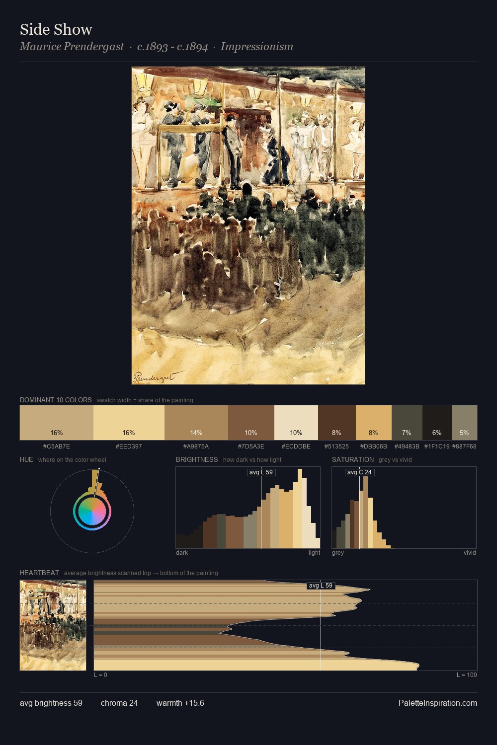
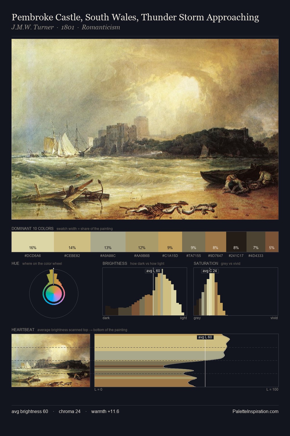
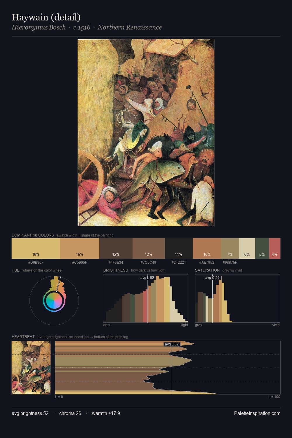
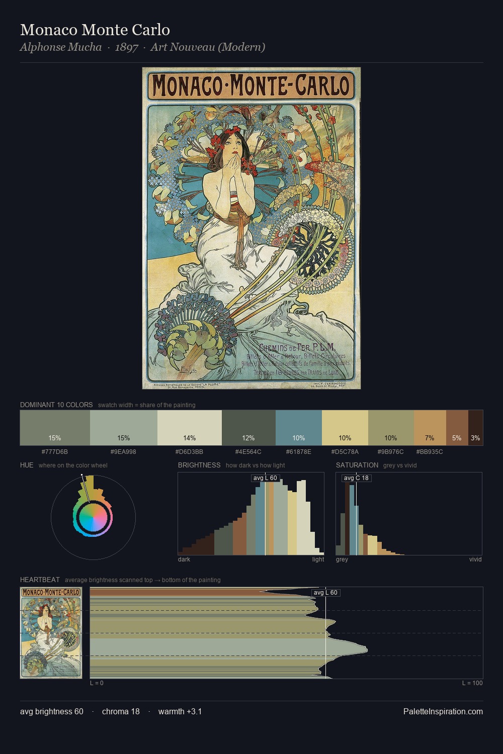
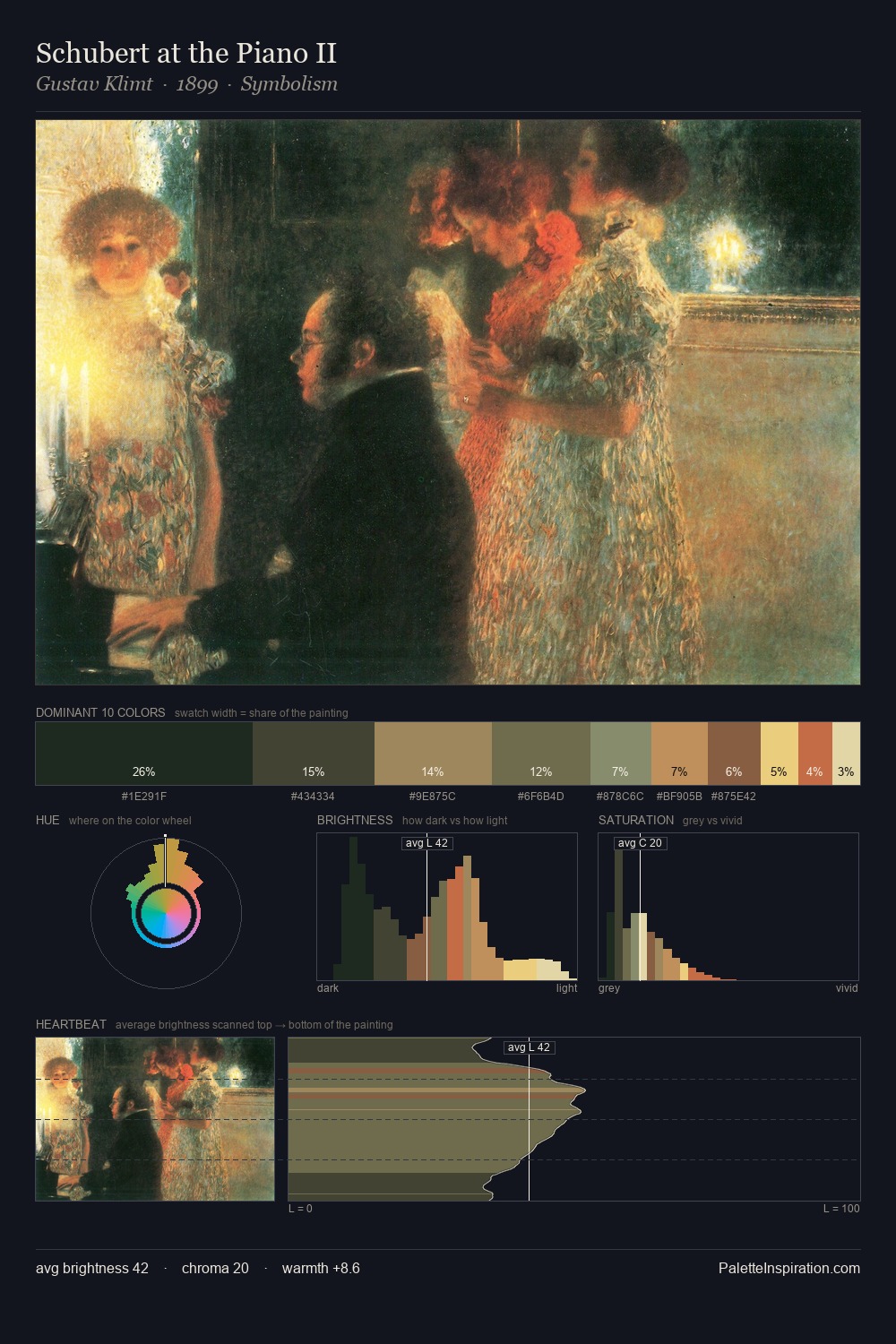
Oskar Kokoschka is strongly light-biased - shadow is suggested rather than declared. Oskar Kokoschka keeps warm and cool in parity, a balance that lends the work a perceptual shimmer. Colours are neither washed out nor blazing; they occupy the productive middle ground of the chroma scale. #C89B63 at 28.0% of the palette: an overwhelming presence that pulls all other colours into its gravitational field. The highest-chroma note - #6E5138 - appears at just 5.3%, deployed as a precision accent against the quieter ground. The full value range is 62 units: broad enough to build convincing three-dimensional form. The combination of mid-to-high key, balanced temperature, and elevated chroma is characteristic of Impressionist observation: light broken into its component hues. Palette 3 sits within the larger chromatic argument that Oskar Kokoschka's complete body of work advances.
Example use cases
- food packaging
- leather accessories
- travel & outdoor
- natural cosmetics
- interior design
I Love This!
Copy, export, or download for your project