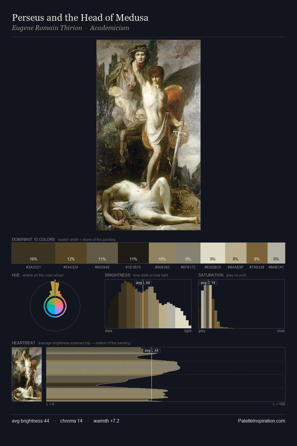
Orest Kiprensky Palette 2

Palette Analysis
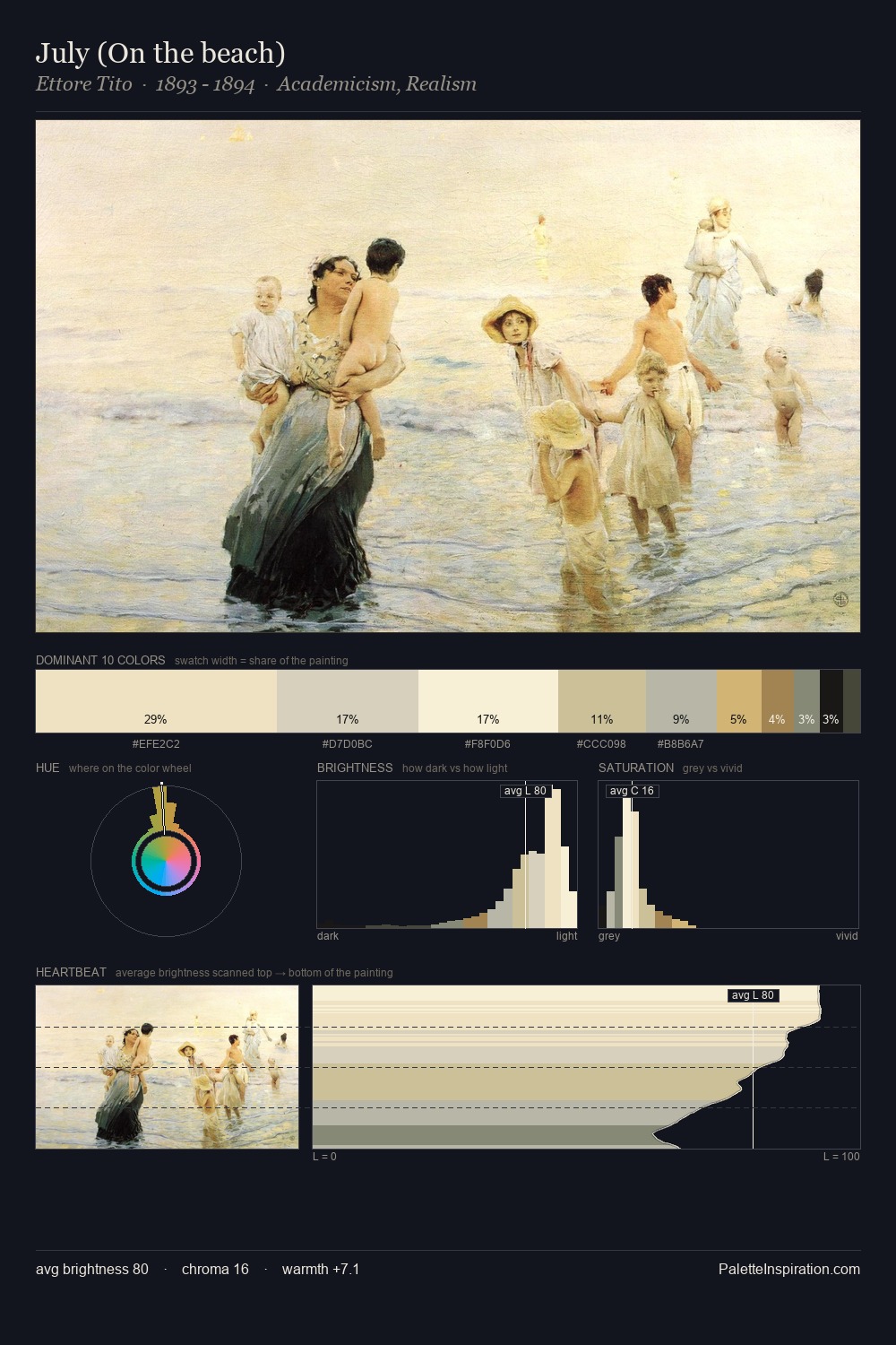
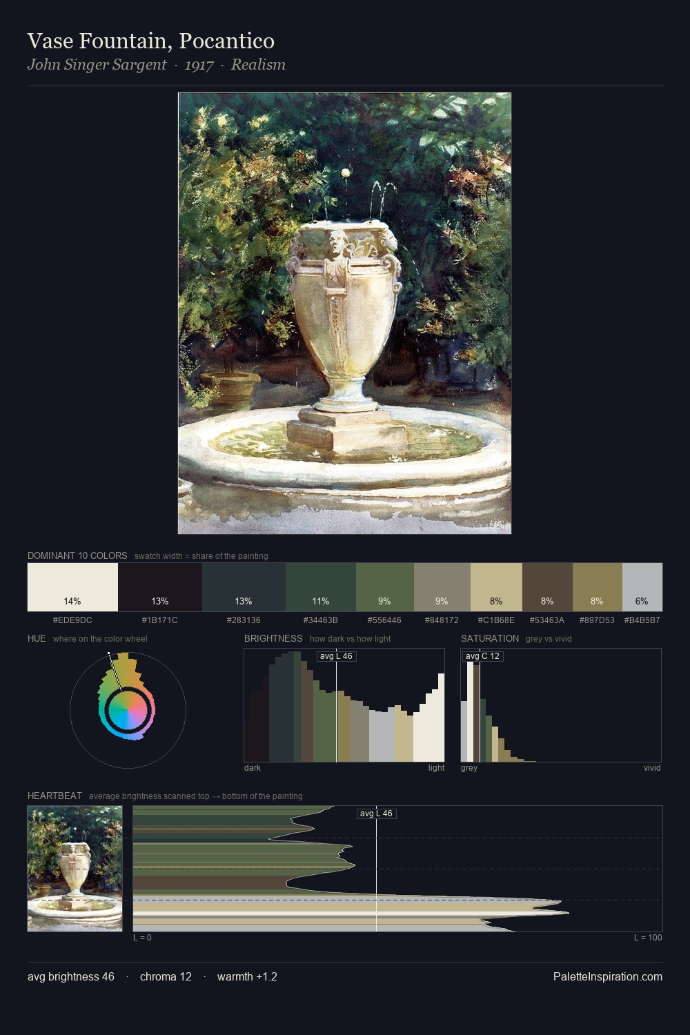
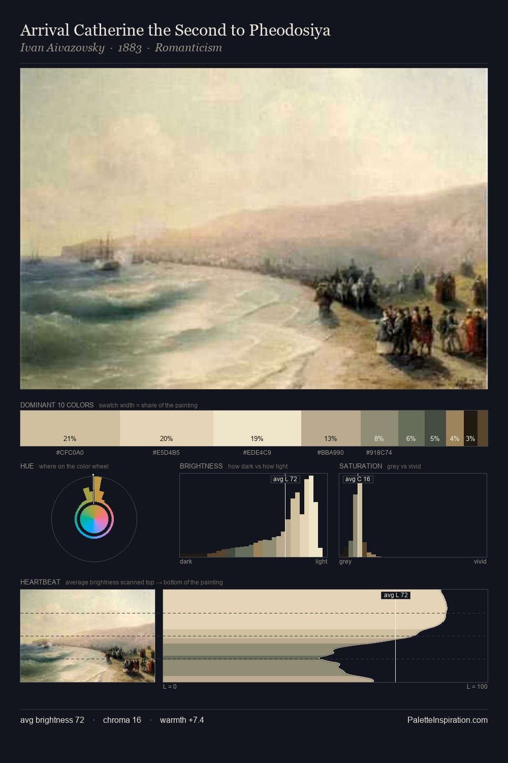
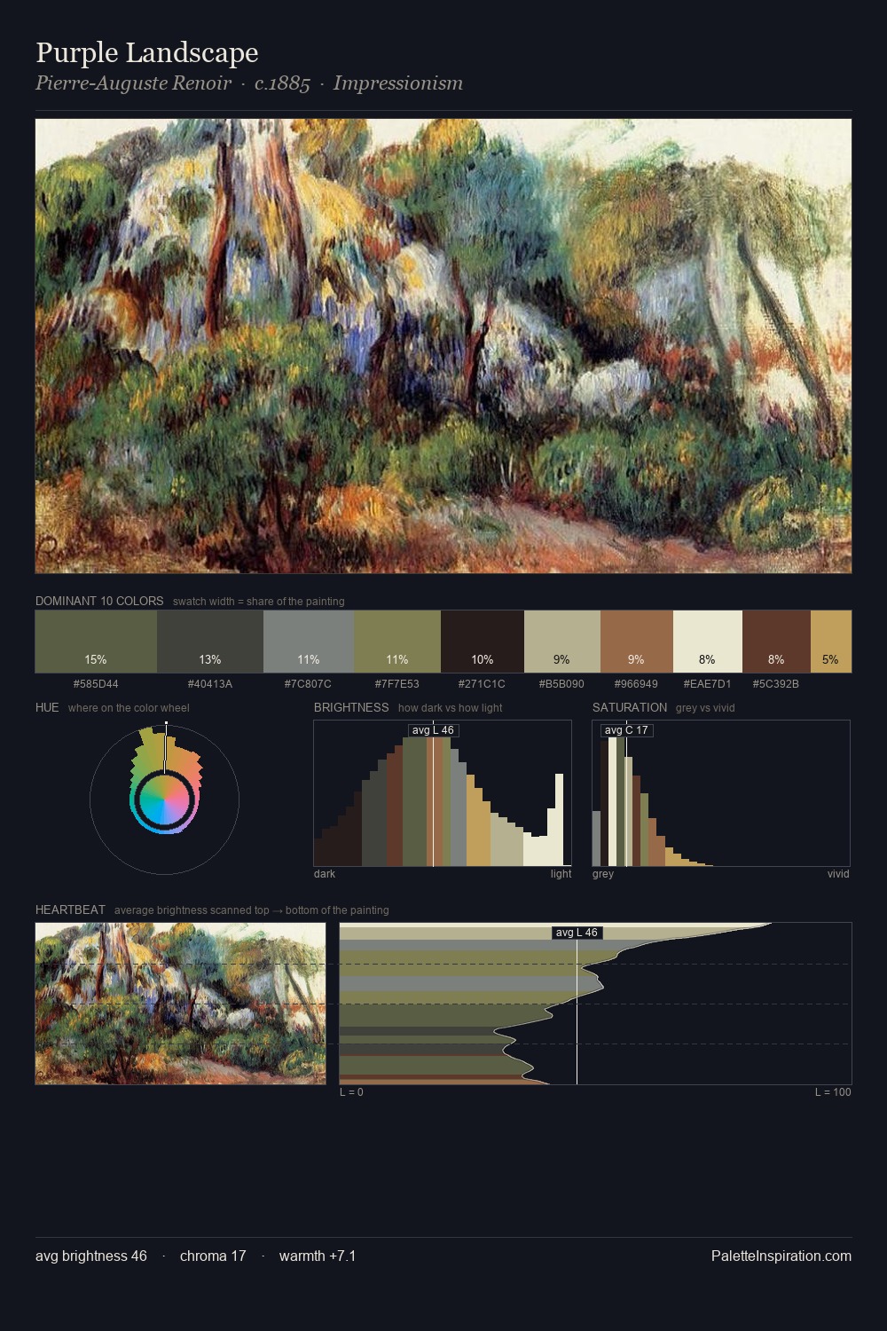
Orest Kiprensky is high in key: pale, luminous, and filled with optical air. A distinctly cool atmosphere runs through this palette: sky, water, and mist given colour form. All colours lean toward grey, building depth through value rather than colour punch. Orest Kiprensky gives 28.7% of the composition to a single #FDF8DA - a decisive chromatic anchor. The most saturated colour, #C2BA8F, is reserved to 5.1% of the surface, where it acts as a focal punctuation. The value range spans 76 units across the palette, providing the full gamut from deep shadow to near-white and ensuring clear tonal hierarchy. High luminosity and cool temperature suggest the plein-air condition: unfiltered daylight and open sky. This is palette 2 of Orest Kiprensky's sequence - a single chapter in a chromatic story told across many works.
Example use cases
- publishing
- corporate identity
- consumer apps
- hospitality
- design agencies
I Love This!
Copy, export, or download for your project