Nicolaas Verkolje Palette 2

Palette Analysis
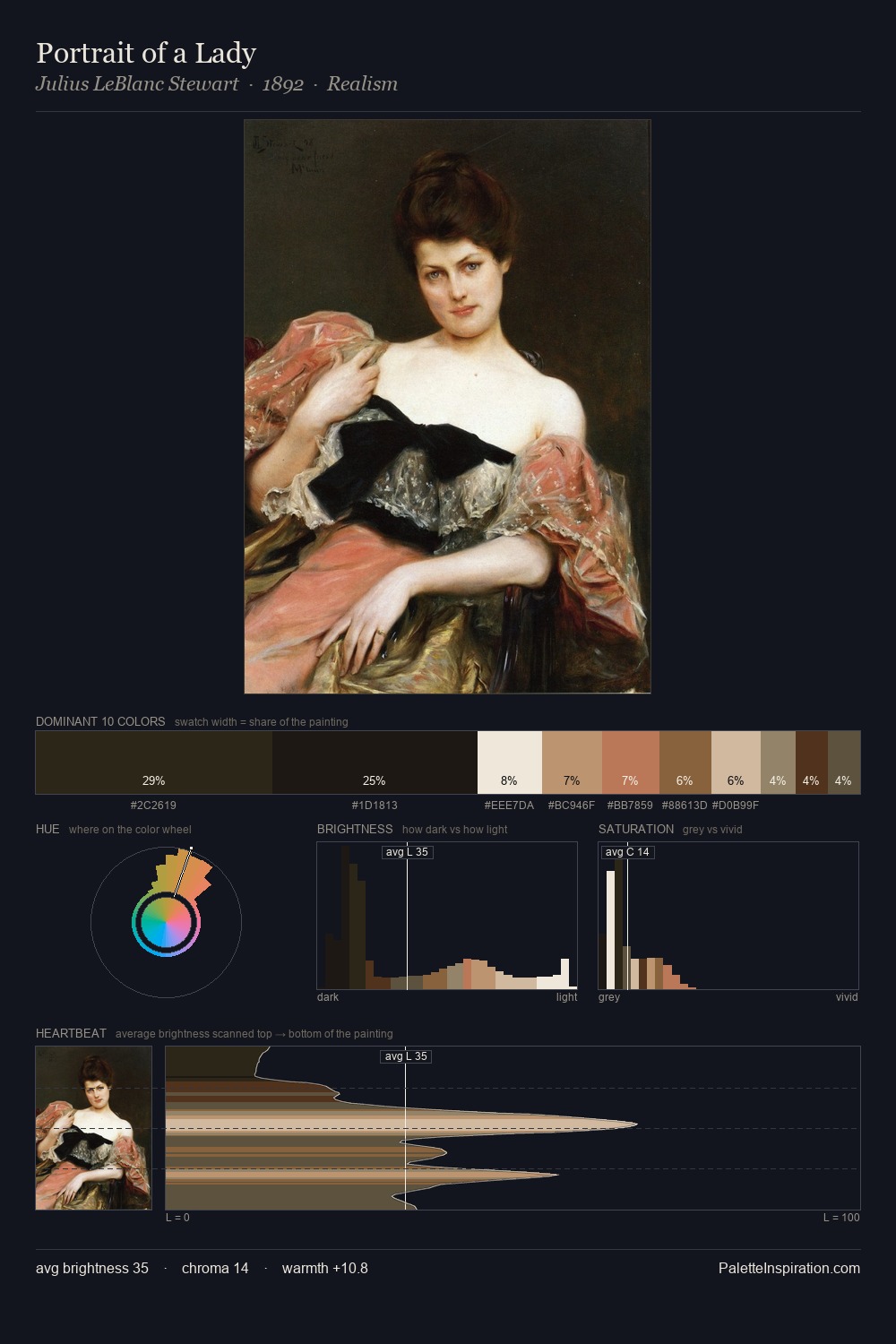
Nicolaas Verkolje occupies the comfortable middle of the value scale, avoiding both extremes to hold the eye in a sustained middle grey. Blues and teal-greys govern the palette, lending it an aquatic or atmospheric quality. Chroma is kept low across all colours, producing the soft, enveloping quality that characterises tonal painting. 25.2% of the palette belongs to #24201C, a concentration that makes it the unmistakable visual centre. #562C1B delivers the chromatic peak at only 2.6% - a small shot of colour with outsized visual impact. The full value range is 75 units: broad enough to build convincing three-dimensional form. The mid-to-high key, cool bias, and moderate chroma point to outdoor observation - sky and diffused daylight as the dominant light source. This is palette 2 of Nicolaas Verkolje's sequence - a single chapter in a chromatic story told across many works.
Example use cases
- theater design
- jewelry brands
- tobacco-adjacent retail
- event branding
- film & entertainment
I Love This!
Copy, export, or download for your project