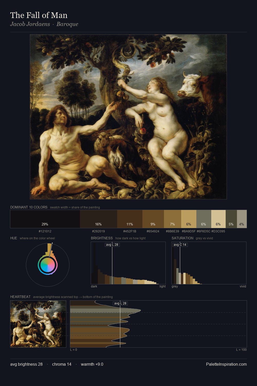
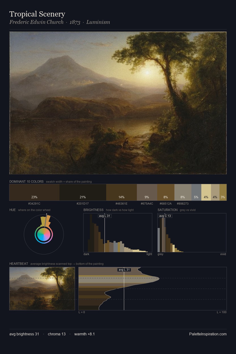
Morten Muller Master Palette

Palette Analysis
Morten Muller occupies the comfortable middle of the value scale, avoiding both extremes to hold the eye in a sustained middle grey. Temperature is cool-dominant, with blue and green families claiming the largest areas. Saturation is deliberately withheld - the beauty here lies in the near-monochromatic gradations rather than colour difference. Only 6.5% is devoted to #6B532E, yet that small allocation delivers the palette's entire chromatic tension. 52 units of value spread create a palette that is varied but unified - contrast in the service of harmony. High luminosity and cool temperature suggest the plein-air condition: unfiltered daylight and open sky. Taken together, these qualities constitute Morten Muller's chromatic voice - distinctive enough to be read across an entire body of work.
Example use cases
- archival print
- university identity
- rare books
- cultural institutions
- nonprofit identity
I Love This!
Copy, export, or download for your project