Mikhail Shibanov Palette 2

Palette Analysis
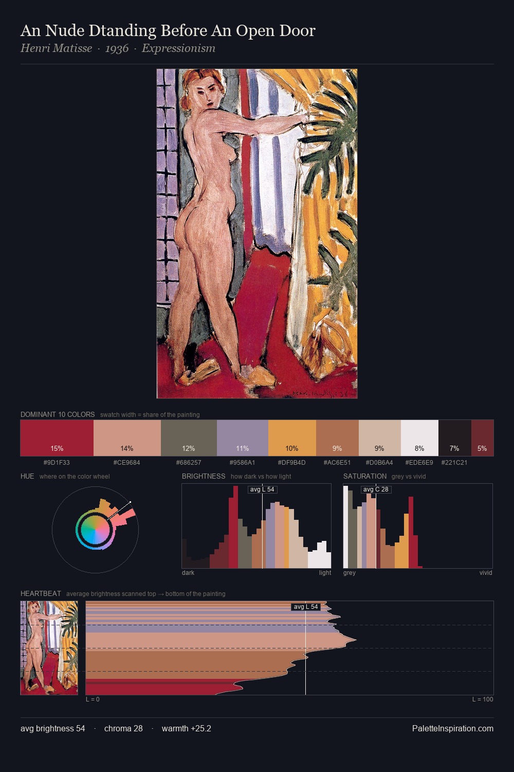
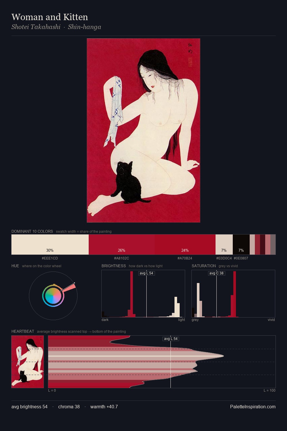
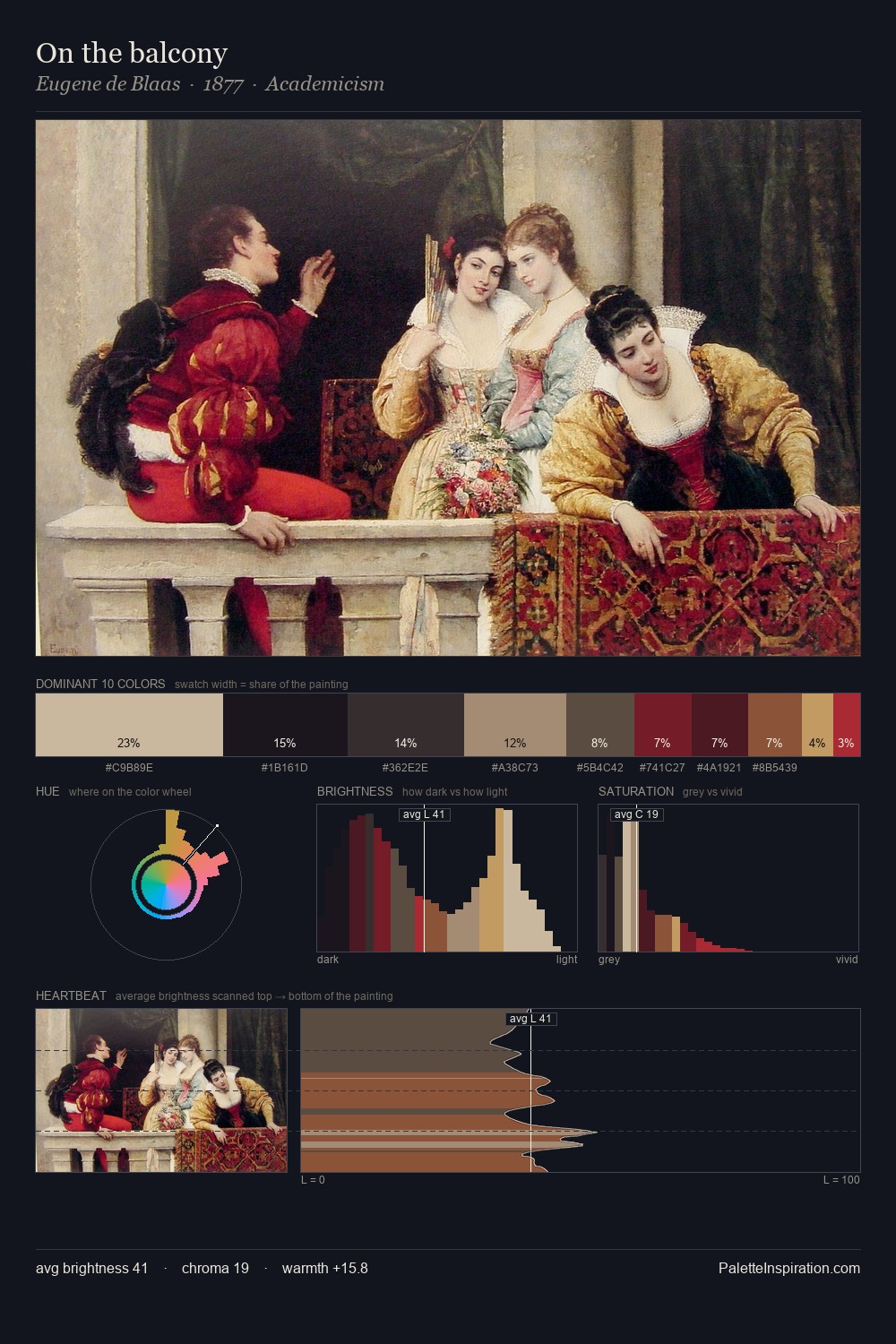
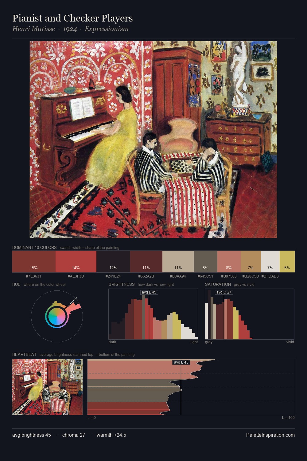
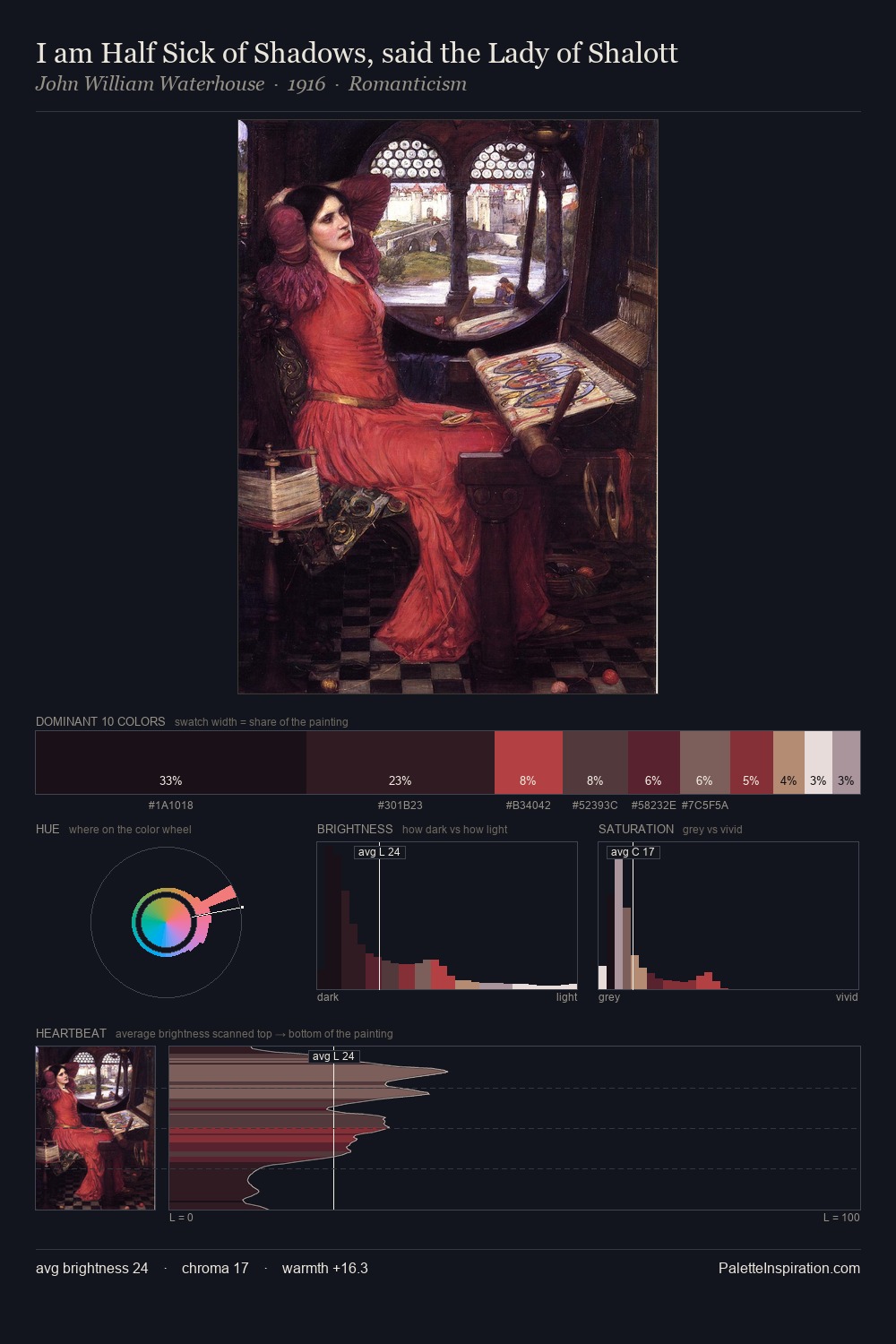
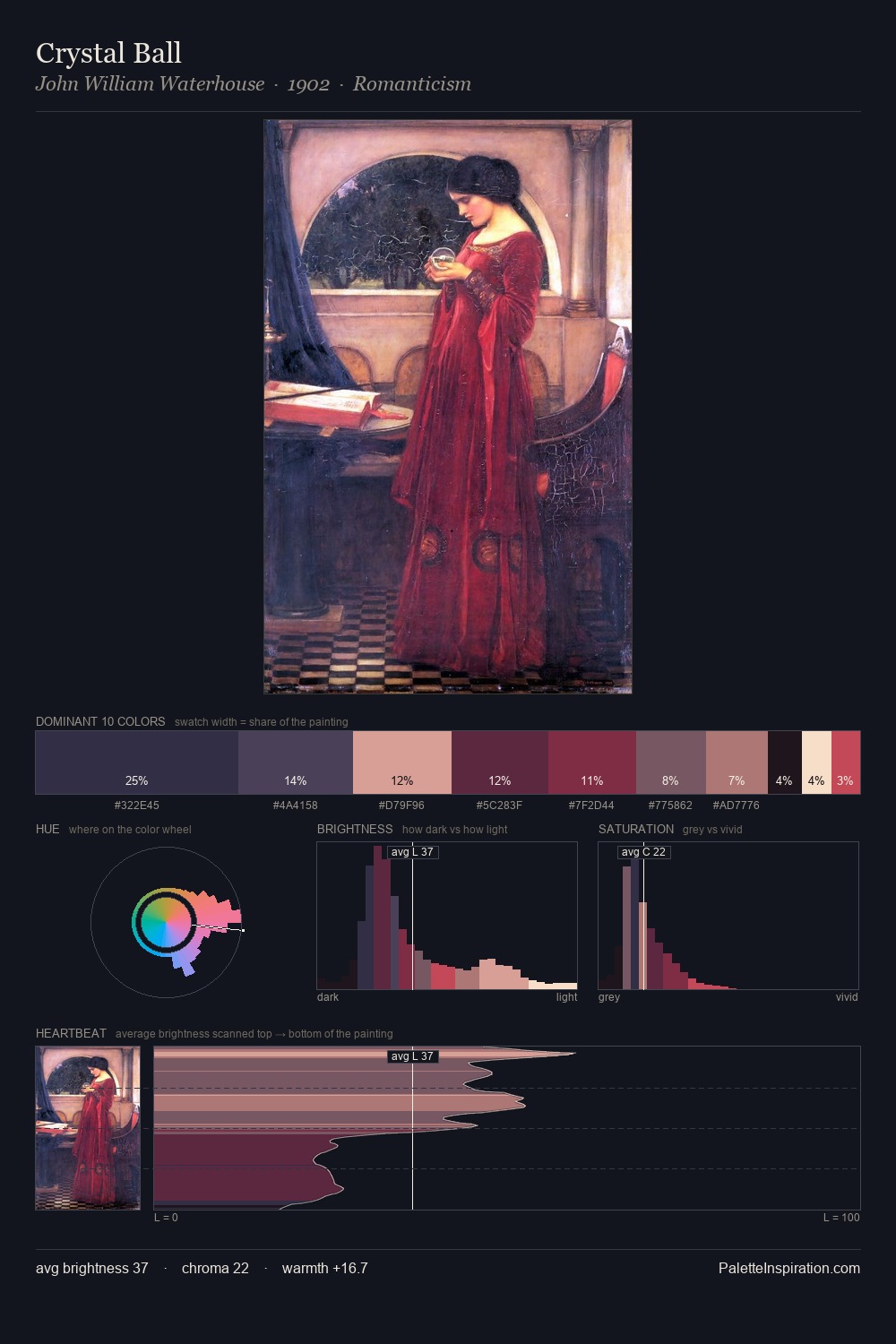
Mikhail Shibanov occupies the comfortable middle of the value scale, avoiding both extremes to hold the eye in a sustained middle grey. Temperature reads distinctly warm: the reds and earth tones from Mikhail Shibanov carry the compositional weight. Mid-range chroma keeps the palette grounded - colourful but not strident. The dominant colour, #0E0F14, takes 36.8% of the total area, establishing the overall mood before any other hue is introduced. #5A2231 delivers the chromatic peak at only 6.0% - a small shot of colour with outsized visual impact. 73 units of value range underpin the palette's structural clarity: the eye always knows where light falls. Mikhail Shibanov's palette 2 carries its own internal logic while remaining in conversation with the artist's broader colour intelligence.
Example use cases
- theater design
- jewelry brands
- tobacco-adjacent retail
- event branding
- film & entertainment
I Love This!
Copy, export, or download for your project