Marsden Hartley Palette 1

Palette Analysis
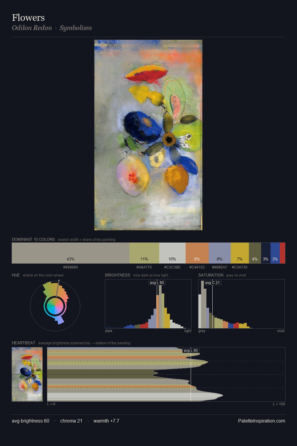
Marsden Hartley is strongly light-biased - shadow is suggested rather than declared. Blues and teal-greys govern the palette, lending it an aquatic or atmospheric quality. Colours are neither washed out nor blazing; they occupy the productive middle ground of the chroma scale. The most saturated colour, #B15B4E, covers 5.6% of the surface: too much to call an accent, too strong to ignore. The value range spans 71 units across the palette, providing the full gamut from deep shadow to near-white and ensuring clear tonal hierarchy. High luminosity and cool temperature suggest the plein-air condition: unfiltered daylight and open sky. In the context of Marsden Hartley's full range of palettes, group 1 represents one movement in an ongoing chromatic dialogue.
Example use cases
- publishing
- corporate identity
- consumer apps
- hospitality
- design agencies
I Love This!
Copy, export, or download for your project