Marie-Denise Villers Palette 3

Palette Analysis
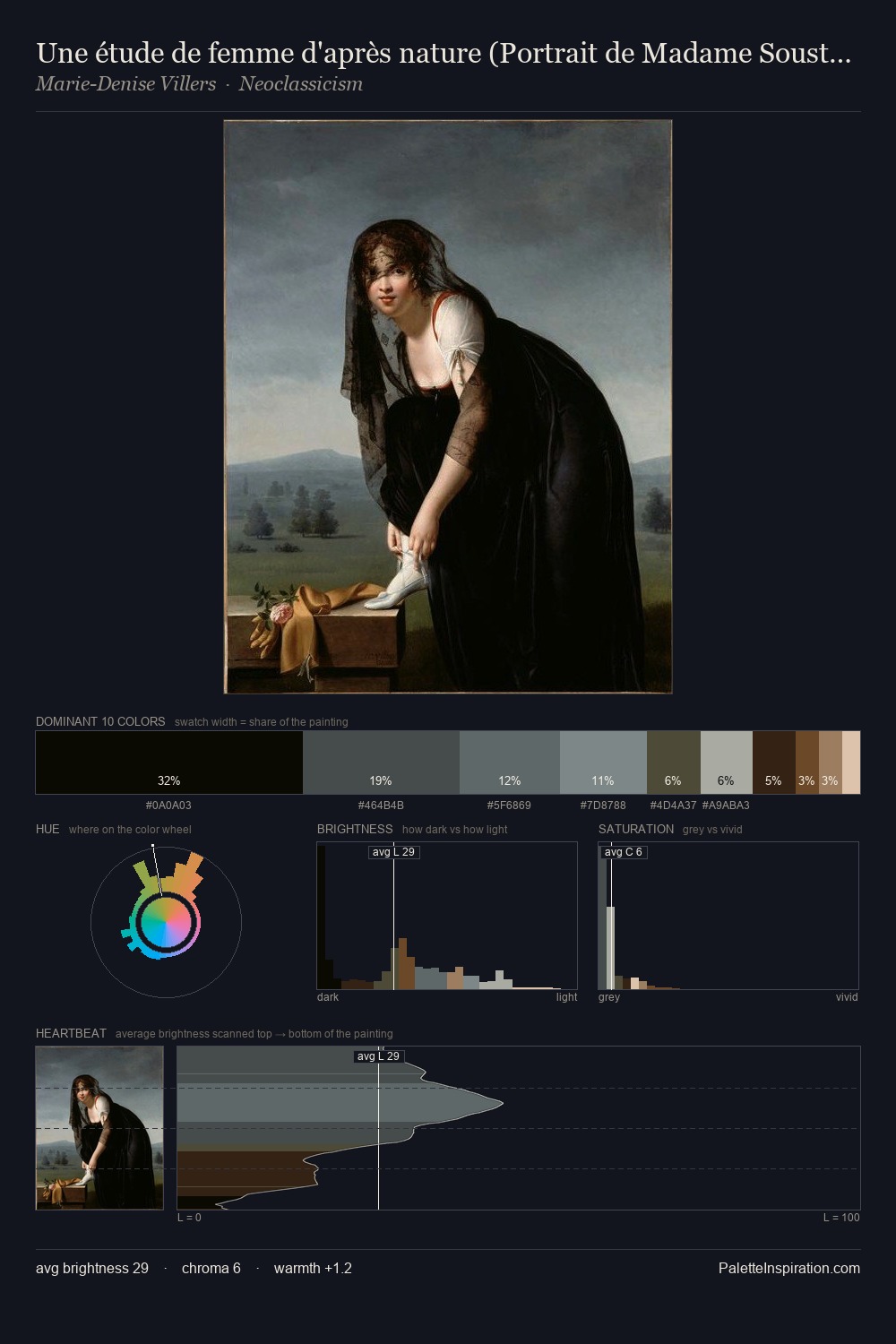
Marie-Denise Villers occupies the comfortable middle of the value scale, avoiding both extremes to hold the eye in a sustained middle grey. Marie-Denise Villers tilts toward cool - blues and silver-greys carry the structural weight. The absence of saturated colour is itself an expressive choice: this is a palette of restraint and atmosphere. The dominant colour, #0A0A03, takes 35.8% of the total area, establishing the overall mood before any other hue is introduced. At 2.6%, #B28C6D carries the palette's sharpest chromatic charge: an accent that earns its place precisely because it is withheld. From deepest dark to palest light, the palette traverses 64 units of the value scale - a span that creates natural depth. The mid-to-high key, cool bias, and moderate chroma point to outdoor observation - sky and diffused daylight as the dominant light source. In the context of Marie-Denise Villers's full range of palettes, group 3 represents one movement in an ongoing chromatic dialogue.
Example use cases
- music labels
- luxury hospitality
- editorial photography
- leather goods
- premium streaming
I Love This!
Copy, export, or download for your project