Luigi Premazzi Palette 5
Muted Gamboge
Muted Deliberately desaturated - chroma pulled toward gray, the restraint of tonal painting.
Gamboge Deep golden yellow - a traditional warm pigment, rich amber-gold.

Palette Analysis
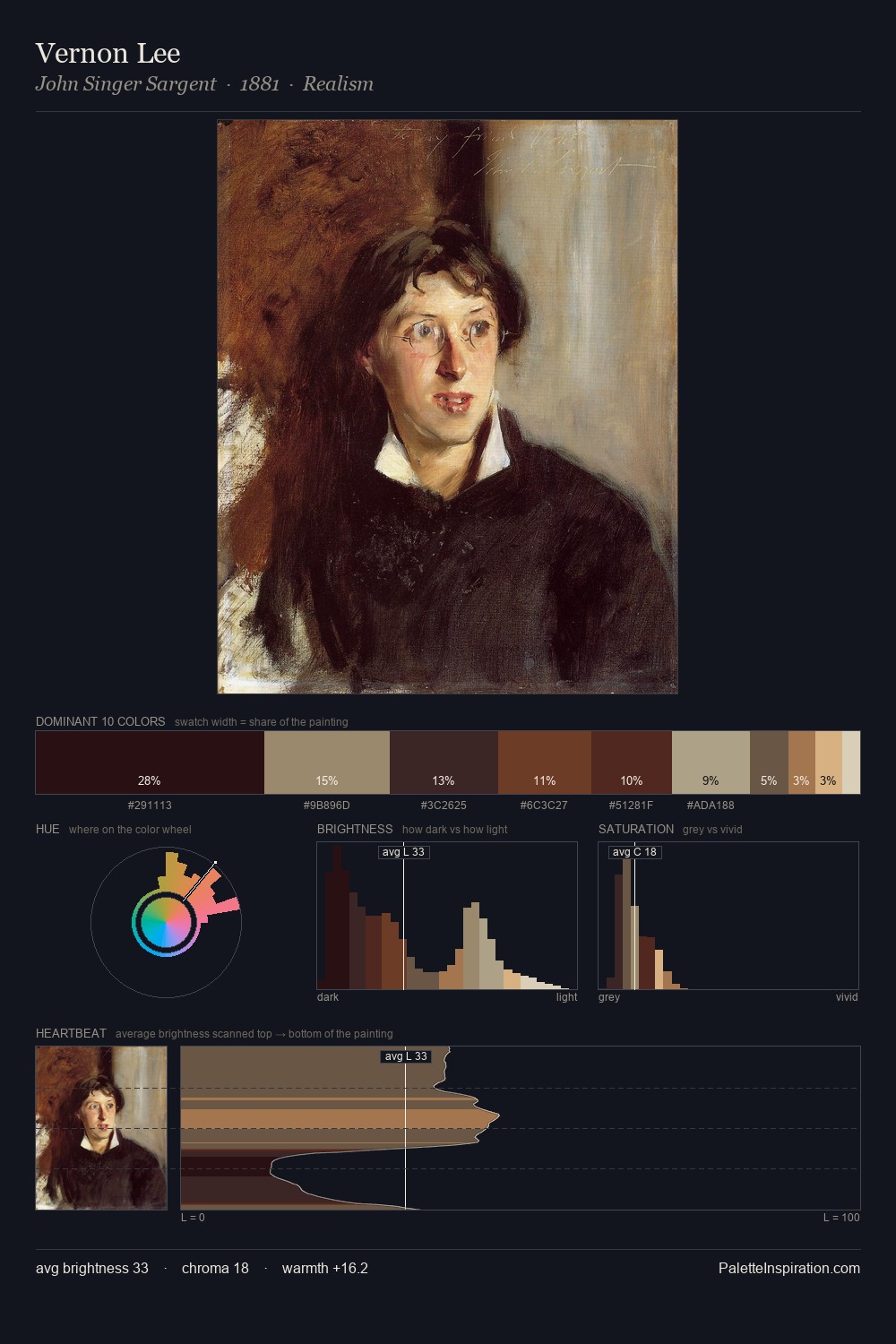
Luigi Premazzi distributes its values across the middle register, creating harmony without high contrast. Luigi Premazzi orchestrates warmth above all else - reds, ambers, and siennas take the lead. Saturation is deliberately withheld - the beauty here lies in the near-monochromatic gradations rather than colour difference. The highest-chroma note - #9C6948 - appears at just 8.3%, deployed as a precision accent against the quieter ground. The value range spans 66 units across the palette, providing the full gamut from deep shadow to near-white and ensuring clear tonal hierarchy. This is palette 5 of Luigi Premazzi's sequence - a single chapter in a chromatic story told across many works.
Example use cases
- interior design
- furniture brands
- cookbook publishing
- wine & spirits
- food packaging
I Love This!
Use This Palette
Copy, export, or download for your project
Copy, export, or download for your project
Copy:
Download:
Share: