Luigi Premazzi Palette 1

Palette Analysis
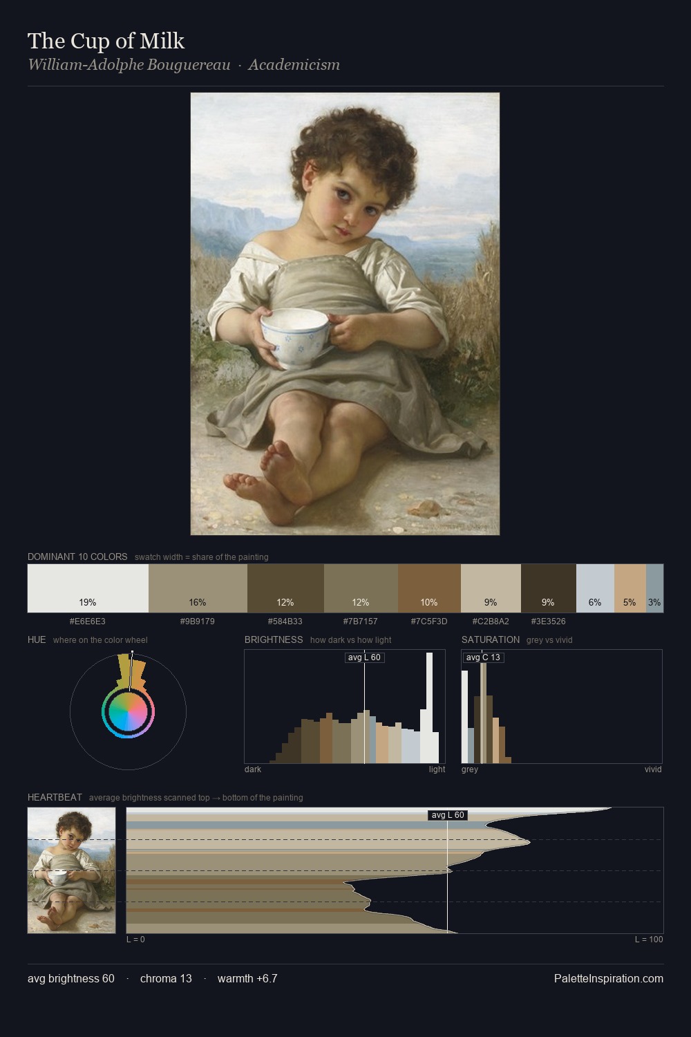
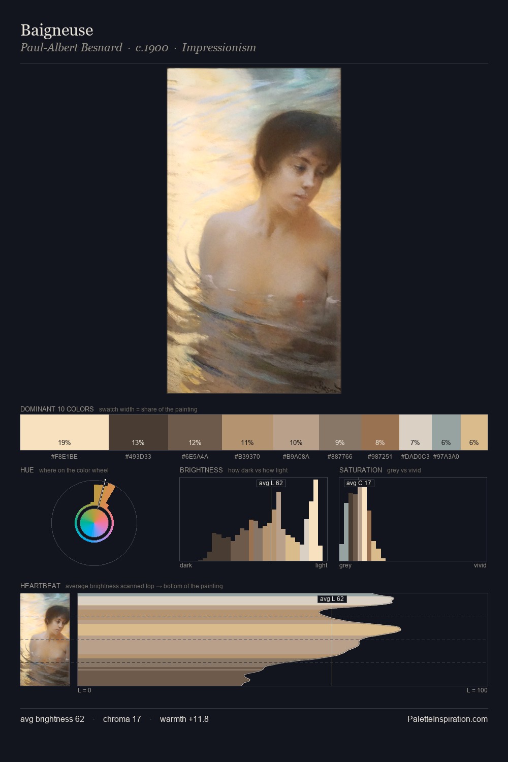
Light floods Luigi Premazzi; the palette keeps values pale and airy across its range. Luigi Premazzi tilts toward cool - blues and silver-greys carry the structural weight. Saturation is deliberately withheld - the beauty here lies in the near-monochromatic gradations rather than colour difference. The most saturated colour, #CDBFA1, is reserved to 10.9% of the surface, where it acts as a focal punctuation. 46 units of value spread create a palette that is varied but unified - contrast in the service of harmony. The mid-to-high key, cool bias, and moderate chroma point to outdoor observation - sky and diffused daylight as the dominant light source. This is palette 1 of Luigi Premazzi's sequence - a single chapter in a chromatic story told across many works.
Example use cases
- archival print
- university identity
- rare books
- cultural institutions
- nonprofit identity
I Love This!
Copy, export, or download for your project