Karl von Blaas Palette 1

Palette Analysis
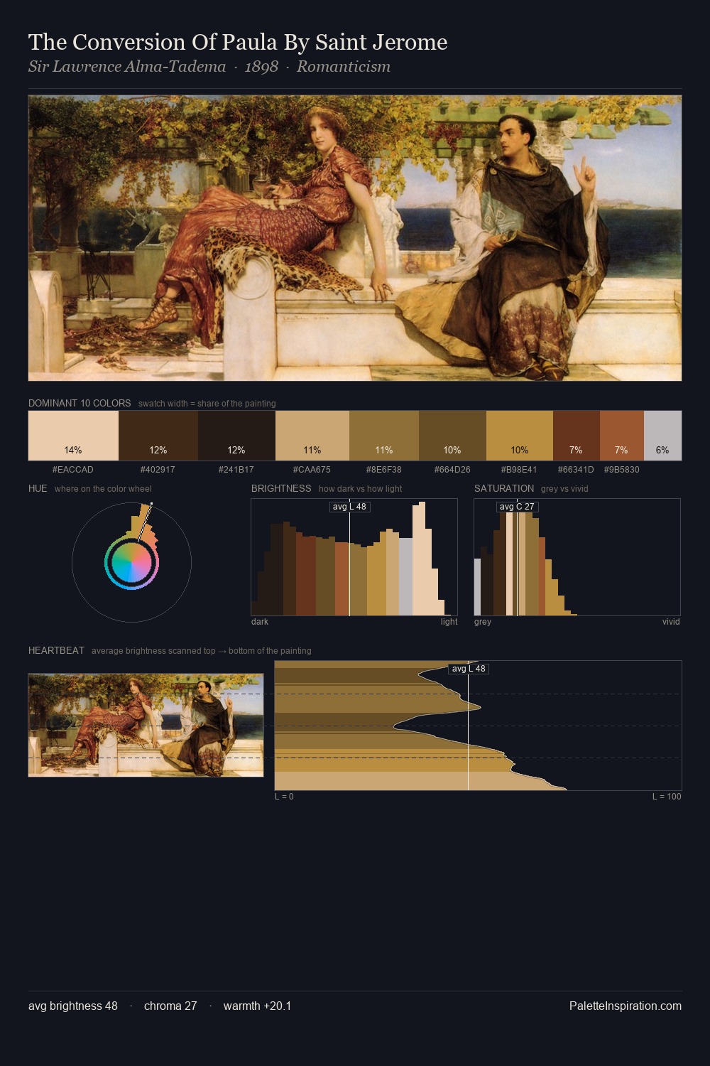
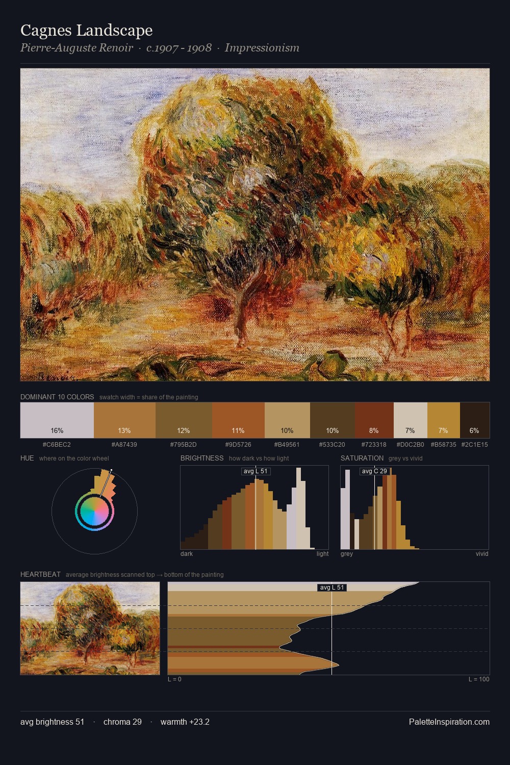
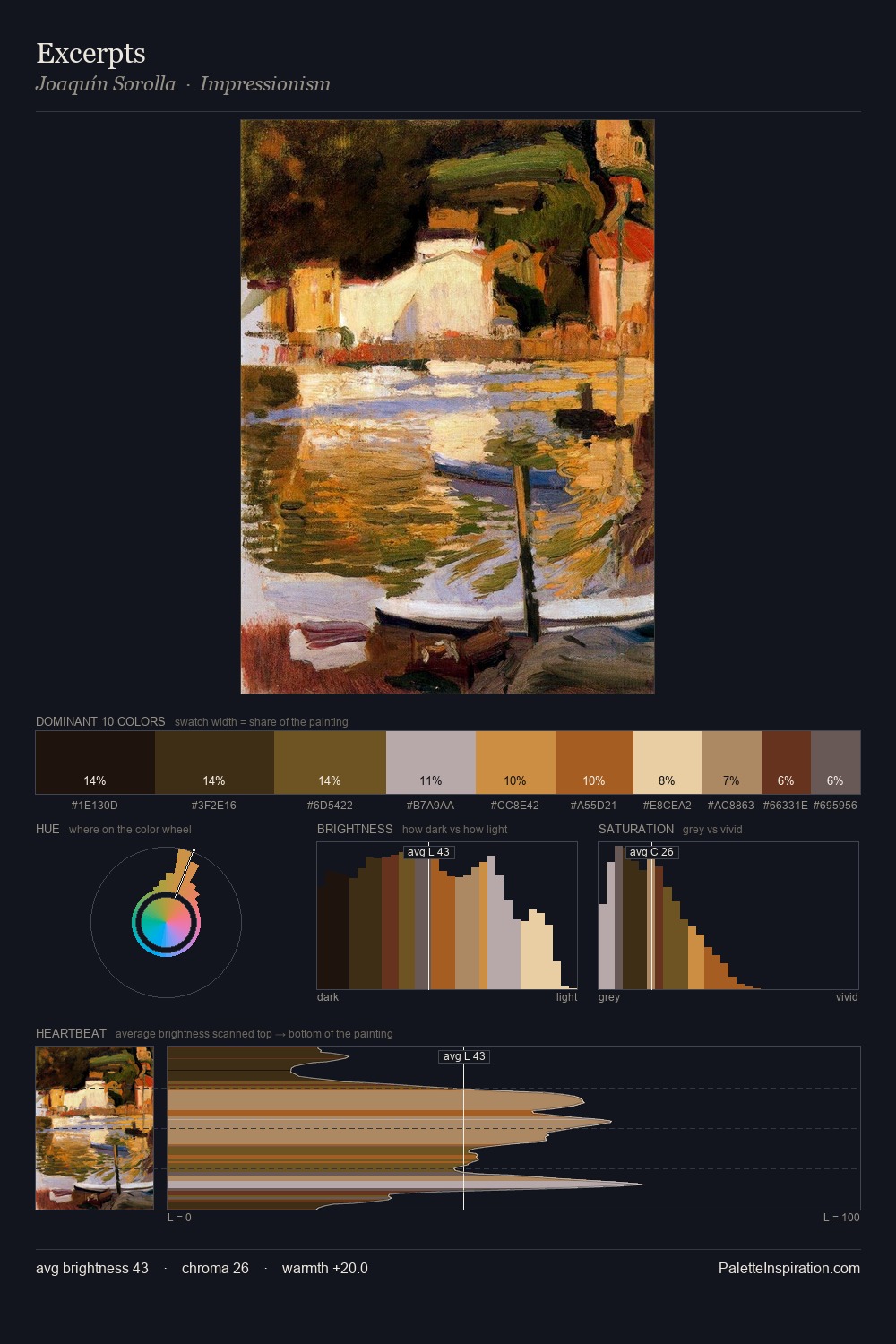
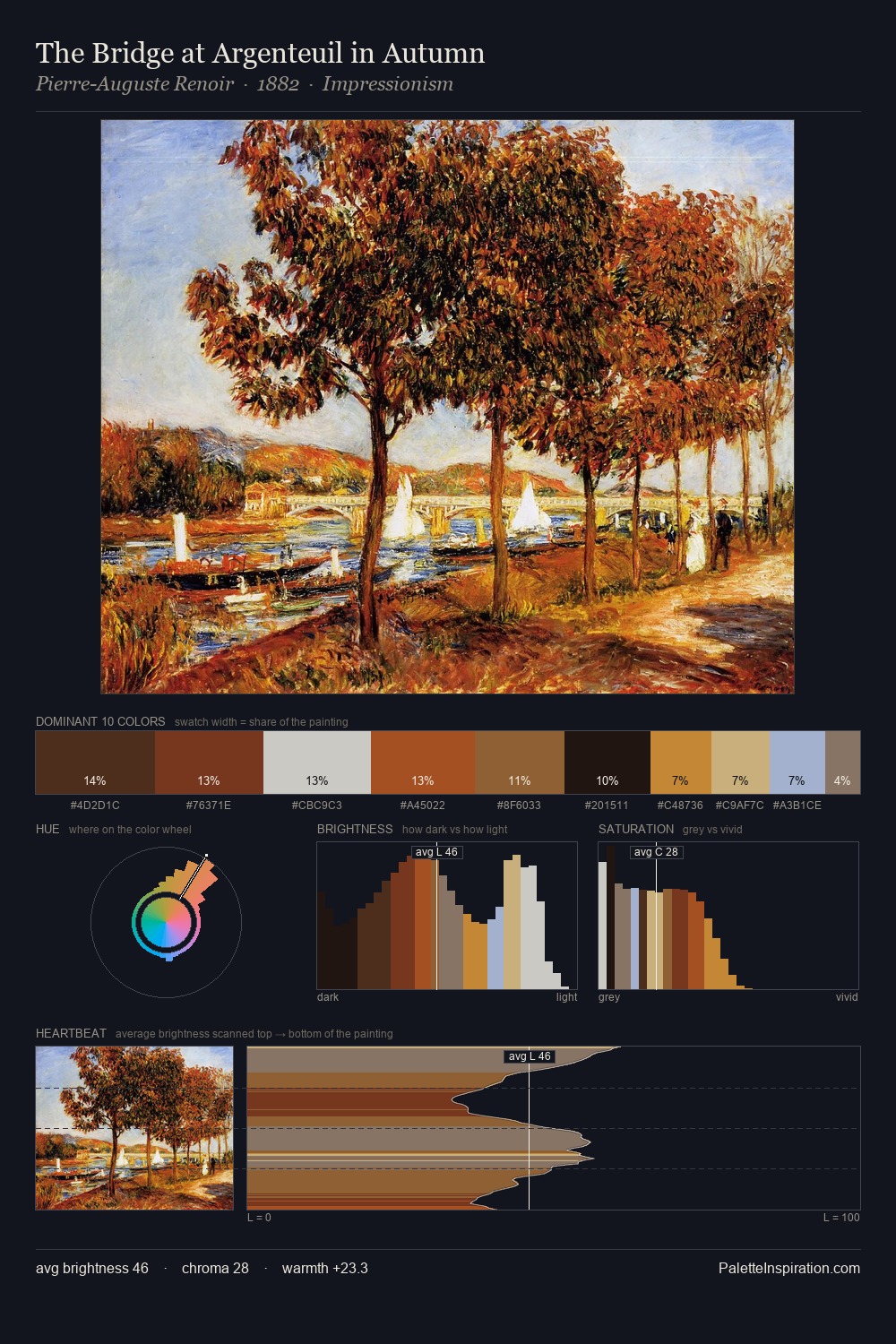
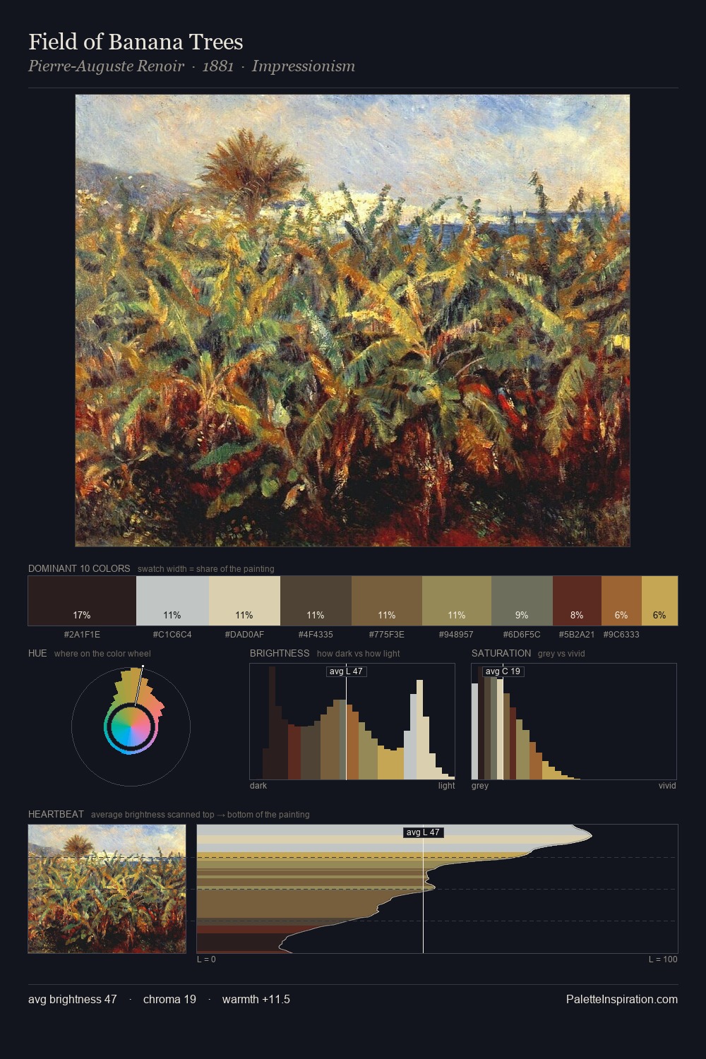
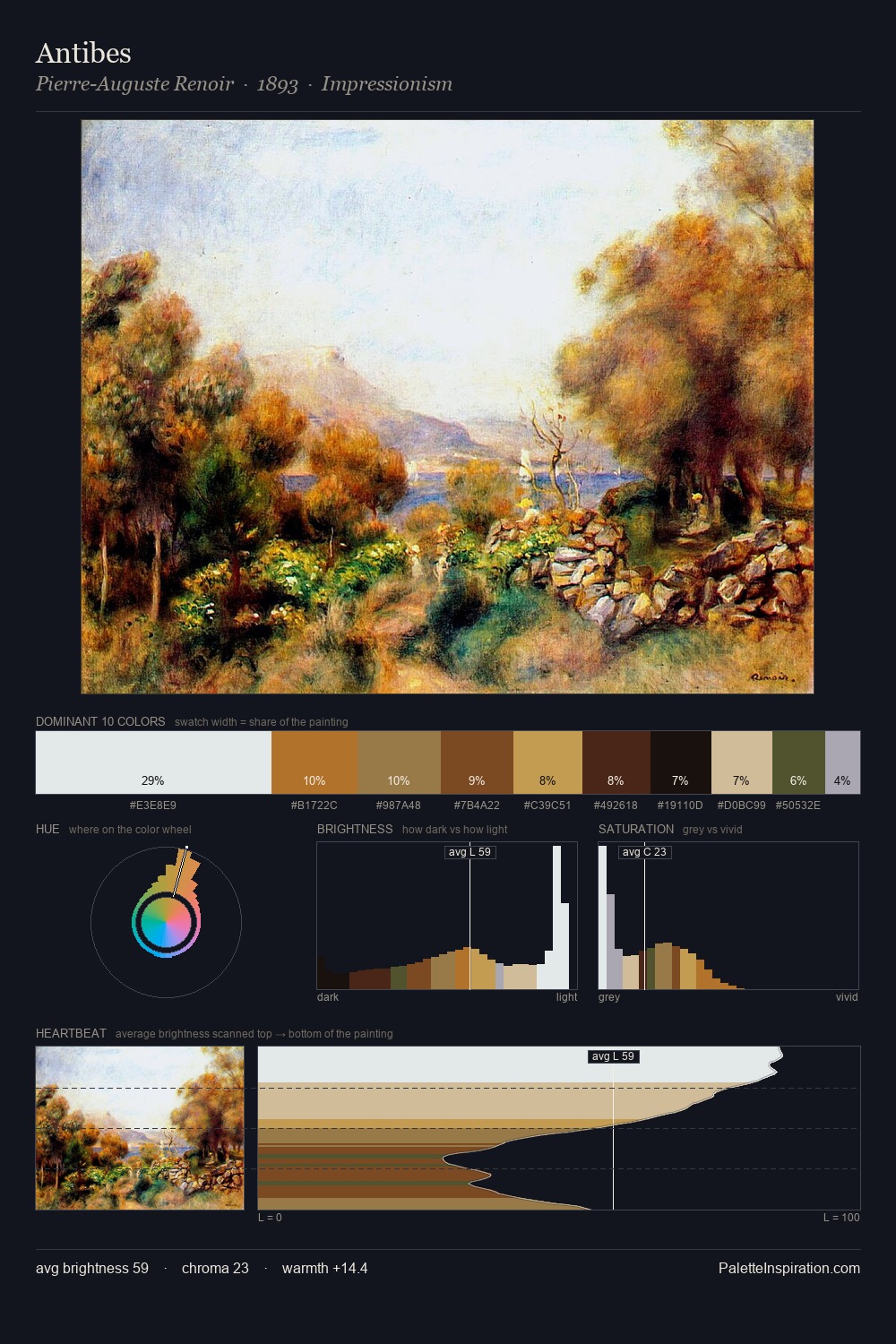
The value structure of Karl von Blaas is mid-key: quiet, controlled, and cohesive. Warm and cool are kept in productive tension, creating the kind of chromatic harmony that sustains the eye. Mid-saturation across the board: the palette has colour character without chromatic excess. Only 7.8% is devoted to #A46428, yet that small allocation delivers the palette's entire chromatic tension. From deepest dark to palest light, the palette traverses 60 units of the value scale - a span that creates natural depth. The palette reads as an Impressionist one - light-biased, chromatically direct, and built on temperature contrast rather than value opposition. In the context of Karl von Blaas's full range of palettes, group 1 represents one movement in an ongoing chromatic dialogue.
Example use cases
- ceramics & pottery
- boutique hospitality
- menswear
- heritage food brands
- craft & artisan brands
I Love This!
Copy, export, or download for your project