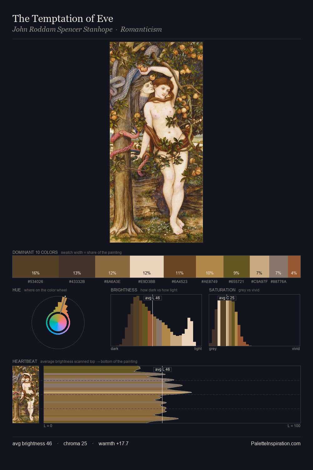
John Roddam Spencer Stanhope Palette 1
Veiled Caramel
Veiled Partially obscured light - mid-dark with a hazy, scrim-filtered quality.
Caramel Warm mid-brown - the color of cooked sugar, smooth and amber-toned.

Palette Analysis
John Roddam Spencer Stanhope sits in the centre of the value range, lending the palette a sense of even, sustained light. Warm hues command this palette; John Roddam Spencer Stanhope favours the reds, oranges, and yellows of firelight and earth. Mid-saturation across the board: the palette has colour character without chromatic excess. #DDBD97 delivers the chromatic peak at only 12.5% - a small shot of colour with outsized visual impact. At 55 units of value range, the palette has the tonal breadth to sustain complex spatial readings. Palette 1 sits within the larger chromatic argument that John Roddam Spencer Stanhope's complete body of work advances.
Example use cases
- ceramics & pottery
- boutique hospitality
- menswear
- heritage food brands
- craft & artisan brands
I Love This!
Use This Palette
Copy, export, or download for your project
Copy, export, or download for your project
Copy:
Download:
Share:
Related Palettes

Richard Wilson Palette 5
Veiled Tawny

George Cochran Lambdin Master Palette
Penumbral Caramel

Johannes Christian Deiker Palette 2
Veiled Topaz

John Roddam Spencer Stanhope Palette 2
Veiled Caramel

John Roddam Spencer Stanhope Palette 3
Shadowed Bister

John Roddam Spencer Stanhope Palette 4
Shadowed Caramel