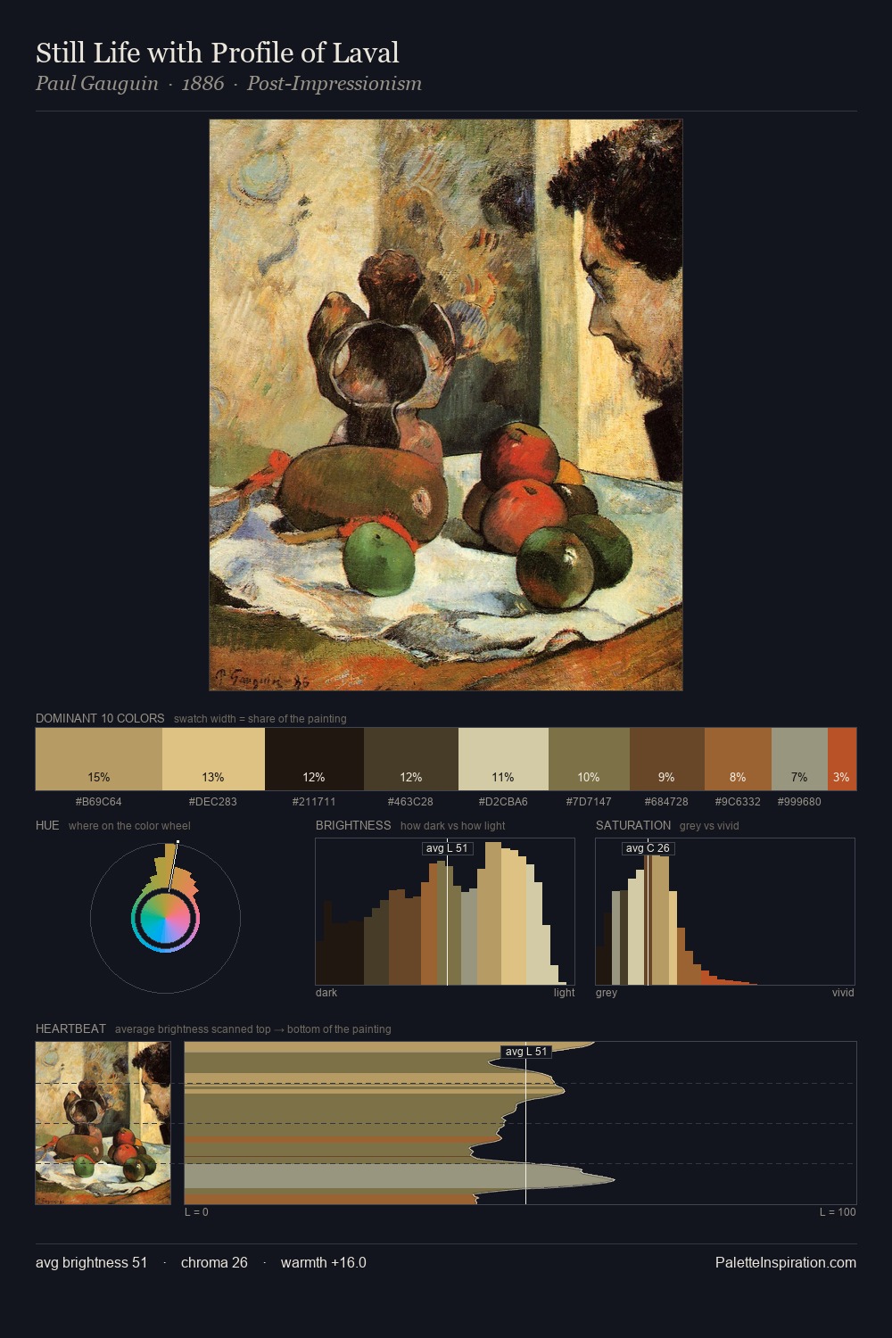
John Pettie Palette 5

Palette Analysis
Mid-key values give John Pettie its characteristic quietness - nothing blazes, nothing disappears. The palette achieves thermal balance - reds and blues, ochres and greens, each holding the other in check. A restrained, mid-chroma palette: every hue is present and legible, but nothing shouts. The saturated accent, #5C4C23, registers at 9.3% - sparse enough to feel like a deliberate surprise. A value spread of 58 units gives the palette both depth and air - shadows are genuinely dark, lights genuinely light. The combination of mid-to-high key, balanced temperature, and elevated chroma is characteristic of Impressionist observation: light broken into its component hues. This is palette 5 of John Pettie's sequence - a single chapter in a chromatic story told across many works.
Example use cases
- music labels
- luxury hospitality
- editorial photography
- leather goods
- premium streaming
I Love This!
Copy, export, or download for your project