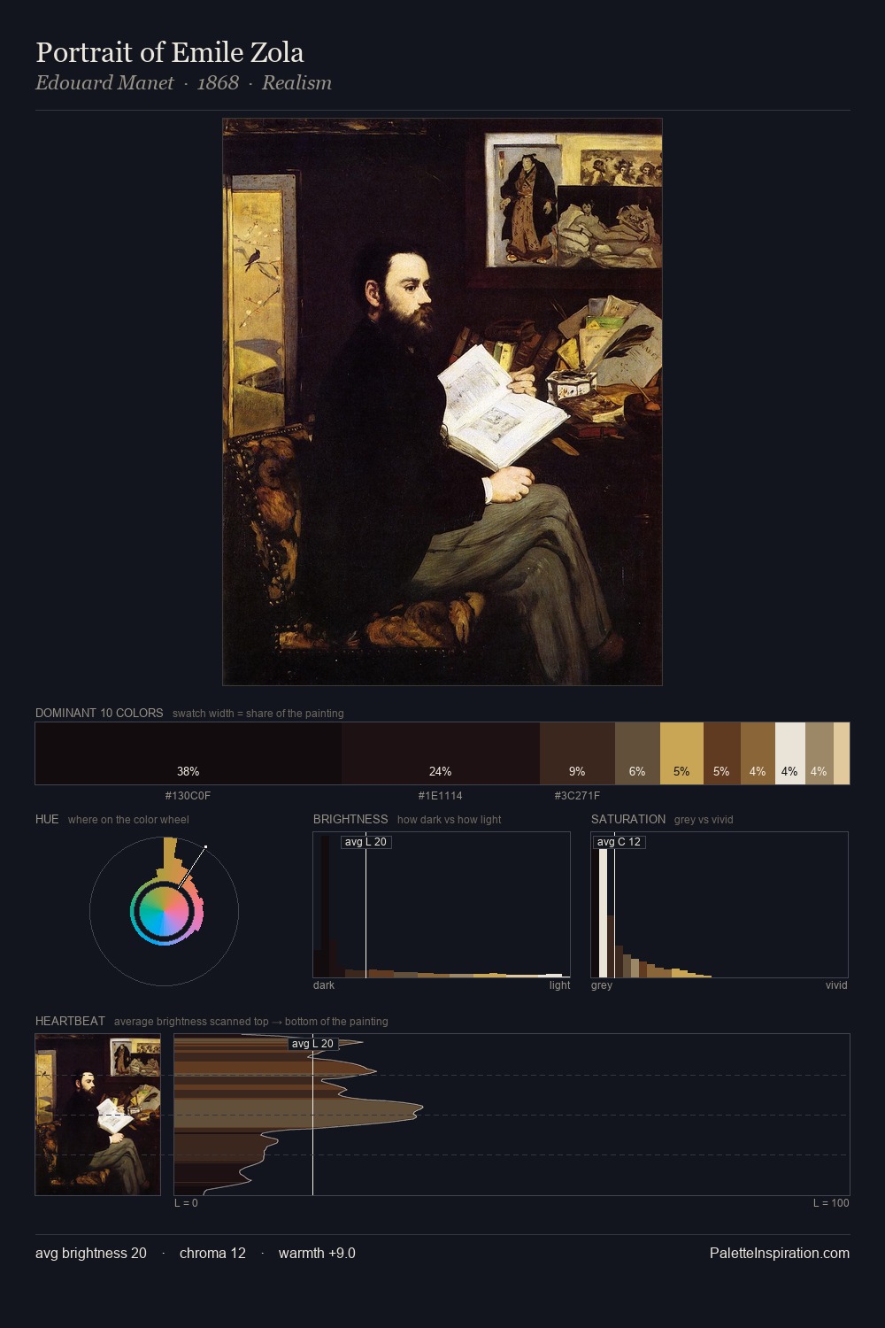
Johann Heinrich Roos Palette 2

Palette Analysis
Johann Heinrich Roos distributes its values across the middle register, creating harmony without high contrast. Temperature is balanced: the palette pits warm earth against cool sky without declaring a winner. Chroma hovers near zero; colour declares itself through subtle shifts in hue rather than outright saturation. 27.9% of the palette belongs to #FFFFFE, a concentration that makes it the unmistakable visual centre. At 4.0%, #895426 carries the palette's sharpest chromatic charge: an accent that earns its place precisely because it is withheld. 83 units of value range underpin the palette's structural clarity: the eye always knows where light falls. In the context of Johann Heinrich Roos's full range of palettes, group 2 represents one movement in an ongoing chromatic dialogue.
Example use cases
- publishing
- corporate identity
- consumer apps
- hospitality
- design agencies
I Love This!
Copy, export, or download for your project