Johann Baptist Clarot Palette 1

Palette Analysis
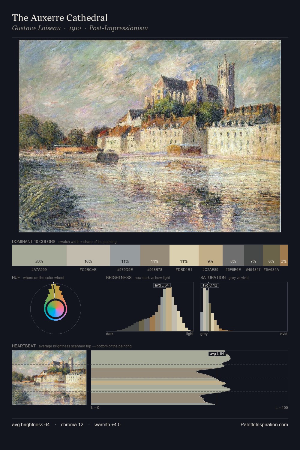
Values in Johann Baptist Clarot tilt decisively toward white, giving the palette its luminous character. Cool tones set the register here - the blues and greens easily outweigh any warm accents. All colours lean toward grey, building depth through value rather than colour punch. 28.9% of the palette belongs to #D8C5A2, a concentration that makes it the unmistakable visual centre. The most saturated colour, #AF9C70, is reserved to 5.1% of the surface, where it acts as a focal punctuation. At 49 units across the value scale, the palette keeps contrast readable without letting it dominate. High luminosity and cool temperature suggest the plein-air condition: unfiltered daylight and open sky. In the context of Johann Baptist Clarot's full range of palettes, group 1 represents one movement in an ongoing chromatic dialogue.
Example use cases
- ceramics & pottery
- boutique hospitality
- menswear
- heritage food brands
- craft & artisan brands
I Love This!
Copy, export, or download for your project