Jan Sluyters Palette 3
Pale Ecru
Pale High-key and low-chroma - delicate, bleached, washed with light.
Ecru Unbleached linen - warm mid-neutral, slightly grayed, raw and natural.

Palette Analysis
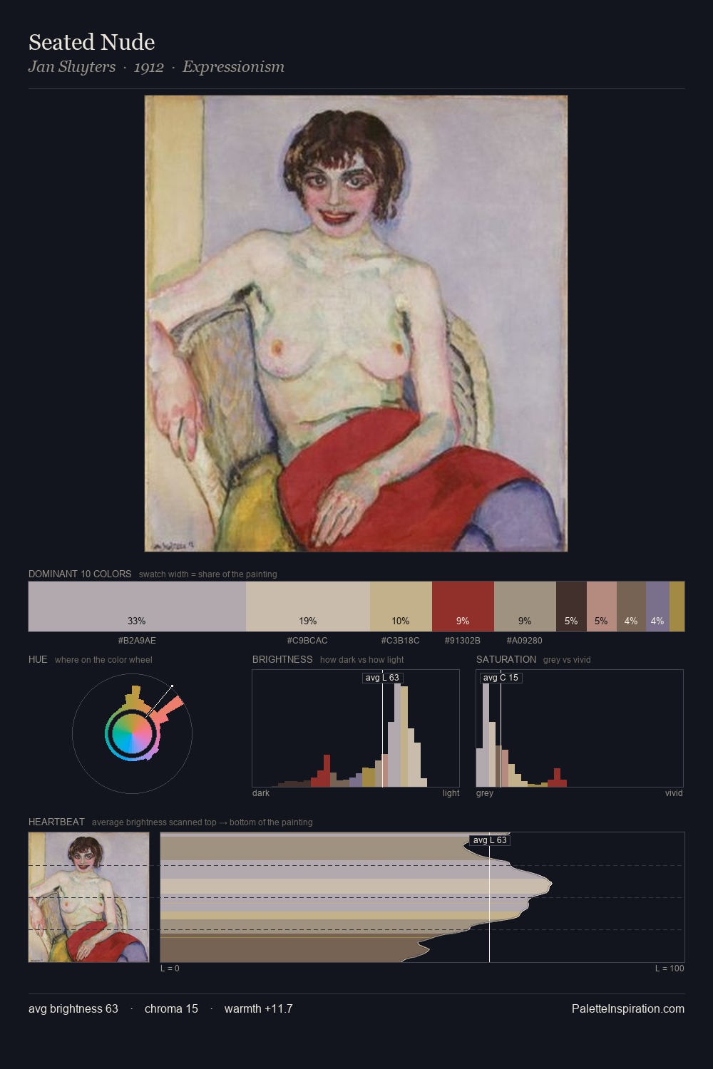
Light floods Jan Sluyters; the palette keeps values pale and airy across its range. Warm and cool are kept in productive tension, creating the kind of chromatic harmony that sustains the eye. All colours lean toward grey, building depth through value rather than colour punch. At 4.0%, #A18C48 carries the palette's sharpest chromatic charge: an accent that earns its place precisely because it is withheld. The value range of 47 units sits in the comfortable middle: enough depth, enough light, neither extreme. Palette 3 sits within the larger chromatic argument that Jan Sluyters's complete body of work advances.
Example use cases
- exhibition design
- foundation branding
- estate management
- art education
- museums & galleries
I Love This!
Use This Palette
Copy, export, or download for your project
Copy, export, or download for your project
Copy:
Download:
Share: