Jan Arends Palette 1

Palette Analysis
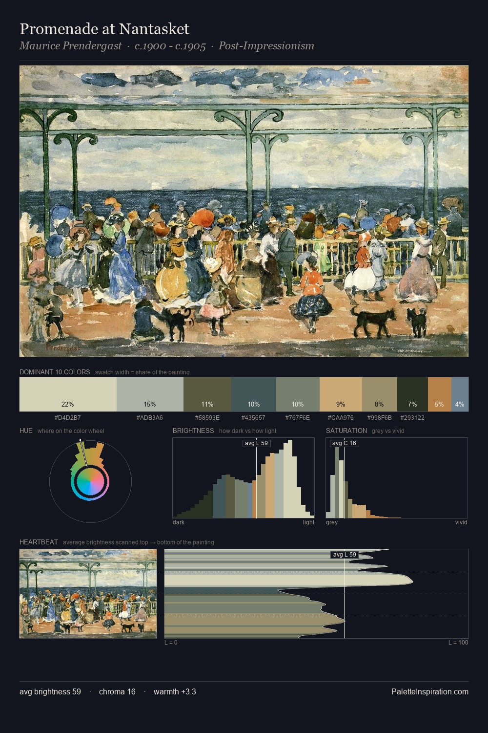
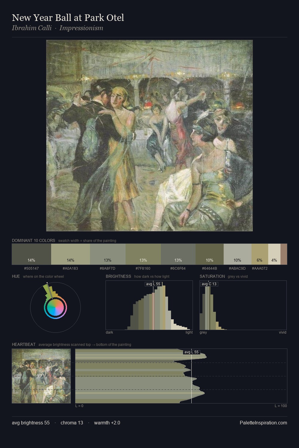
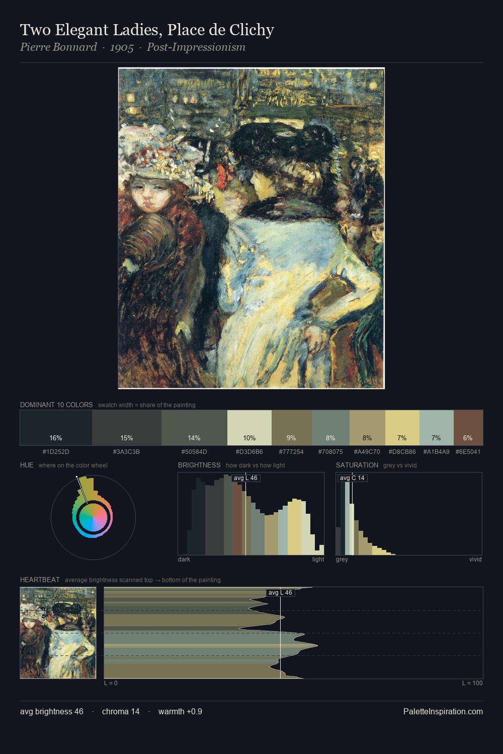
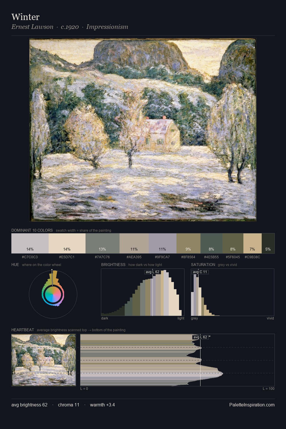
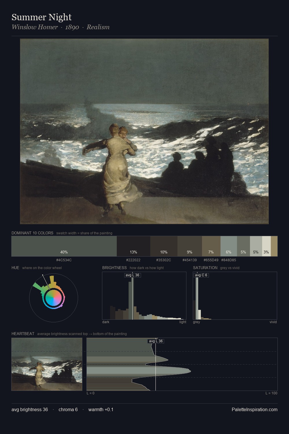
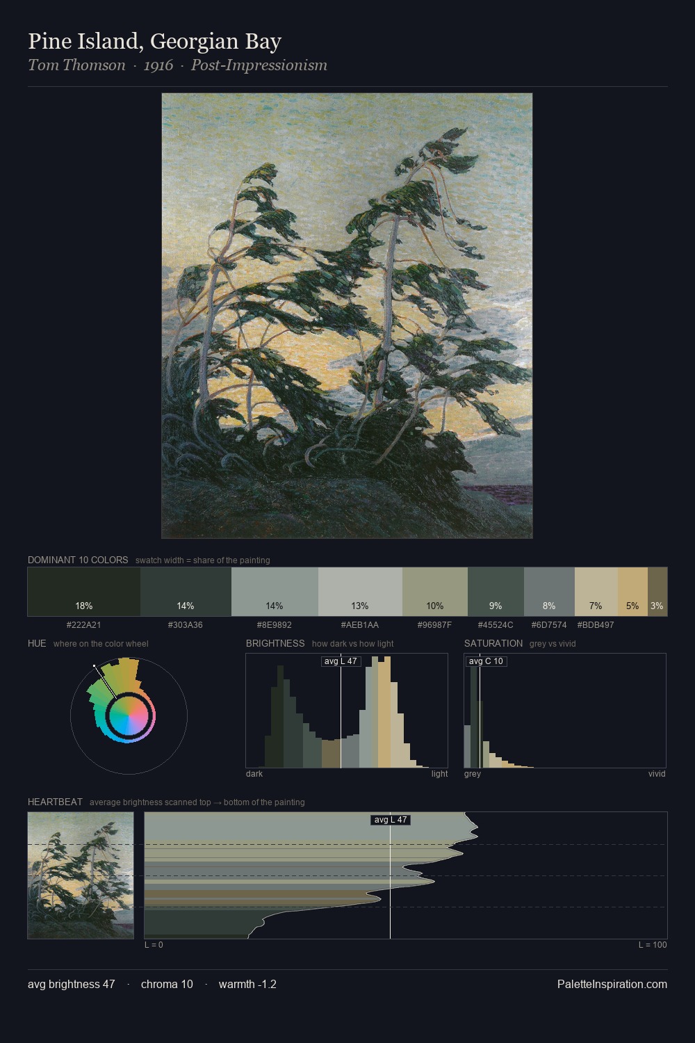
Jan Arends distributes its values across the middle register, creating harmony without high contrast. Cool hues prevail: blues, greens, and greys anchor the palette's emotional temperature. The absence of saturated colour is itself an expressive choice: this is a palette of restraint and atmosphere. At 8.0%, #807752 carries the palette's sharpest chromatic charge: an accent that earns its place precisely because it is withheld. Spanning 44 units on the value axis, the palette achieves the balance between tonal flatness and fragmentation. The mid-to-high key, cool bias, and moderate chroma point to outdoor observation - sky and diffused daylight as the dominant light source. Jan Arends's palette 1 carries its own internal logic while remaining in conversation with the artist's broader colour intelligence.
Example use cases
- museums & galleries
- academic publishing
- heritage brands
- auction houses
- exhibition design
I Love This!
Copy, export, or download for your project