Jacopo Pontormo Palette 10

Palette Analysis
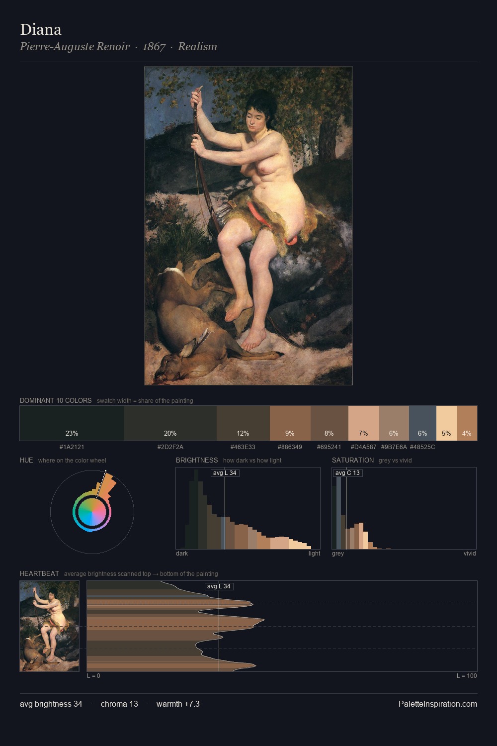
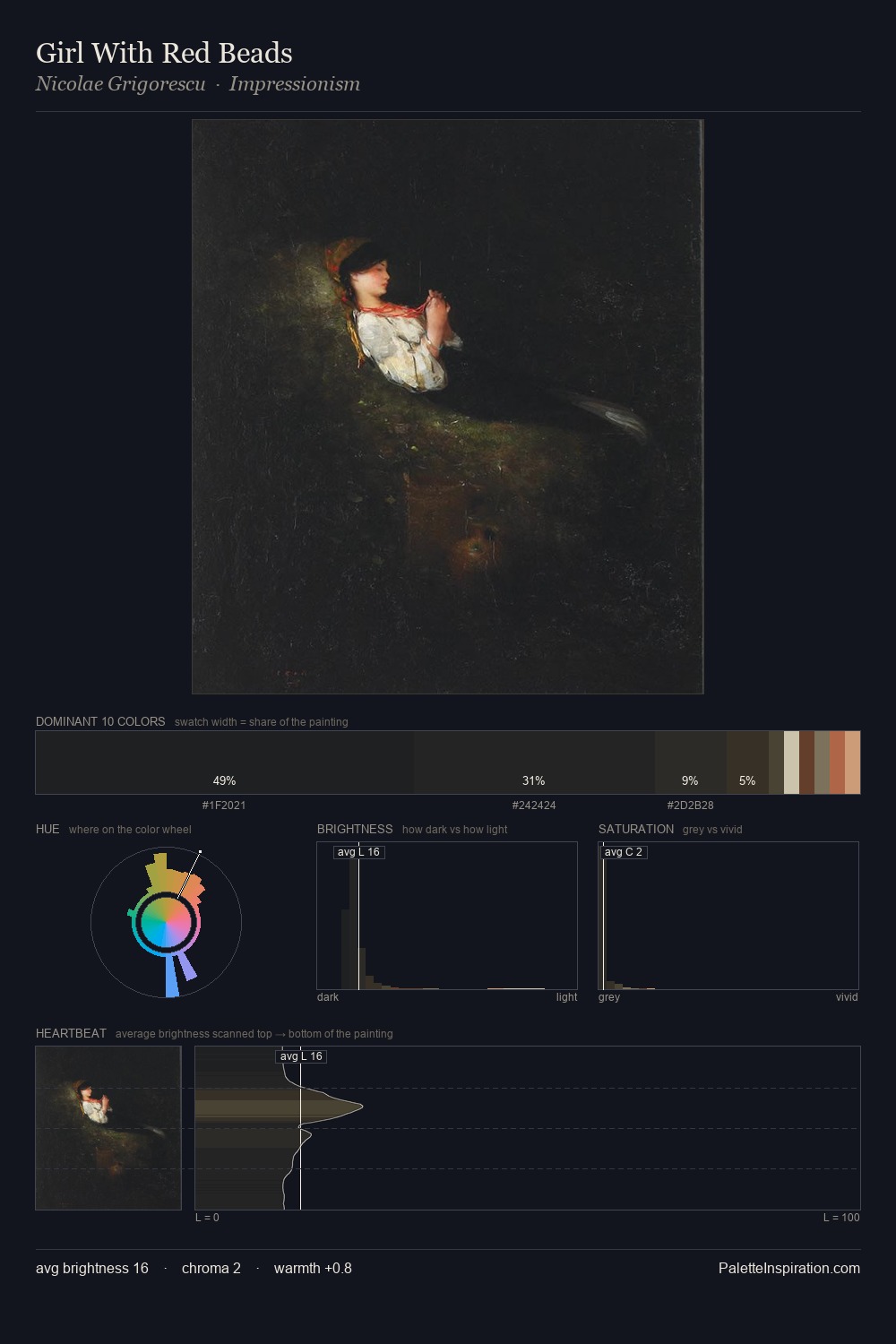
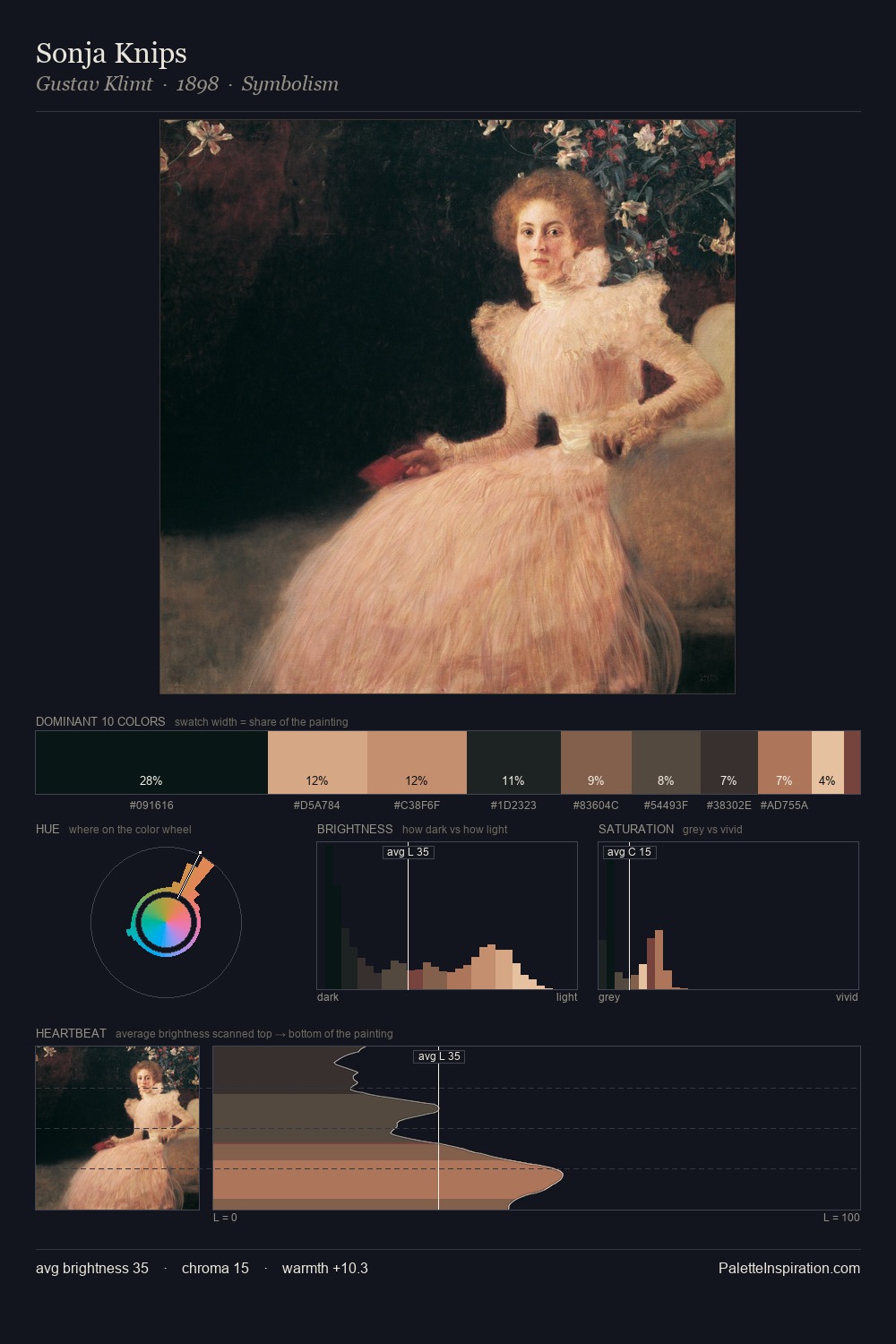
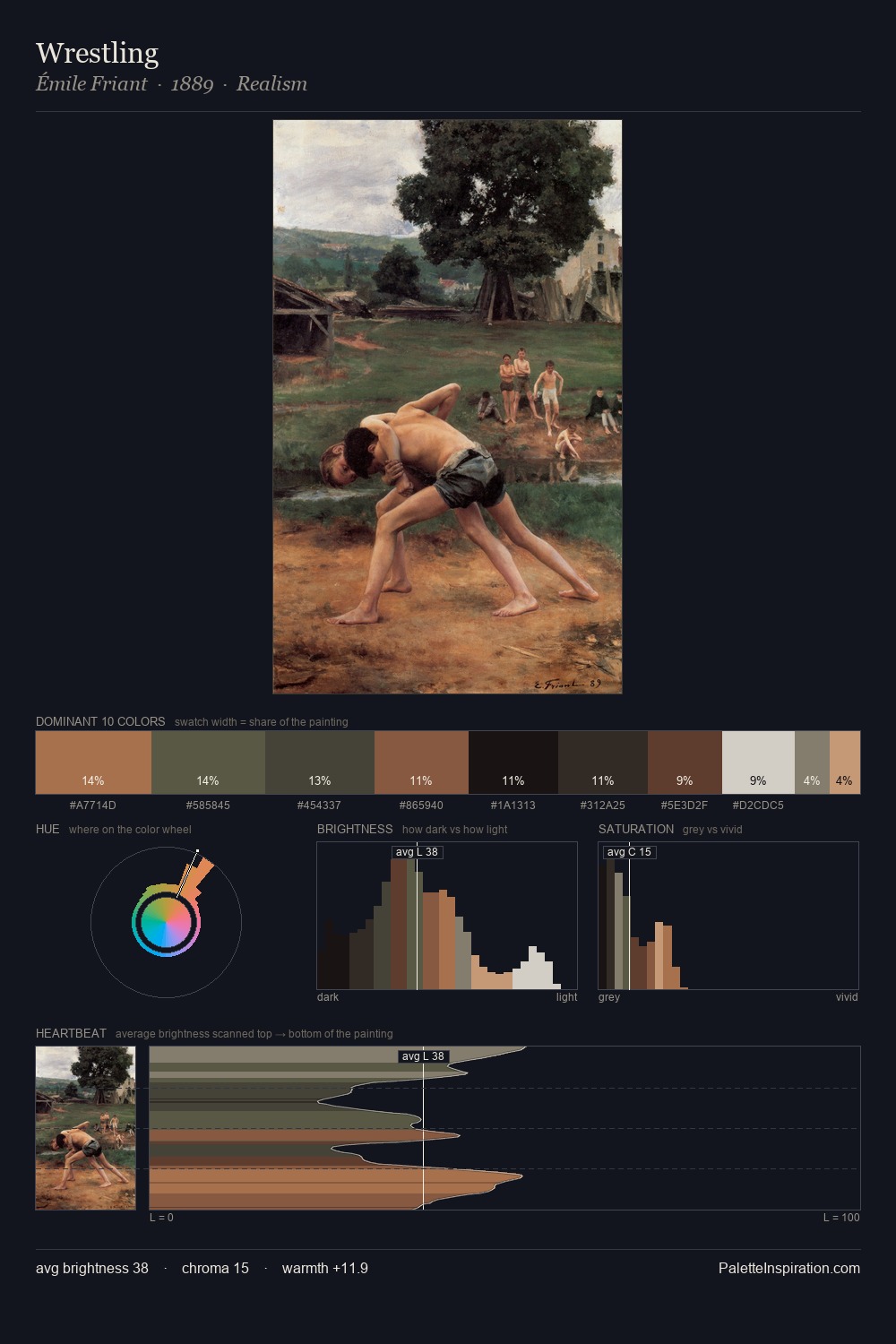
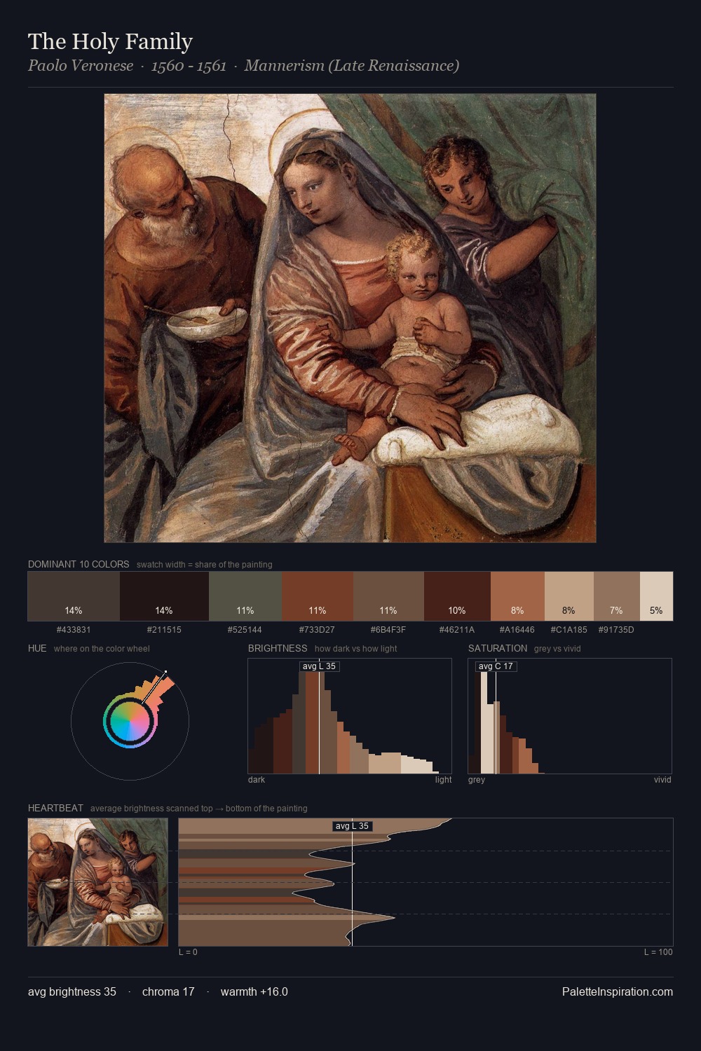
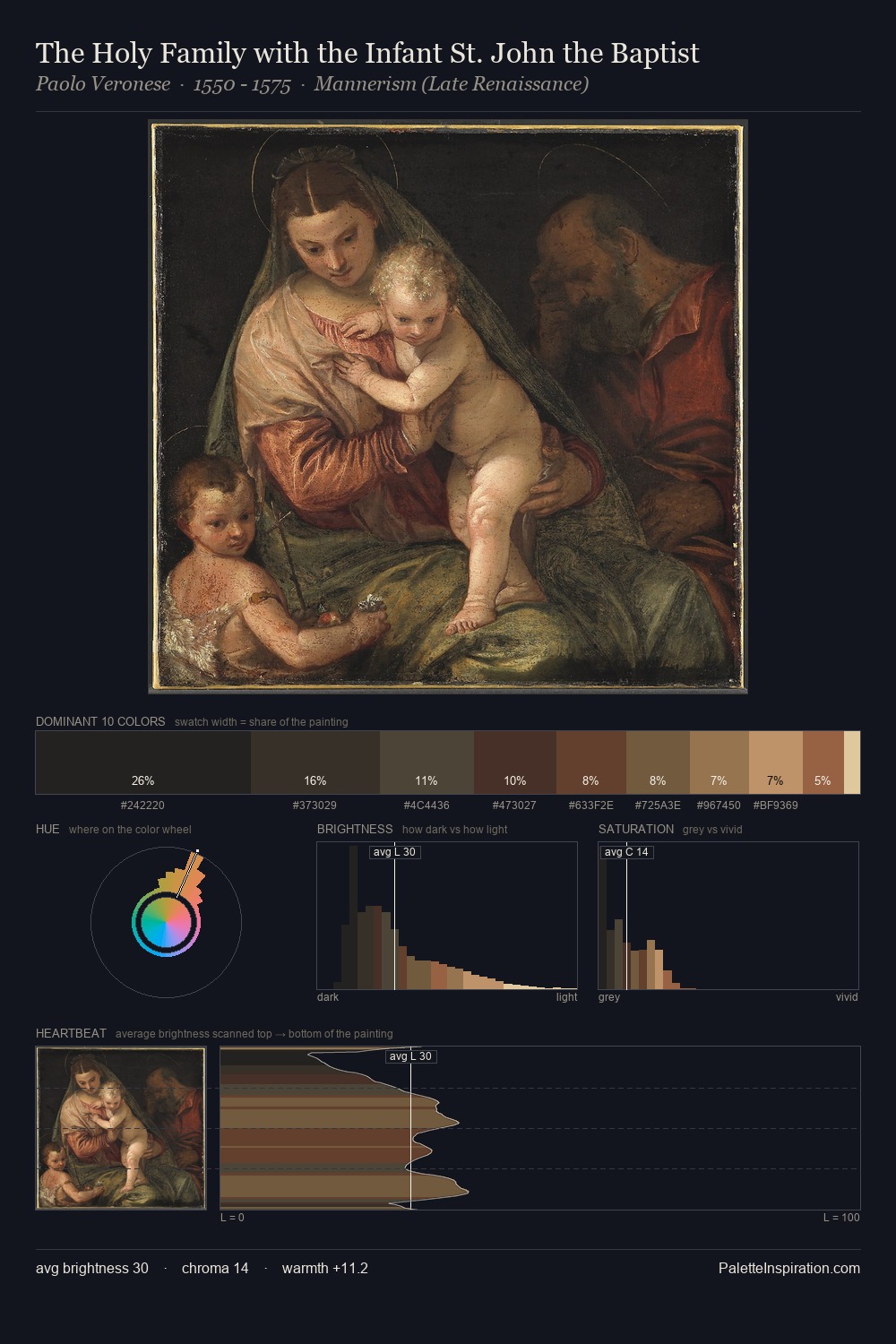
Jacopo Pontormo occupies the comfortable middle of the value scale, avoiding both extremes to hold the eye in a sustained middle grey. Temperature reads distinctly warm: the reds and earth tones from Jacopo Pontormo carry the compositional weight. The absence of saturated colour is itself an expressive choice: this is a palette of restraint and atmosphere. #262323 at 27.1% of the palette: an overwhelming presence that pulls all other colours into its gravitational field. The most saturated colour, #AF6F4A, is reserved to 2.4% of the surface, where it acts as a focal punctuation. Value range is moderate at 45 units - enough contrast for legibility, not so much as to fragment the tonal unity. In the context of Jacopo Pontormo's full range of palettes, group 10 represents one movement in an ongoing chromatic dialogue.
Example use cases
- theater design
- jewelry brands
- tobacco-adjacent retail
- event branding
- film & entertainment
I Love This!
Copy, export, or download for your project