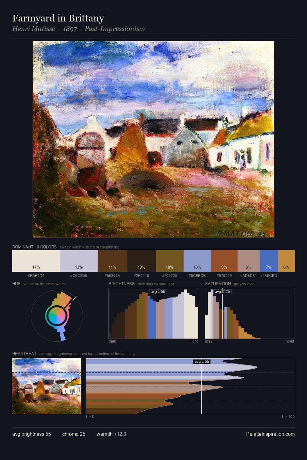
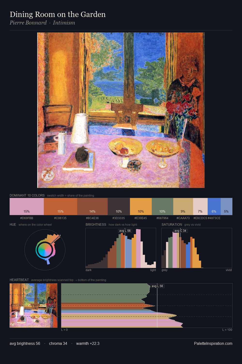
Jørgen Sonne Palette 4

Palette Analysis
Jørgen Sonne keeps values measured and balanced, a hallmark of tonal restraint. Jørgen Sonne builds on cool foundations: the palette favours the blue-cyan-green arc. Mid-range chroma keeps the palette grounded - colourful but not strident. #1A1620 at 30.4% of the palette: an overwhelming presence that pulls all other colours into its gravitational field. #8B4D25 is not a small accent - at 1.8% it qualifies as a major presence and gives the palette its chromatic identity. The value range of 49 units sits in the comfortable middle: enough depth, enough light, neither extreme. The palette has the character of outdoor light: cool, mid-bright, with colour rendered faithfully rather than expressively. Jørgen Sonne's palette 4 carries its own internal logic while remaining in conversation with the artist's broader colour intelligence.
Example use cases
- publishing
- corporate identity
- consumer apps
- hospitality
- design agencies
I Love This!
Copy, export, or download for your project