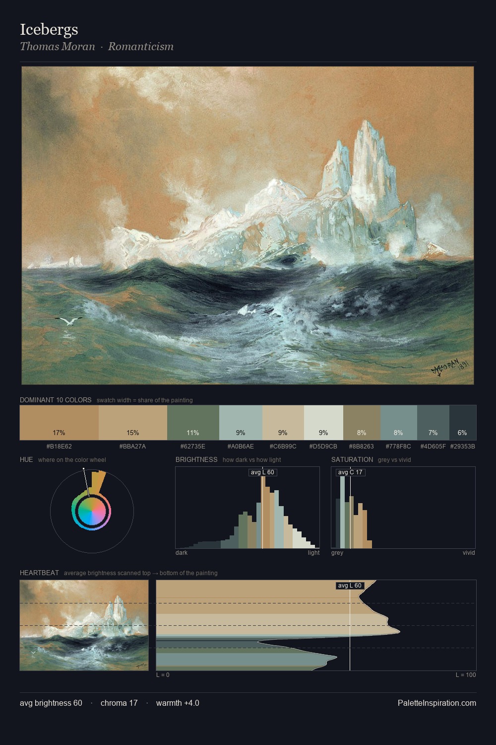
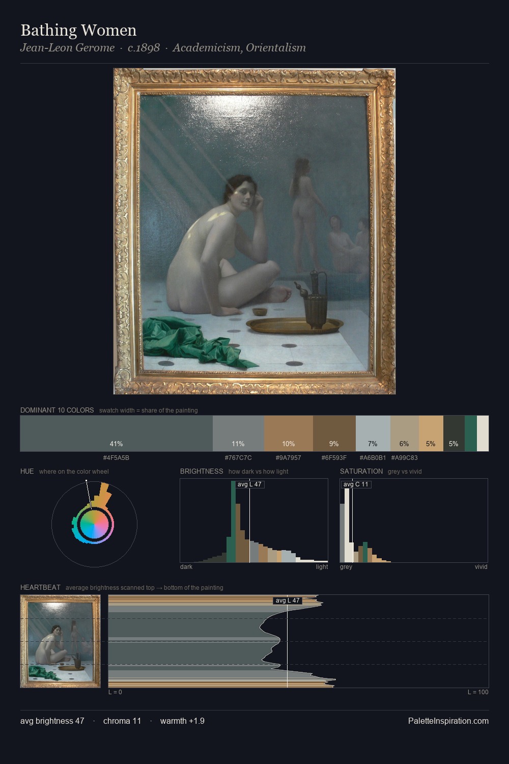
Ivan Bilibin Palette 6
Soft Ivory
Soft Low-contrast, gentle chroma - mid-key values and low saturation, approachable and calm.
Ivory Warm creamy white - the color of natural ivory, warmer than pure white.

Palette Analysis
Light floods Ivan Bilibin; the palette keeps values pale and airy across its range. Cool tones set the register here - the blues and greens easily outweigh any warm accents. Every colour is desaturated; the palette proceeds through near-neutrals and gently-coloured greys. The saturated accent, #AF7D64, registers at 2.9% - sparse enough to feel like a deliberate surprise. Spanning 44 units on the value axis, the palette achieves the balance between tonal flatness and fragmentation. The palette has the character of outdoor light: cool, mid-bright, with colour rendered faithfully rather than expressively. This is palette 6 of Ivan Bilibin's sequence - a single chapter in a chromatic story told across many works.
Example use cases
- exhibition design
- foundation branding
- estate management
- art education
- museums & galleries
I Love This!
Use This Palette
Copy, export, or download for your project
Copy, export, or download for your project
Copy:
Download:
Share: