Interior Palette 26
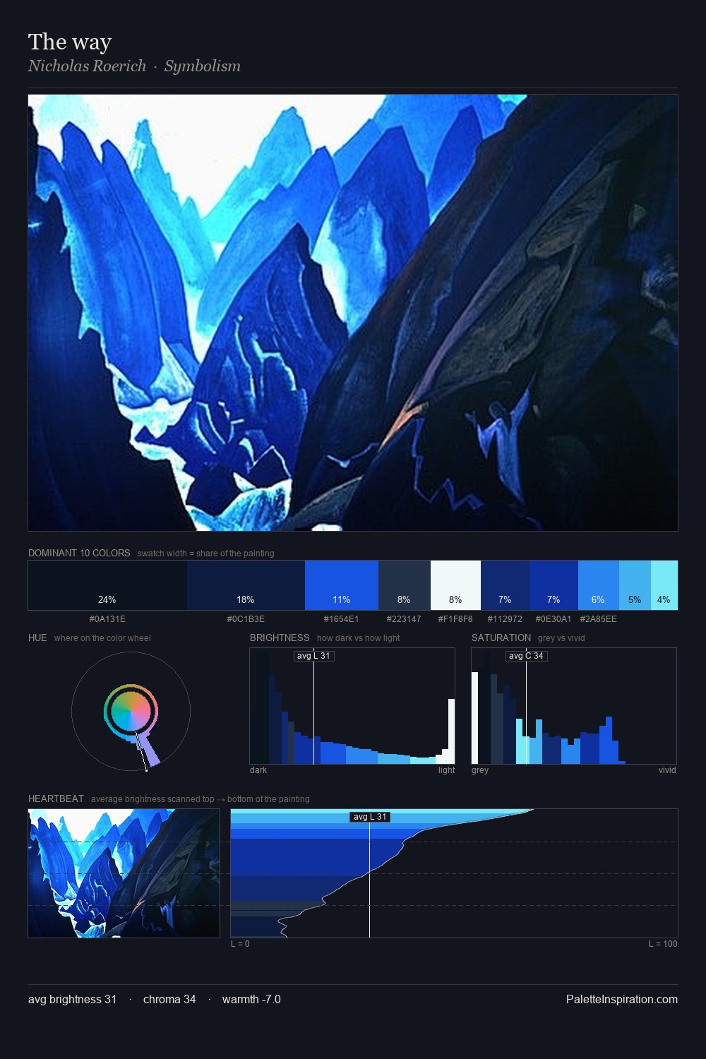
Somber Grotto
Somber Subdued and serious - low-key, low-chroma, emotionally weighted toward gravity.
Grotto Deep sea-cave blue-green - the color of water in a coastal grotto.

Palette Analysis
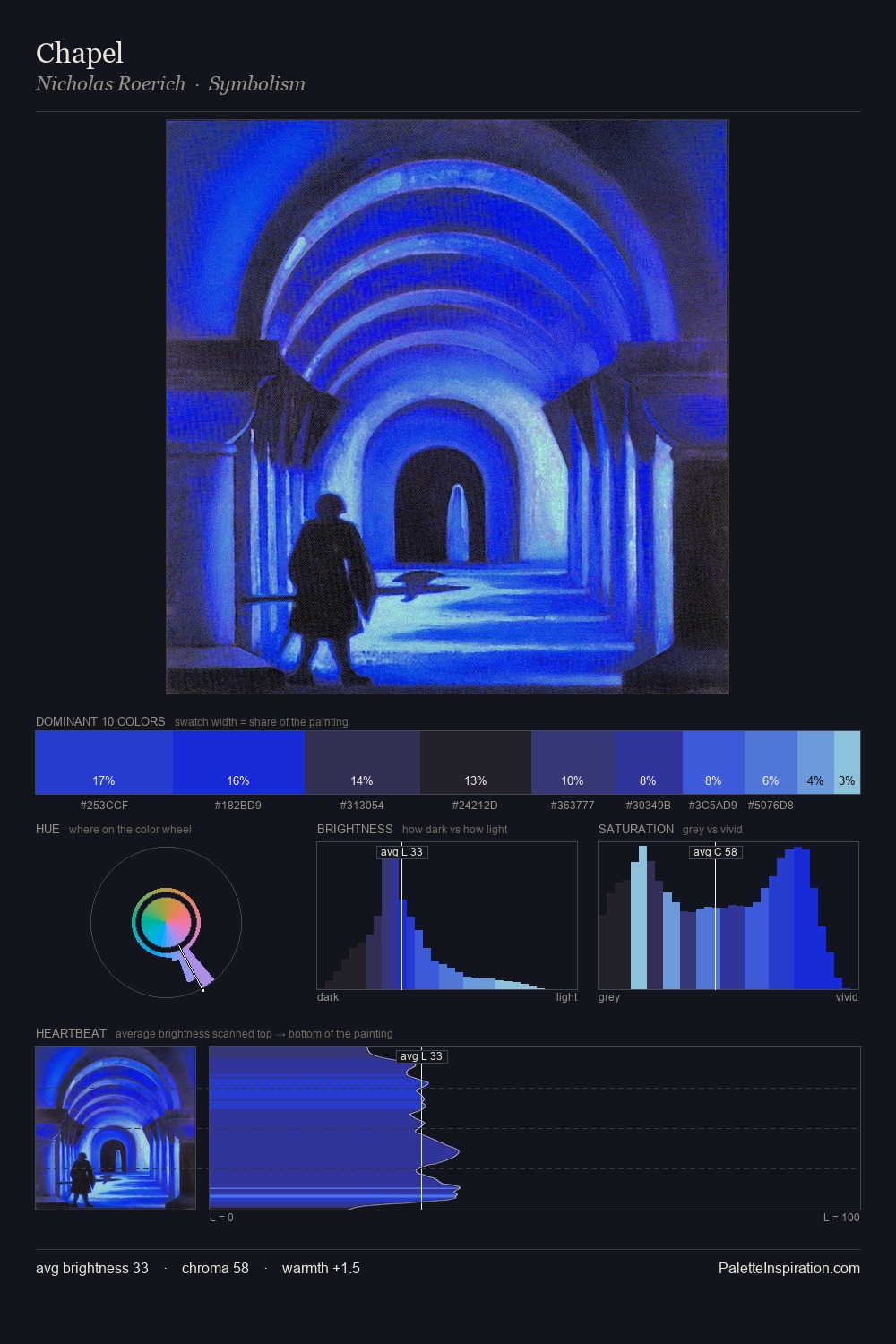
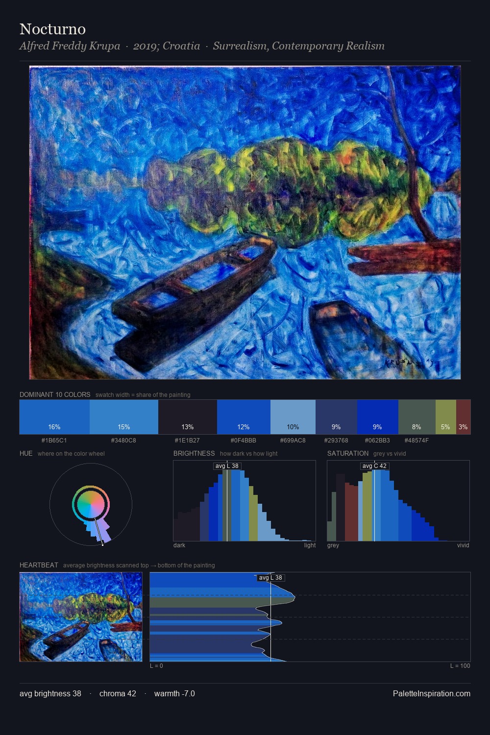
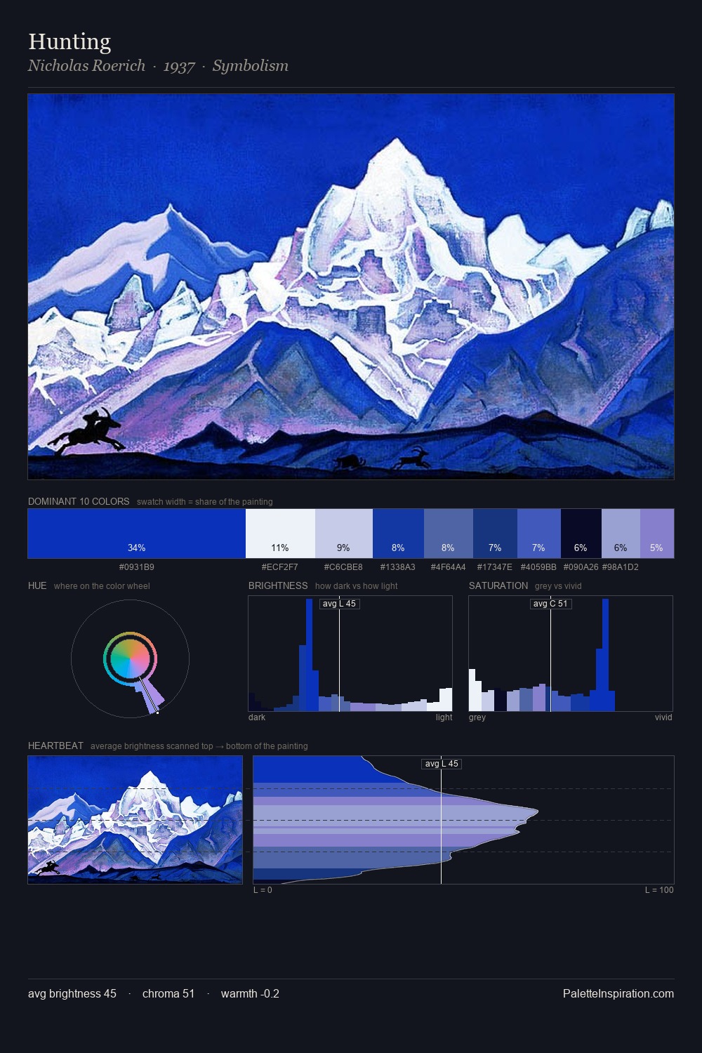
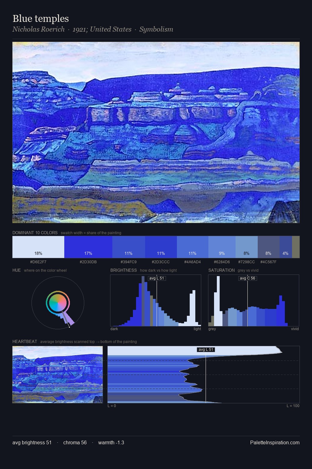
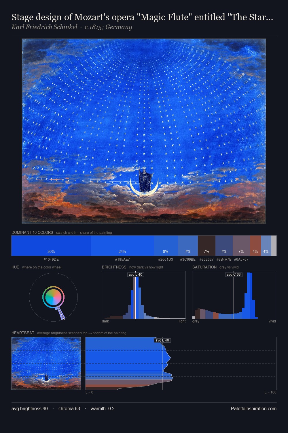
interior occupies the comfortable middle of the value scale, avoiding both extremes to hold the eye in a sustained middle grey. A distinctly cool atmosphere runs through this palette: sky, water, and mist given colour form. The chromatic intensity here is exceptional - colours compete with each other at near-peak saturation. The most saturated colour, #1B2CD9, covers 20.2% of the surface: too much to call an accent, too strong to ignore. Value range is moderate at 53 units - enough contrast for legibility, not so much as to fragment the tonal unity. High luminosity and cool temperature suggest the plein-air condition: unfiltered daylight and open sky.
Example use cases
- design agencies
- product brands
- e-commerce
- editorial sites
- publishing
I Love This!
Use This Palette
Copy, export, or download for your project
Copy, export, or download for your project
Copy:
Download:
Share: