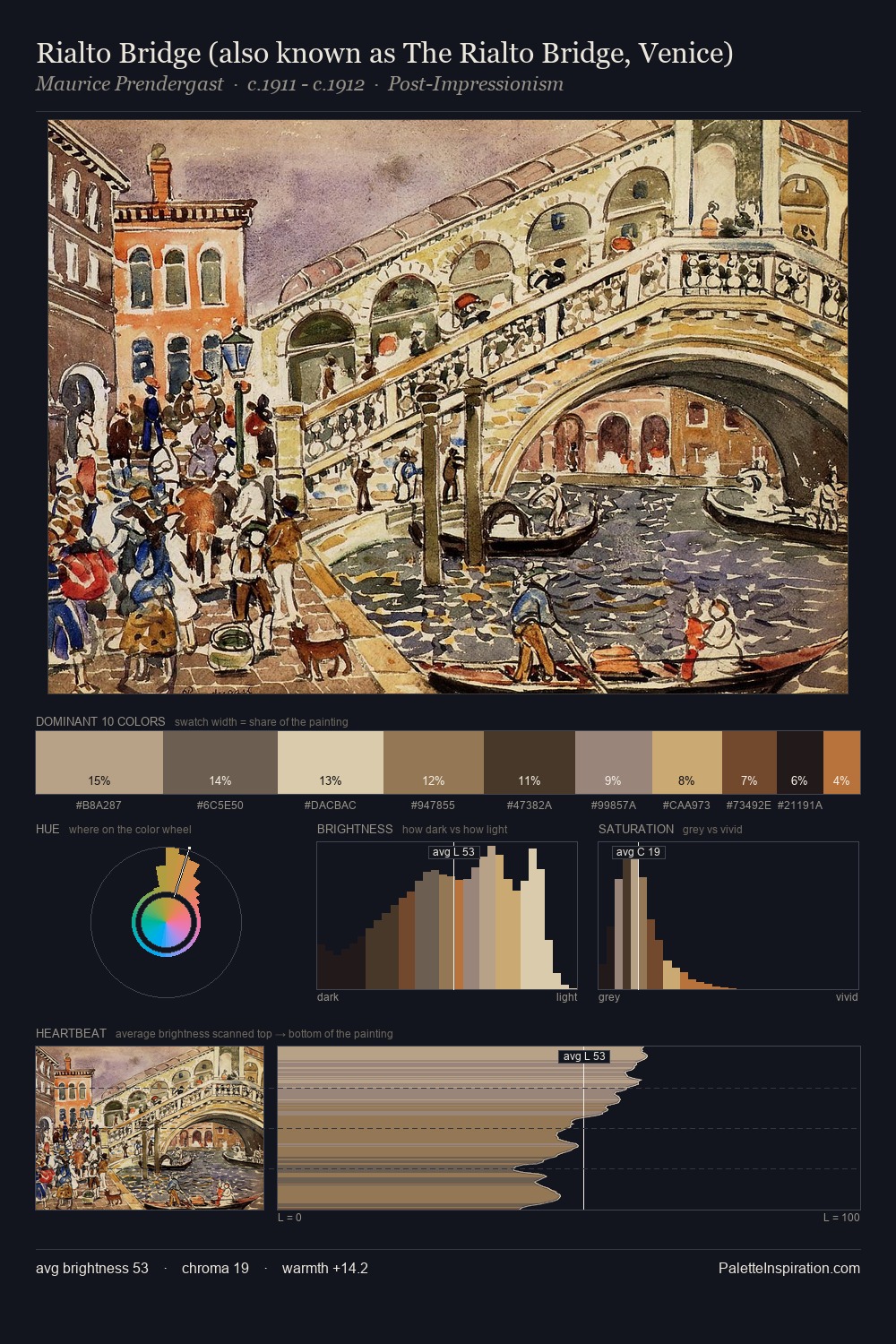
Illustration Palette 9
Veiled Tawny
Veiled Partially obscured light - mid-dark with a hazy, scrim-filtered quality.
Tawny Warm orange-brown - a traditional term for the color of tanned leather or lion fur.

Palette Analysis
illustration distributes its values across the middle register, creating harmony without high contrast. The palette achieves thermal balance - reds and blues, ochres and greens, each holding the other in check. Chroma hovers near zero; colour declares itself through subtle shifts in hue rather than outright saturation. The most saturated colour, #B7A46D, is reserved to 9.7% of the surface, where it acts as a focal punctuation. Value range is moderate at 49 units - enough contrast for legibility, not so much as to fragment the tonal unity.
Example use cases
- ceramics & pottery
- boutique hospitality
- menswear
- heritage food brands
- craft & artisan brands
I Love This!
Use This Palette
Copy, export, or download for your project
Copy, export, or download for your project
Copy:
Download:
Share: