Hippolyte Petitjean Palette 2

Palette Analysis
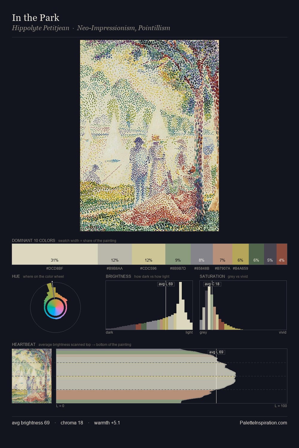
Values in Hippolyte Petitjean tilt decisively toward white, giving the palette its luminous character. Cool hues prevail: blues, greens, and greys anchor the palette's emotional temperature. Muted throughout, the palette achieves its effects through value and temperature rather than chromatic force. #DBD7BF claims 35.0% of the surface, functioning as the work's tonal foundation. The most saturated colour, #8F4B41, is reserved to 3.1% of the surface, where it acts as a focal punctuation. Spanning 41 units on the value axis, the palette achieves the balance between tonal flatness and fragmentation. High luminosity and cool temperature suggest the plein-air condition: unfiltered daylight and open sky. Hippolyte Petitjean's palette 2 carries its own internal logic while remaining in conversation with the artist's broader colour intelligence.
Example use cases
- publishing
- corporate identity
- consumer apps
- hospitality
- design agencies
I Love This!
Copy, export, or download for your project