Herman Johannes van der Weele Palette 2

Palette Analysis
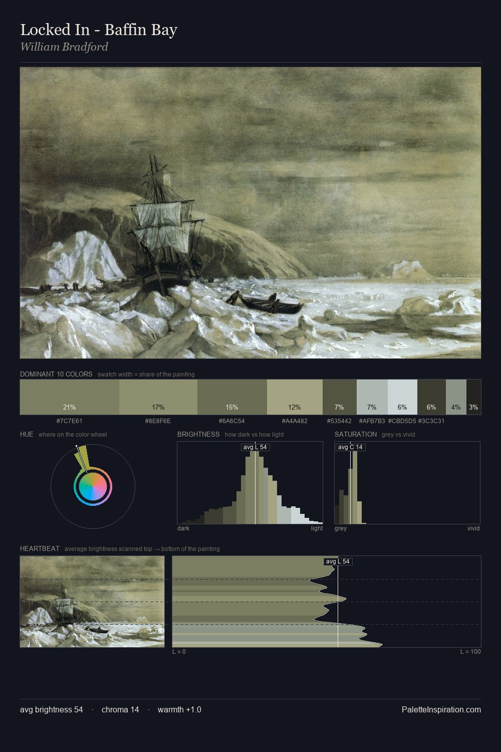
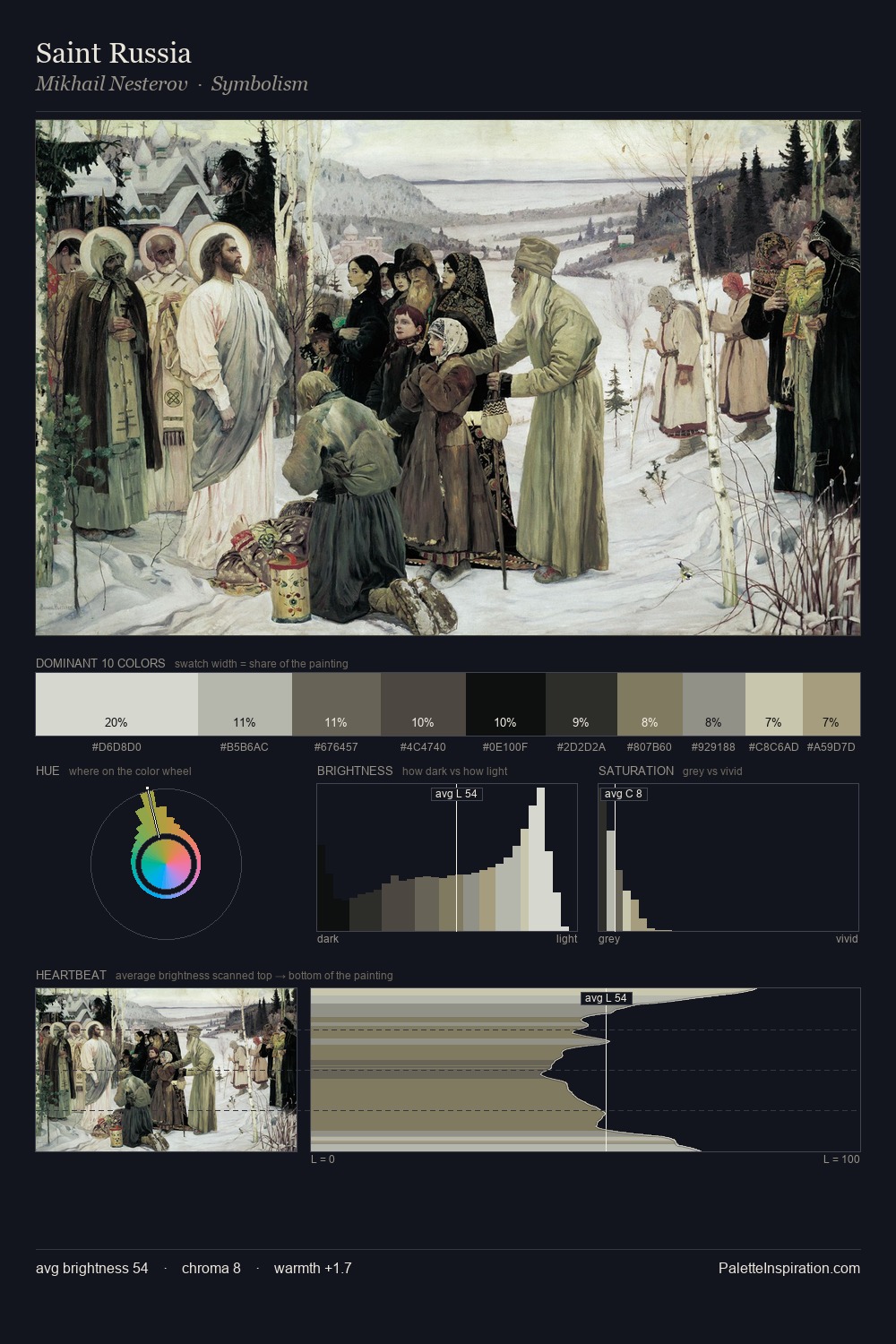
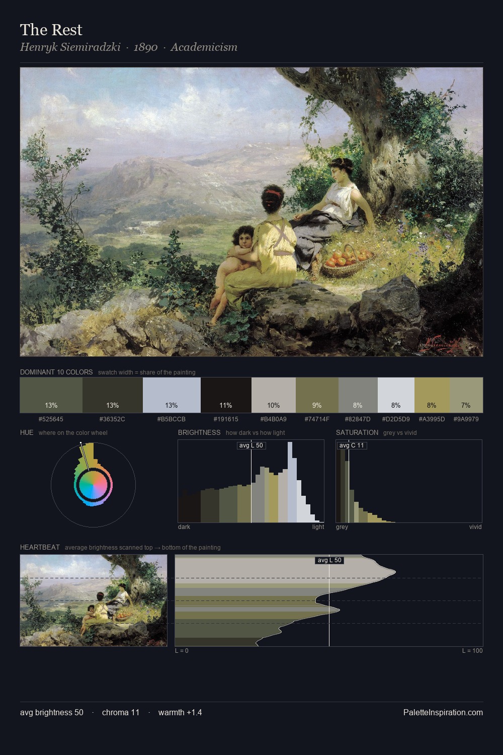
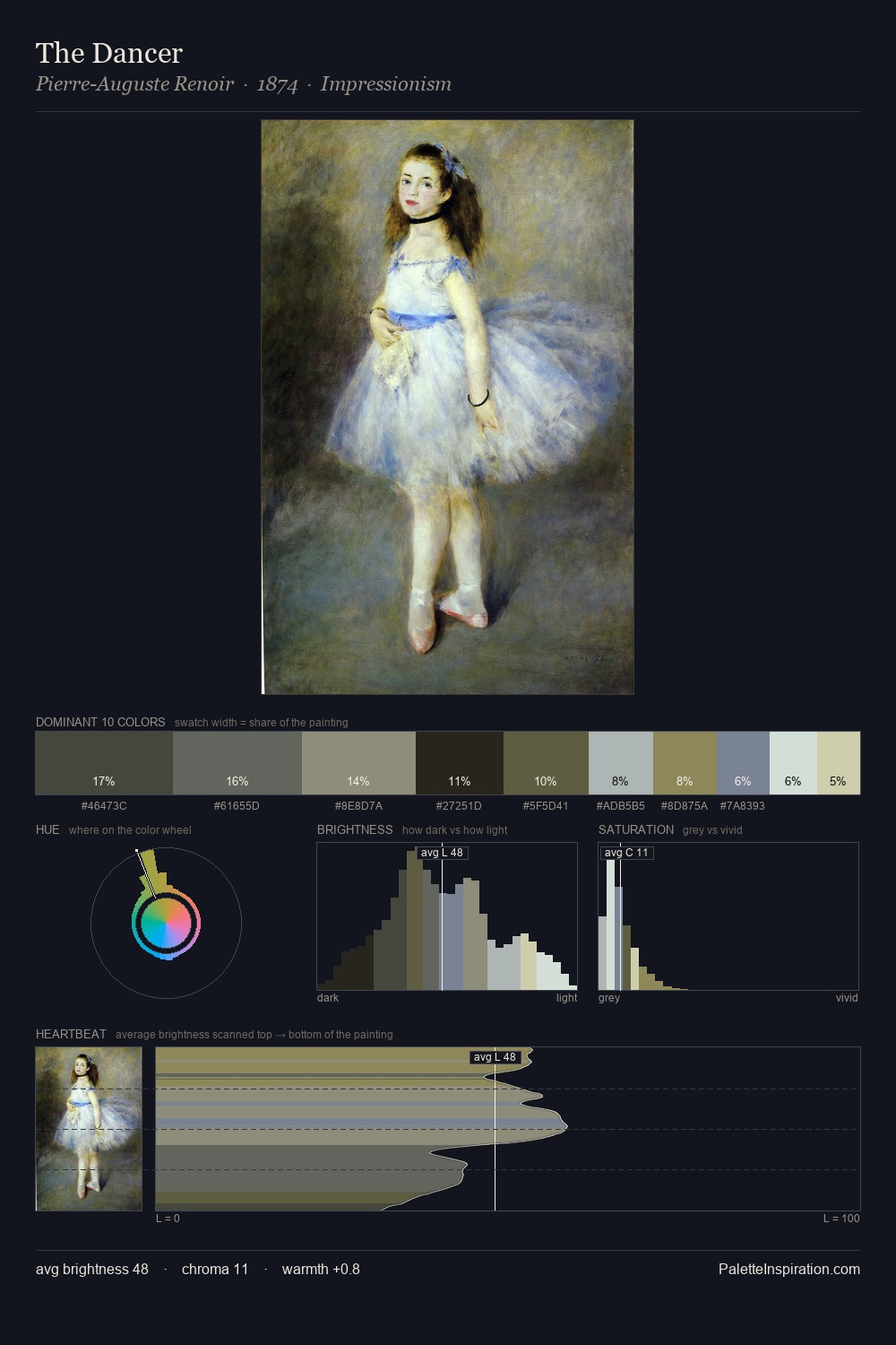
Light floods Herman Johannes van der Weele; the palette keeps values pale and airy across its range. Temperature is cool-dominant, with blue and green families claiming the largest areas. Chroma is kept low across all colours, producing the soft, enveloping quality that characterises tonal painting. At 40.1%, #D0DDE0 functions less as a colour accent and more as a complete atmospheric environment. At 3.8%, #AA9F7C carries the palette's sharpest chromatic charge: an accent that earns its place precisely because it is withheld. The full value range is 59 units: broad enough to build convincing three-dimensional form. The mid-to-high key, cool bias, and moderate chroma point to outdoor observation - sky and diffused daylight as the dominant light source. In the context of Herman Johannes van der Weele's full range of palettes, group 2 represents one movement in an ongoing chromatic dialogue.
Example use cases
- exhibition design
- foundation branding
- estate management
- art education
- museums & galleries
I Love This!
Copy, export, or download for your project