Henryk Berlewi Palette 1

Palette Analysis
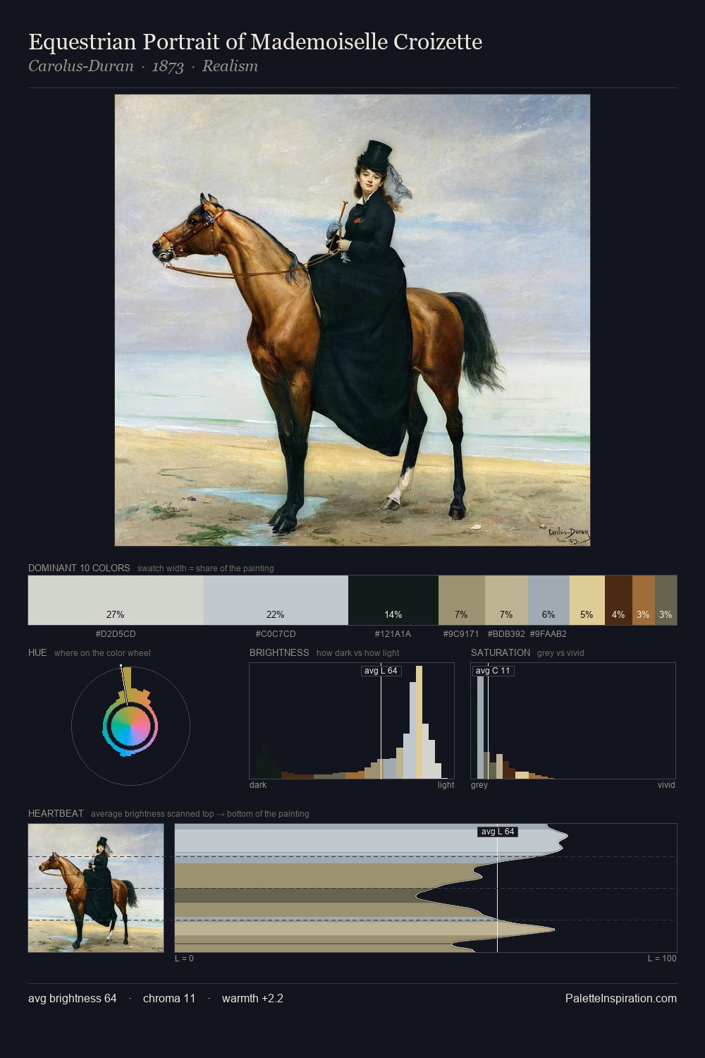
Henryk Berlewi is high-key - luminous, open, and weighted toward light. Temperature is cool-dominant, with blue and green families claiming the largest areas. Saturation is measured and controlled, giving the palette presence without visual aggression. 48.9% of the palette belongs to #E1CF94, a concentration that makes it the unmistakable visual centre. #A59872 functions as the palette's exclamation mark: highest chroma, lowest percentage (1.4%). The value range spans 65 units across the palette, providing the full gamut from deep shadow to near-white and ensuring clear tonal hierarchy. High luminosity and cool temperature suggest the plein-air condition: unfiltered daylight and open sky. Henryk Berlewi's palette 1 carries its own internal logic while remaining in conversation with the artist's broader colour intelligence.
Example use cases
- design agencies
- product brands
- e-commerce
- editorial sites
- publishing
I Love This!
Copy, export, or download for your project