Henri de Toulouse-Lautrec Palette 1

Palette Analysis
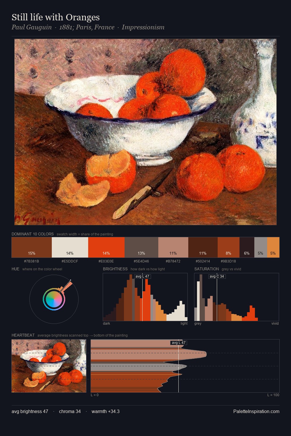
Henri de Toulouse-Lautrec is high in key: pale, luminous, and filled with optical air. Henri de Toulouse-Lautrec orchestrates warmth above all else - reds, ambers, and siennas take the lead. Muted throughout, the palette achieves its effects through value and temperature rather than chromatic force. The dominant colour, #F1F3F4, takes 27.0% of the total area, establishing the overall mood before any other hue is introduced. The most saturated colour, #CE906D, is reserved to 2.8% of the surface, where it acts as a focal punctuation. 76 units of value range underpin the palette's structural clarity: the eye always knows where light falls. This is palette 1 of Henri de Toulouse-Lautrec's sequence - a single chapter in a chromatic story told across many works.
Example use cases
- publishing
- corporate identity
- consumer apps
- hospitality
- design agencies
I Love This!
Copy, export, or download for your project