Heinrich Lefler Palette 3

Palette Analysis
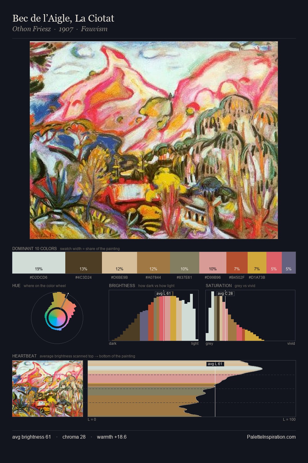
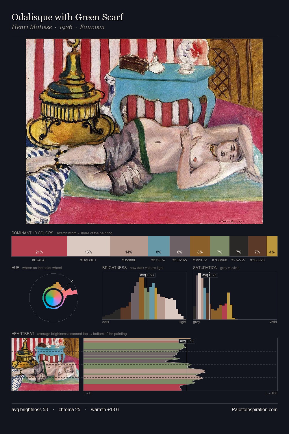
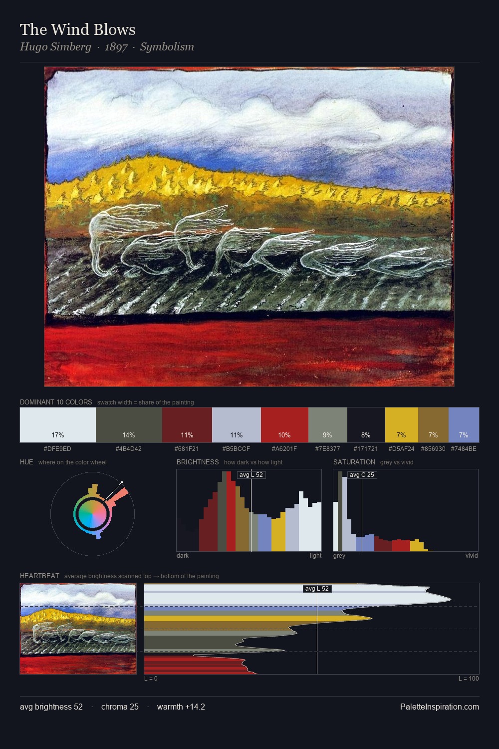
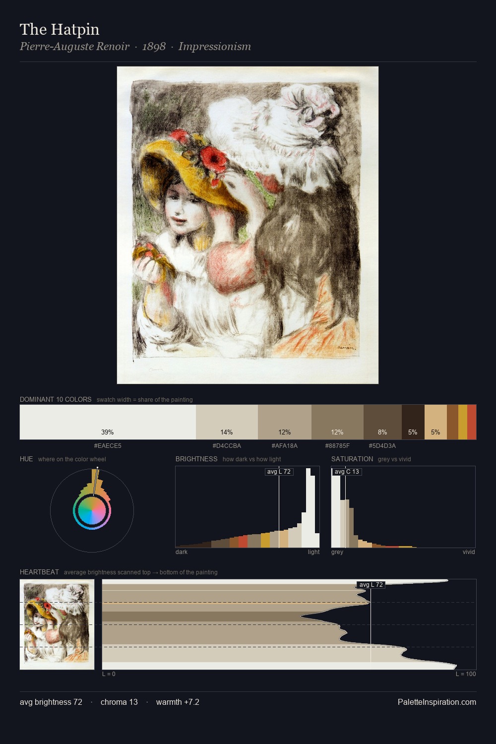
Values in Heinrich Lefler tilt decisively toward white, giving the palette its luminous character. Heinrich Lefler tilts toward cool - blues and silver-greys carry the structural weight. All colours lean toward grey, building depth through value rather than colour punch. 48.2% of the palette belongs to #FDFDFB, a concentration that makes it the unmistakable visual centre. At 1.0%, #DD4954 carries the palette's sharpest chromatic charge: an accent that earns its place precisely because it is withheld. From deepest dark to palest light, the palette traverses 70 units of the value scale - a span that creates natural depth. The palette has the character of outdoor light: cool, mid-bright, with colour rendered faithfully rather than expressively. Heinrich Lefler's palette 3 carries its own internal logic while remaining in conversation with the artist's broader colour intelligence.
Example use cases
- publishing
- corporate identity
- consumer apps
- hospitality
- design agencies
I Love This!
Copy, export, or download for your project