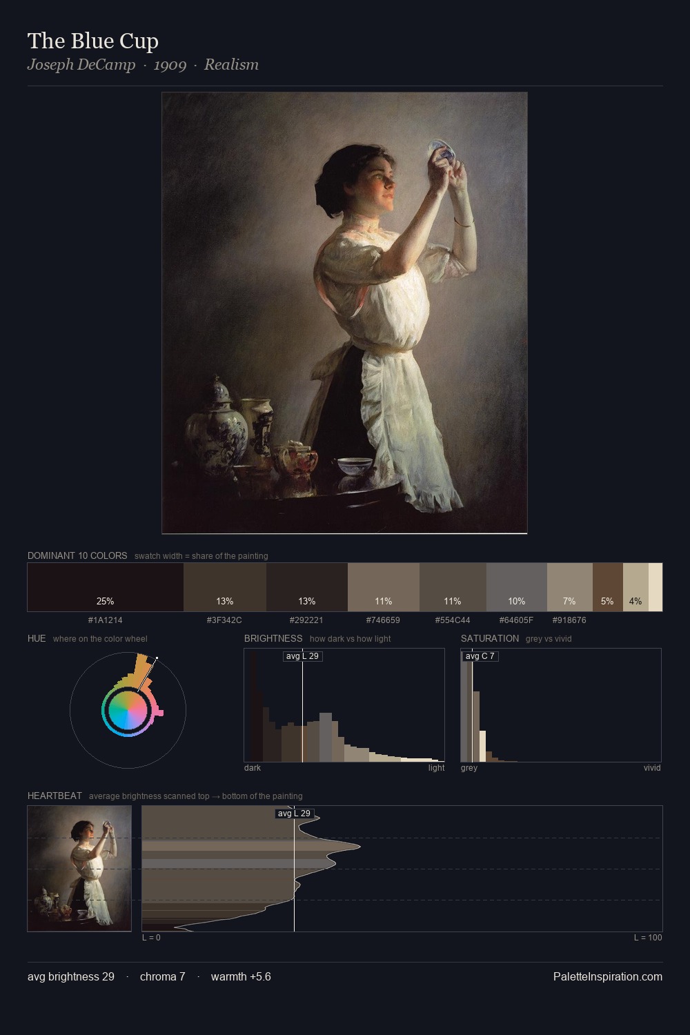
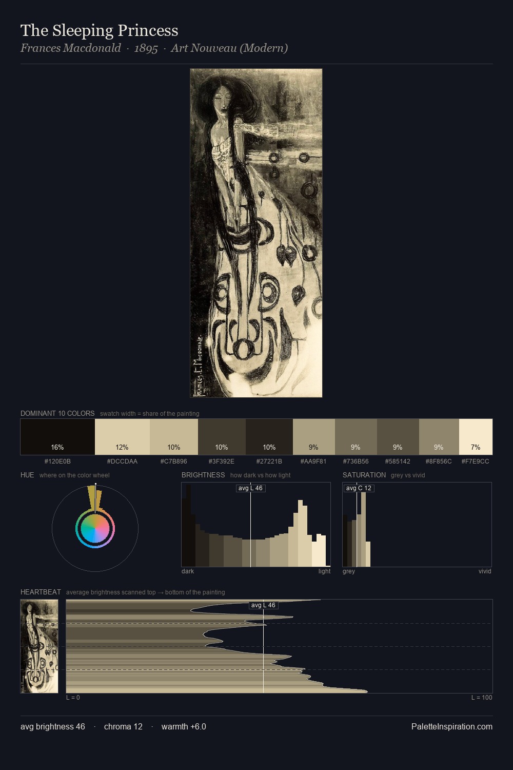
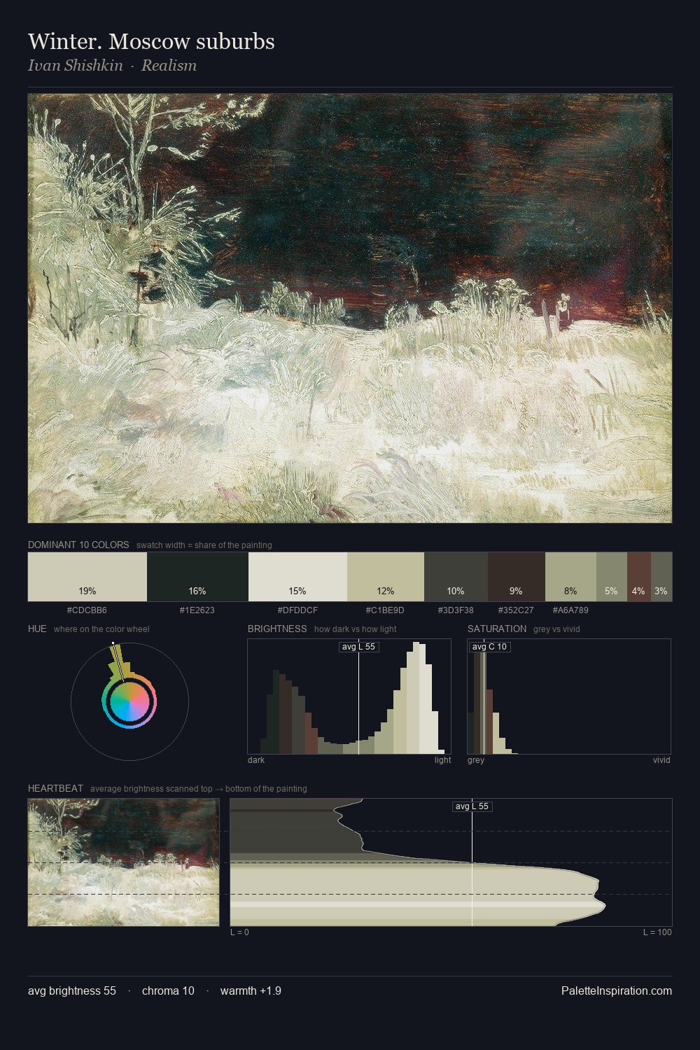
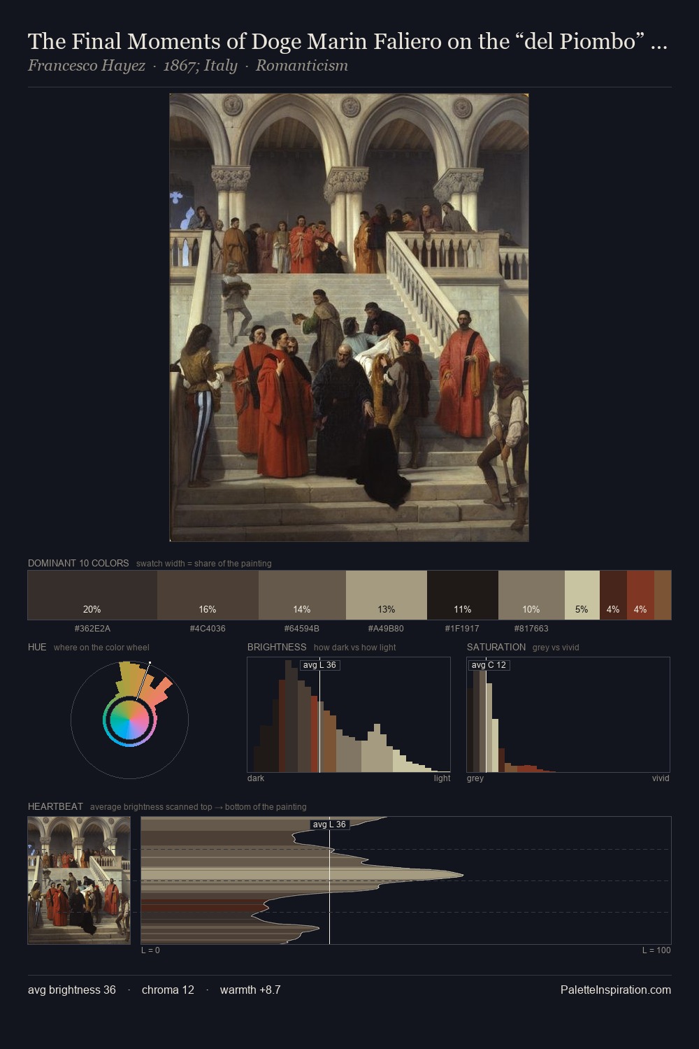
Harry Watrous Palette 5

Palette Analysis
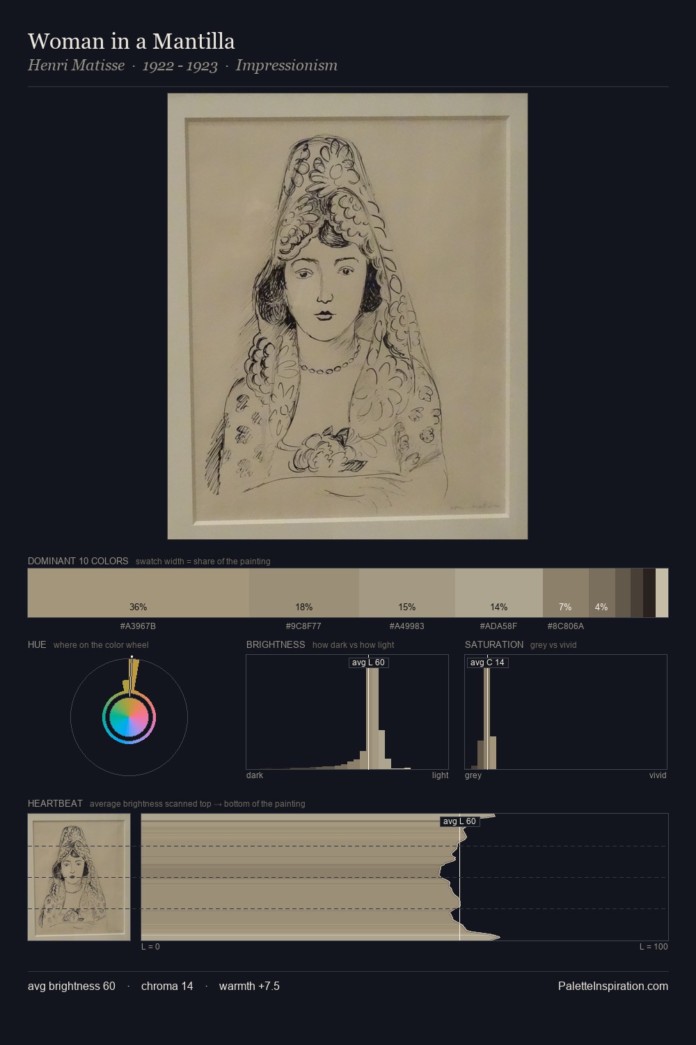
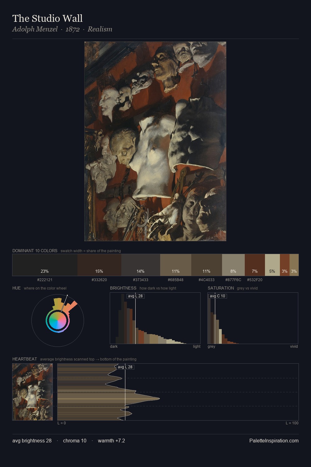
Harry Watrous distributes its values across the middle register, creating harmony without high contrast. Harry Watrous builds on cool foundations: the palette favours the blue-cyan-green arc. Chroma hovers near zero; colour declares itself through subtle shifts in hue rather than outright saturation. A single dominant - #A6A286 at 27.2% - sets the character of the whole composition. The highest-chroma note - #443128 - appears at just 4.2%, deployed as a precision accent against the quieter ground. 57 units of value range underpin the palette's structural clarity: the eye always knows where light falls. The palette has the character of outdoor light: cool, mid-bright, with colour rendered faithfully rather than expressively. Harry Watrous's palette 5 carries its own internal logic while remaining in conversation with the artist's broader colour intelligence.
Example use cases
- museums & galleries
- academic publishing
- heritage brands
- auction houses
- exhibition design
I Love This!
Copy, export, or download for your project