Haralampi Tachev Palette 1

Palette Analysis
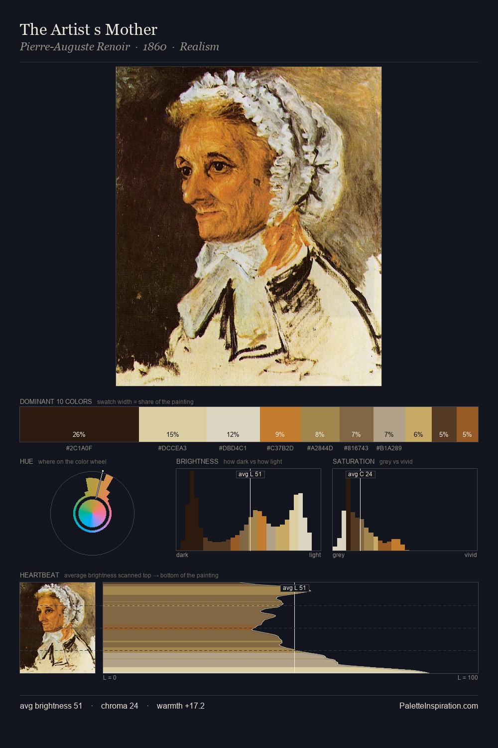
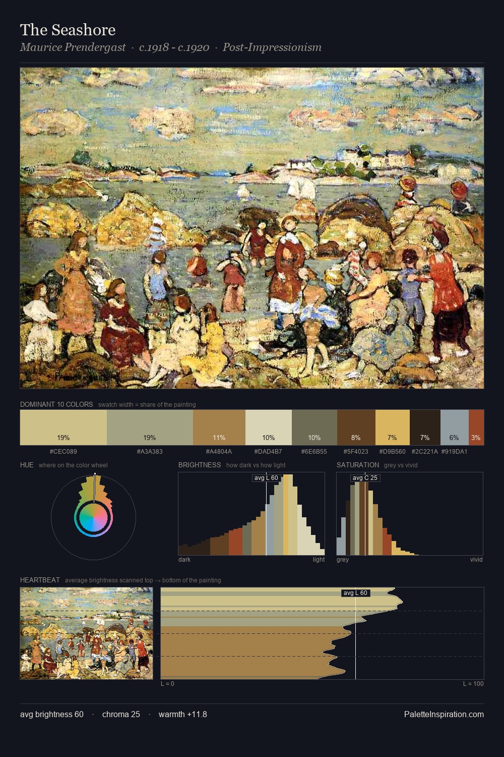
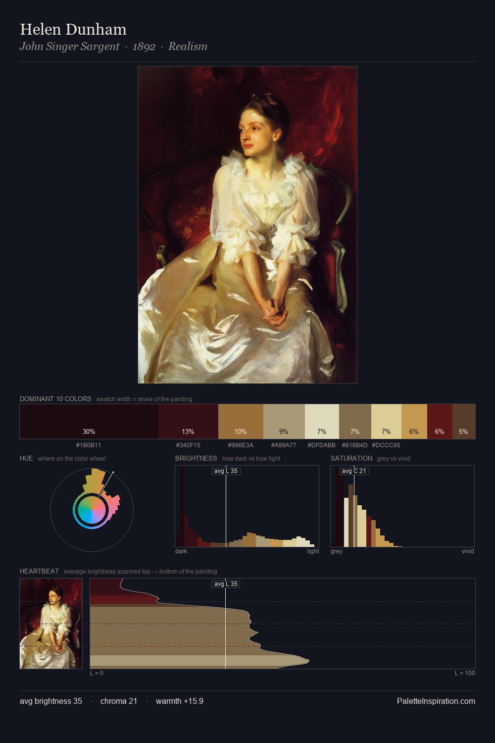
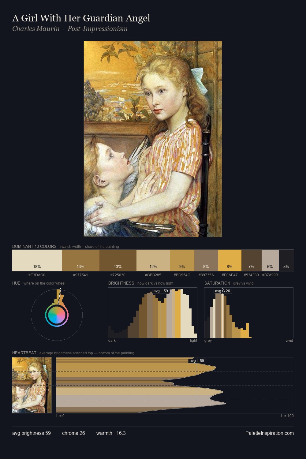
Haralampi Tachev works in the upper reaches of the value scale, creating an atmosphere of brightness and expansiveness. Haralampi Tachev tilts toward cool - blues and silver-greys carry the structural weight. Saturation is deliberately withheld - the beauty here lies in the near-monochromatic gradations rather than colour difference. A single dominant - #F2E7D0 at 28.3% - sets the character of the whole composition. Only 4.0% is devoted to #E1C596, yet that small allocation delivers the palette's entire chromatic tension. From deepest dark to palest light, the palette traverses 72 units of the value scale - a span that creates natural depth. The palette has the character of outdoor light: cool, mid-bright, with colour rendered faithfully rather than expressively. Palette 1 sits within the larger chromatic argument that Haralampi Tachev's complete body of work advances.
Example use cases
- ceramics & pottery
- boutique hospitality
- menswear
- heritage food brands
- craft & artisan brands
I Love This!
Copy, export, or download for your project