Hans Richter Master Palette
Muted Gamboge
Muted Deliberately desaturated - chroma pulled toward gray, the restraint of tonal painting.
Gamboge Deep golden yellow - a traditional warm pigment, rich amber-gold.

Palette Analysis
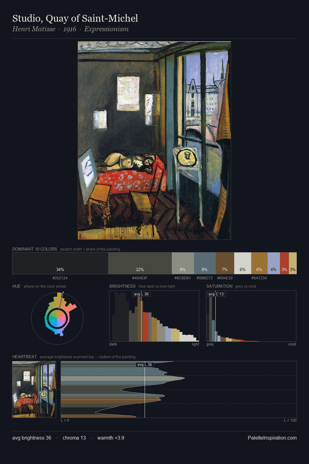
Hans Richter occupies the comfortable middle of the value scale, avoiding both extremes to hold the eye in a sustained middle grey. Neither warm nor cool has the upper hand here; the equilibrium between the two generates the palette's visual energy. Saturation is measured and controlled, giving the palette presence without visual aggression. #A5442D functions as the palette's exclamation mark: highest chroma, lowest percentage (5.0%). The full value range is 65 units: broad enough to build convincing three-dimensional form. The palette reads as an Impressionist one - light-biased, chromatically direct, and built on temperature contrast rather than value opposition. This is the light Hans Richter preferred, made measurable.
Example use cases
- ceramics & pottery
- boutique hospitality
- menswear
- heritage food brands
- craft & artisan brands
I Love This!
Use This Palette
Copy, export, or download for your project
Copy, export, or download for your project
Copy:
Download:
Share: