Hans Baldung Palette 7

Palette Analysis
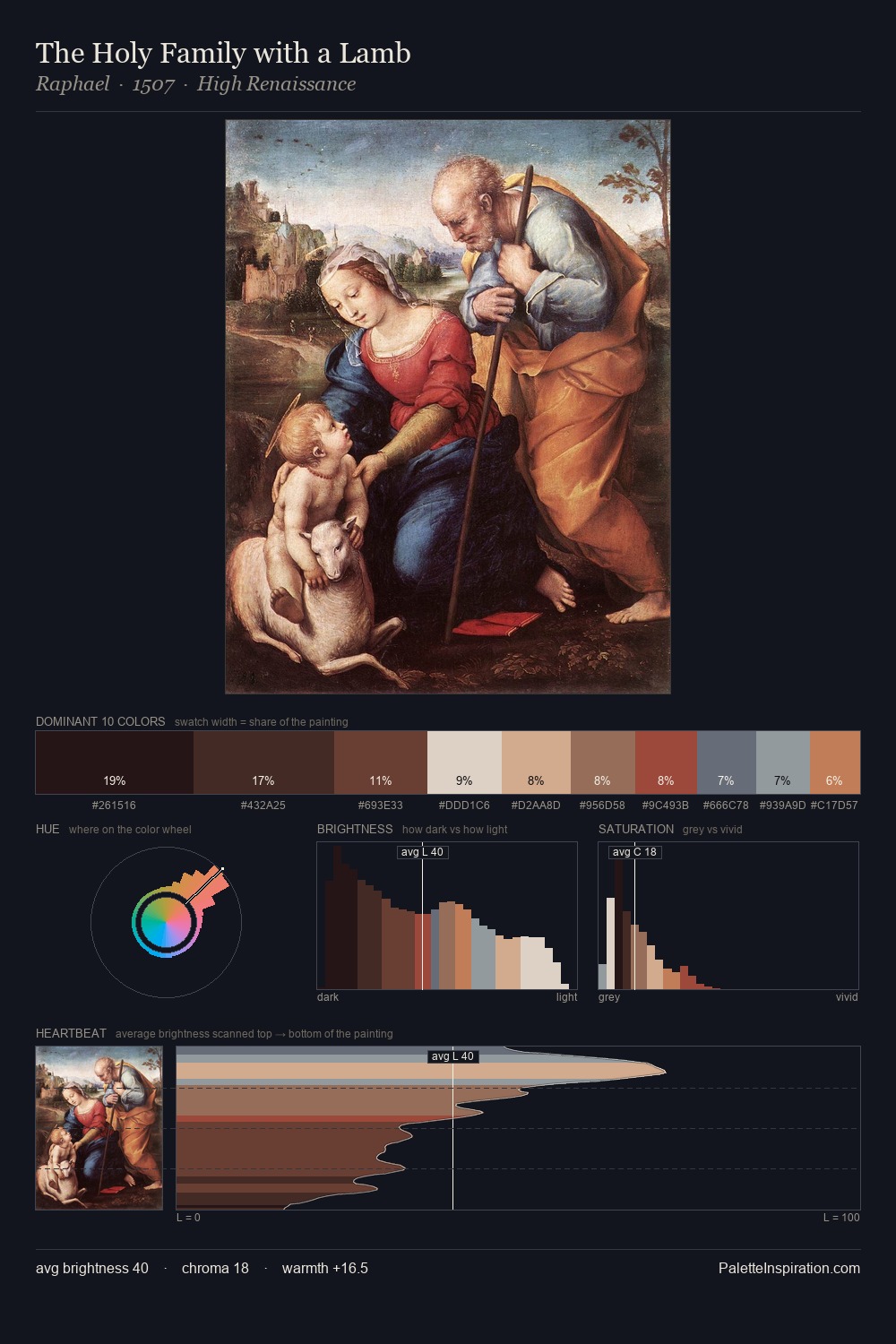
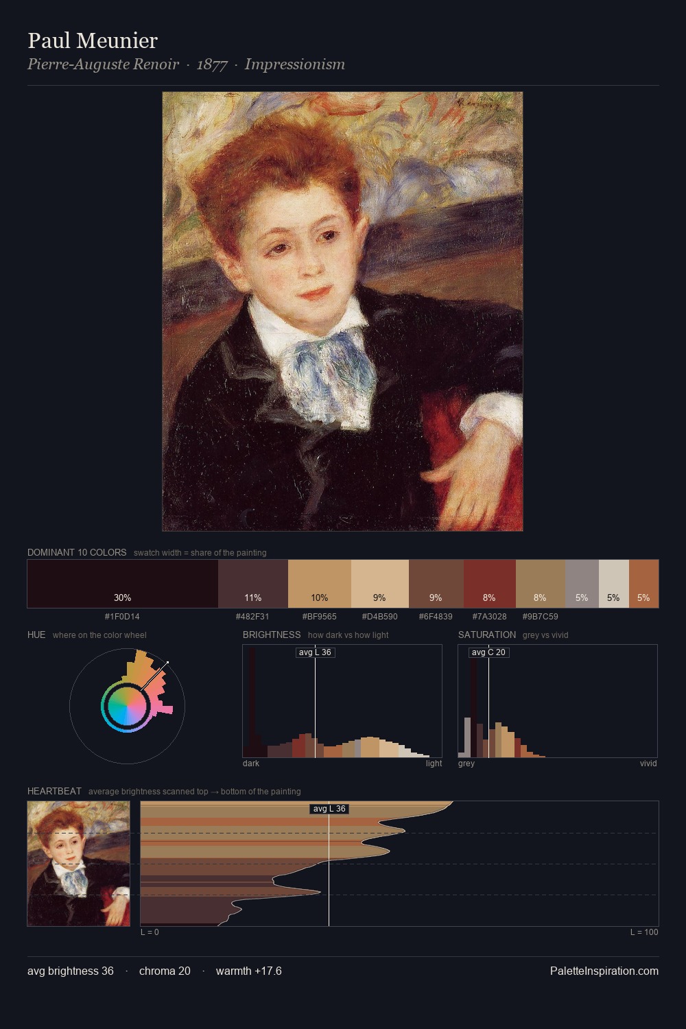
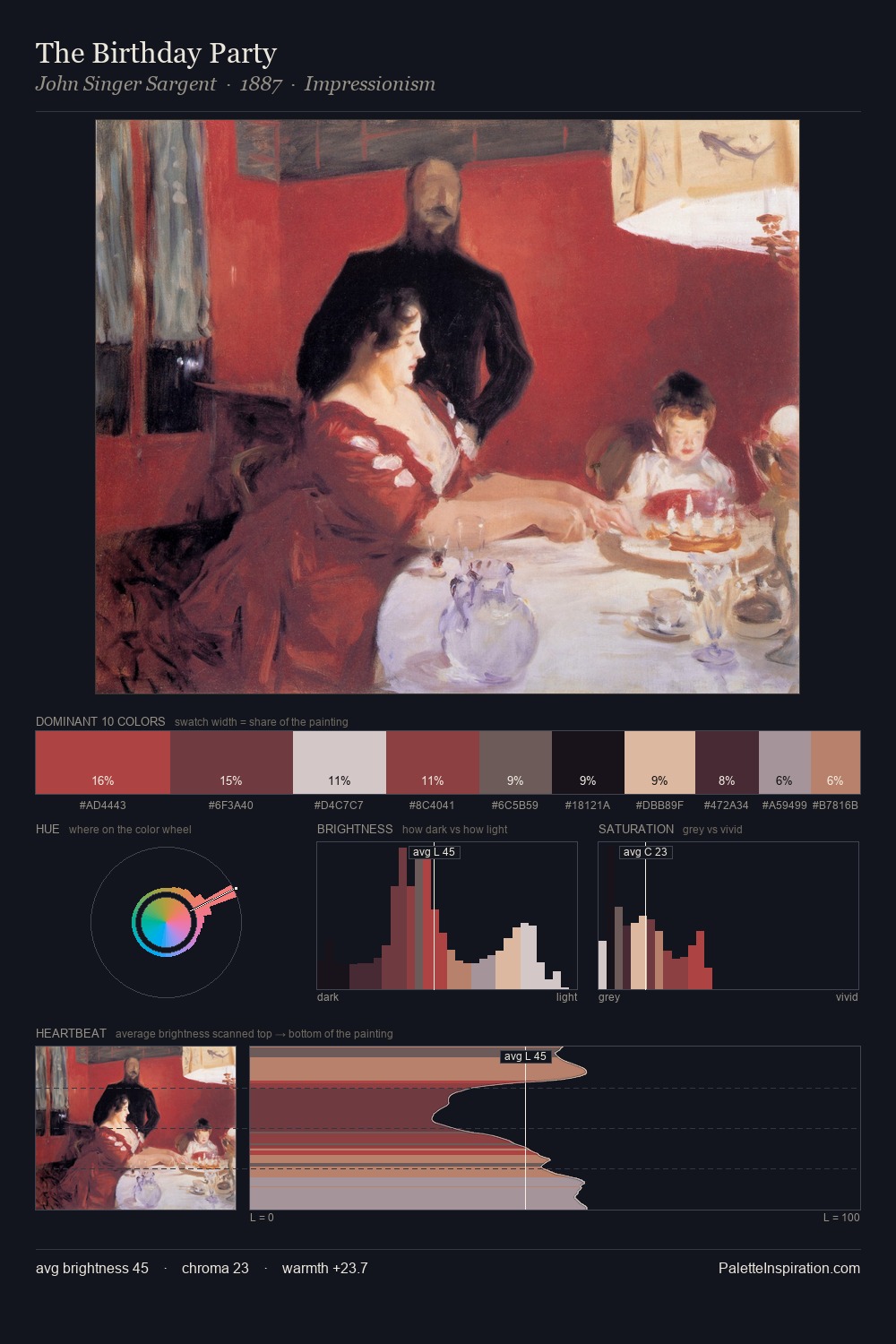
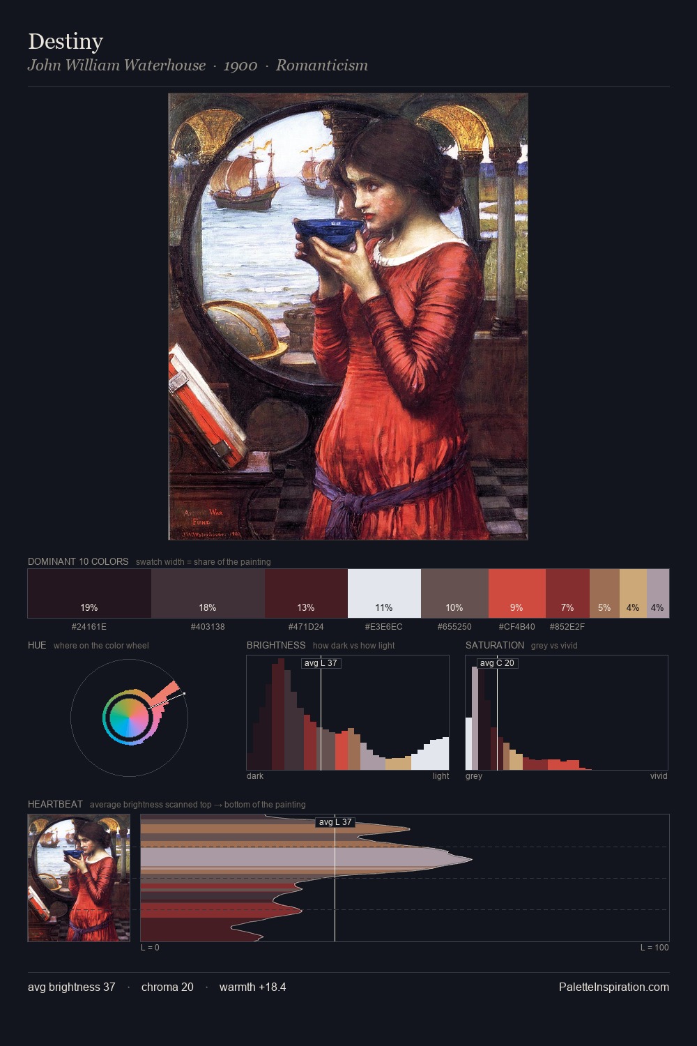
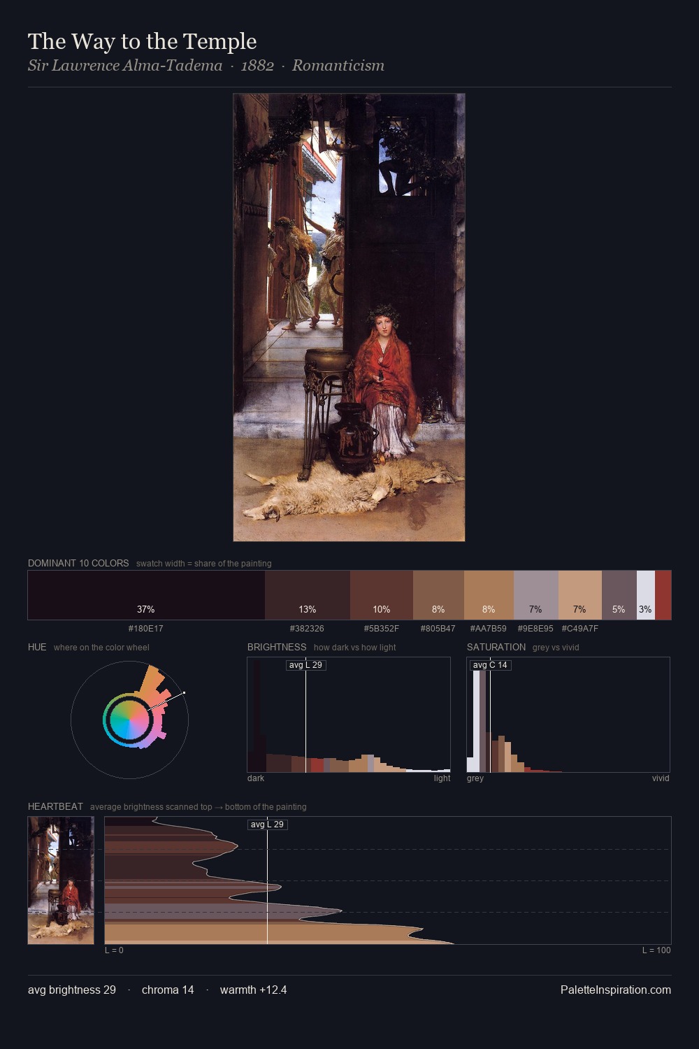
Hans Baldung occupies the comfortable middle of the value scale, avoiding both extremes to hold the eye in a sustained middle grey. Yellow, ochre, sienna: warm hues that Hans Baldung deploys as the palette's primary energy. Chroma hovers near zero; colour declares itself through subtle shifts in hue rather than outright saturation. The dominant colour, #29191A, takes 31.8% of the total area, establishing the overall mood before any other hue is introduced. The highest-chroma note - #87363D - appears at just 4.1%, deployed as a precision accent against the quieter ground. A value spread of 64 units gives the palette both depth and air - shadows are genuinely dark, lights genuinely light. In the context of Hans Baldung's full range of palettes, group 7 represents one movement in an ongoing chromatic dialogue.
Example use cases
- theater design
- jewelry brands
- tobacco-adjacent retail
- event branding
- film & entertainment
I Love This!
Copy, export, or download for your project