Gustave Caillebotte Palette 2
Pale Parchment
Pale High-key and low-chroma - delicate, bleached, washed with light.
Parchment Aged warm neutral - the color of old manuscript parchment, tan and slightly yellowed.

Palette Analysis
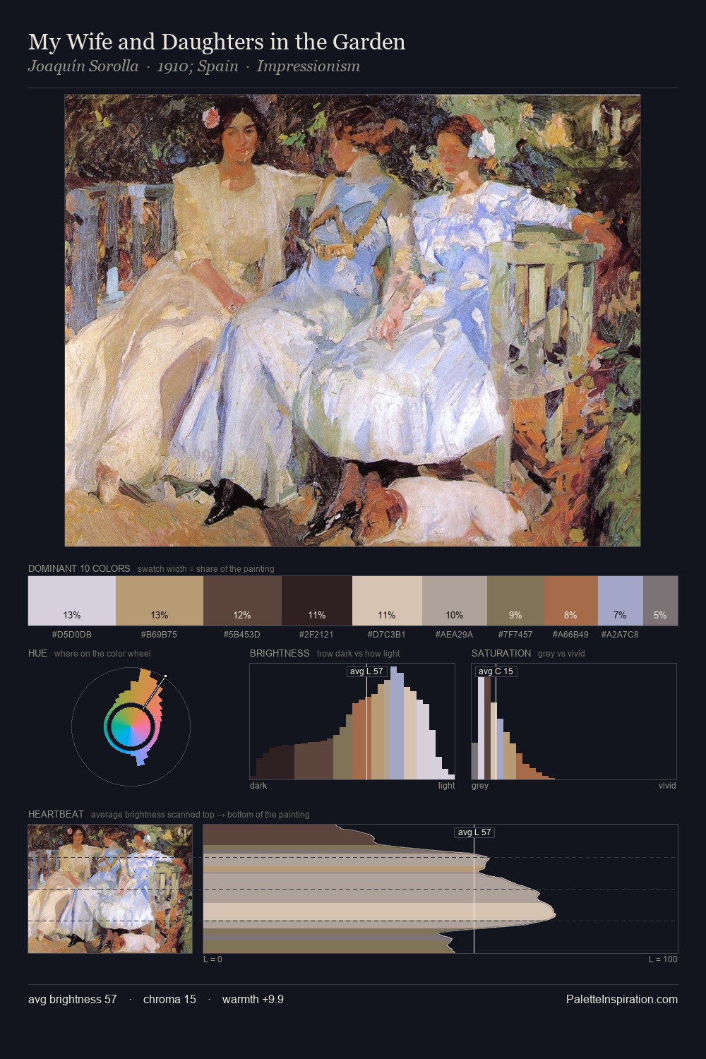
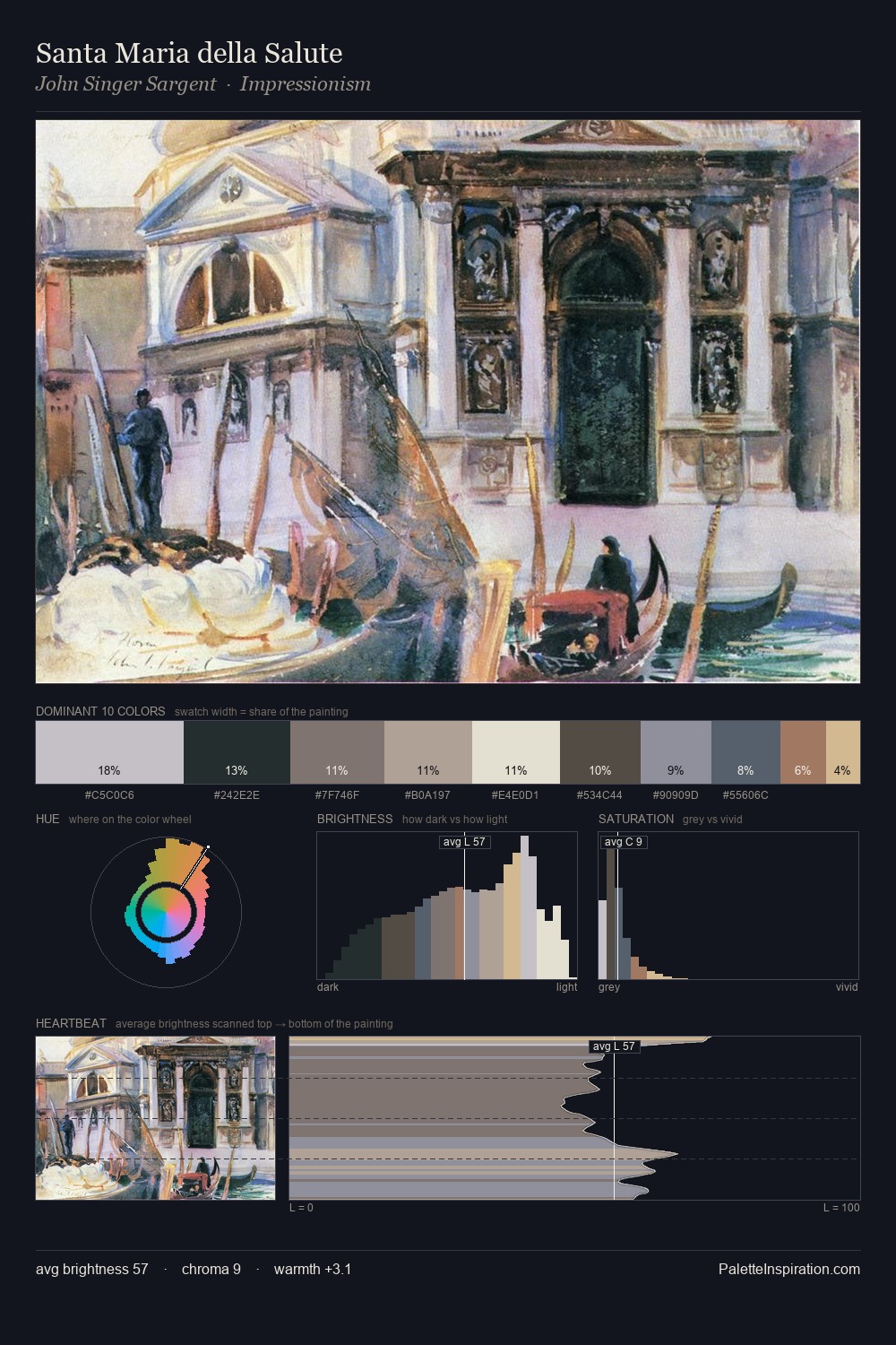
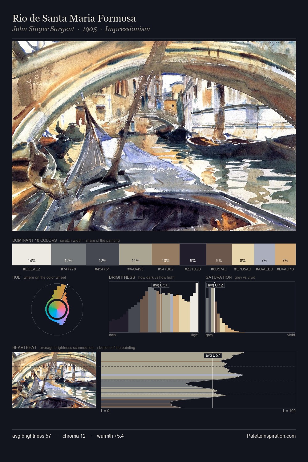
Gustave Caillebotte sits in the centre of the value range, lending the palette a sense of even, sustained light. The dominant temperature is warm, with earth tones and fire-hues setting the emotional key. Muted throughout, the palette achieves its effects through value and temperature rather than chromatic force. The most saturated colour, #C9A783, is reserved to 4.0% of the surface, where it acts as a focal punctuation. The full value range is 59 units: broad enough to build convincing three-dimensional form. Palette 2 sits within the larger chromatic argument that Gustave Caillebotte's complete body of work advances.
Example use cases
- exhibition design
- foundation branding
- estate management
- art education
- museums & galleries
I Love This!
Use This Palette
Copy, export, or download for your project
Copy, export, or download for your project
Copy:
Download:
Share: