Granville Redmond Palette 2

Palette Analysis
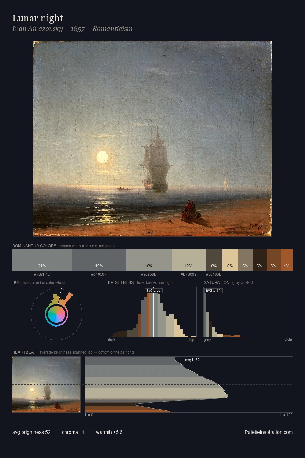
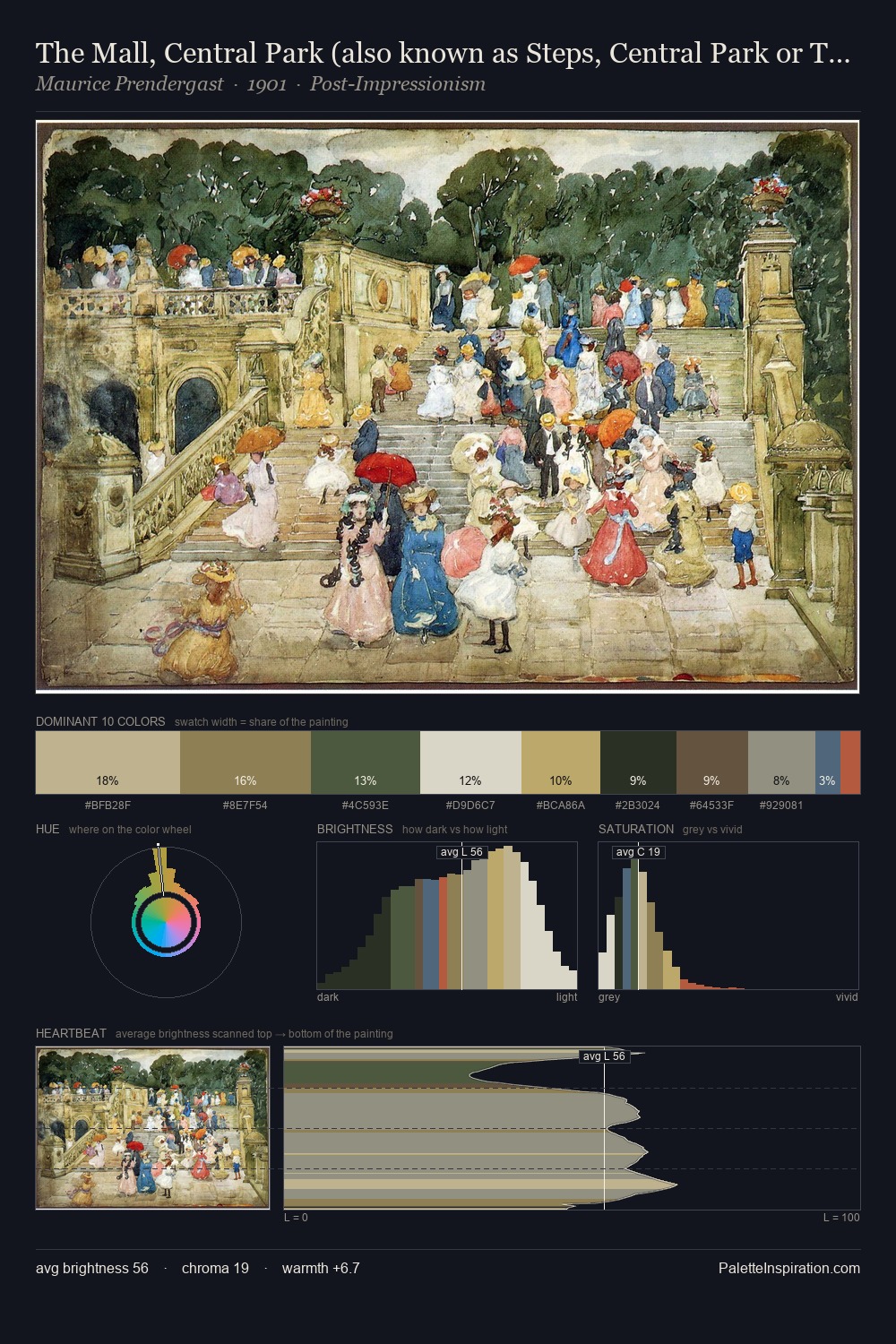
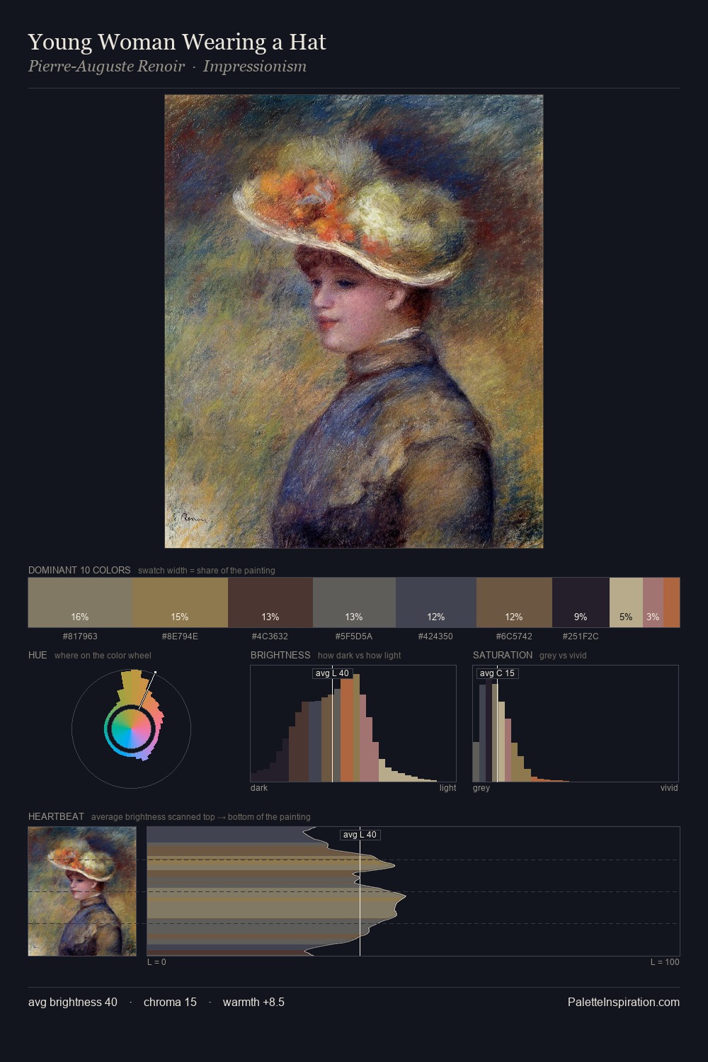
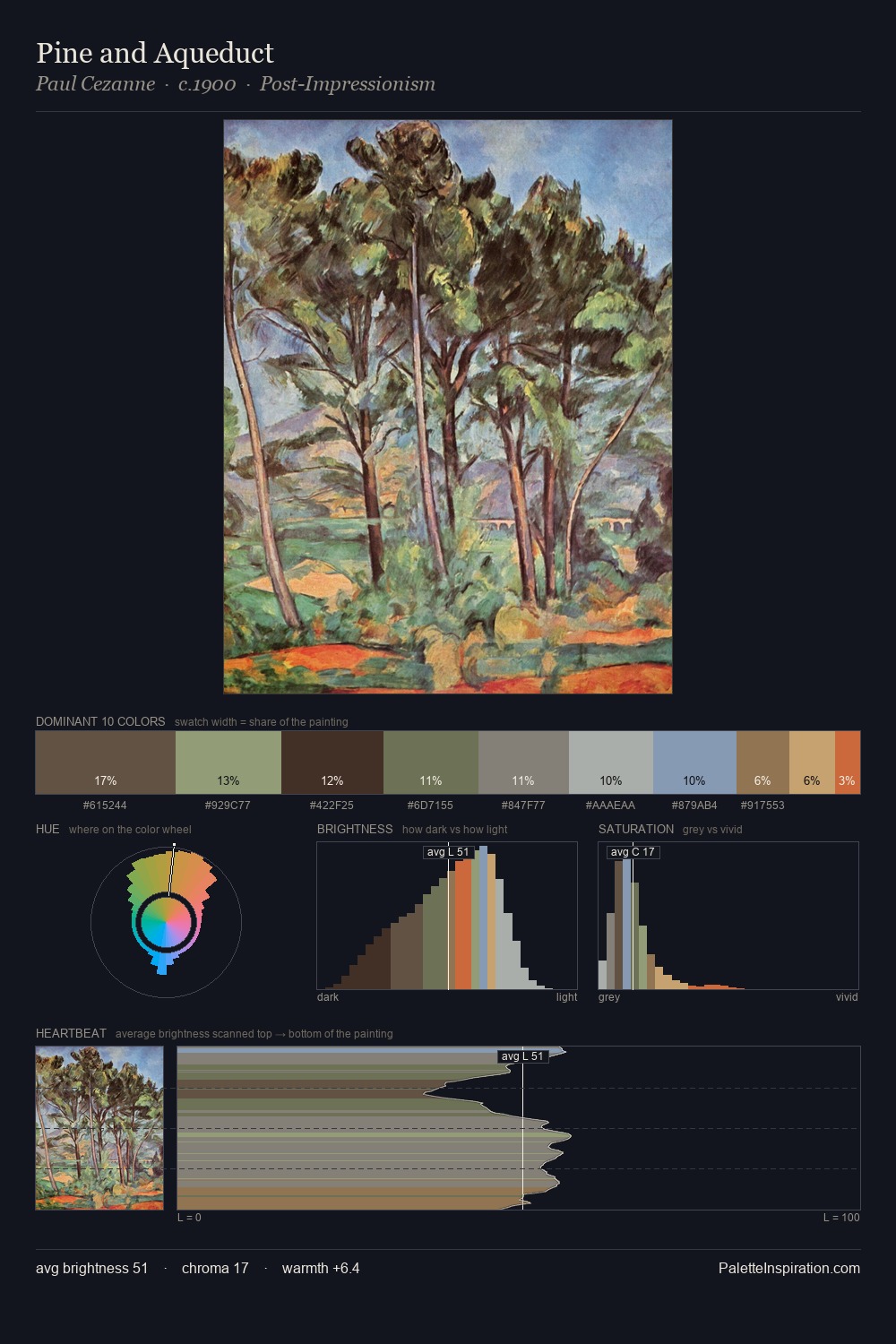
Granville Redmond sits in the centre of the value range, lending the palette a sense of even, sustained light. Blues and teal-greys govern the palette, lending it an aquatic or atmospheric quality. The absence of saturated colour is itself an expressive choice: this is a palette of restraint and atmosphere. At 27.5%, #9CA388 functions less as a colour accent and more as a complete atmospheric environment. Only 6.6% is devoted to #DBBB8F, yet that small allocation delivers the palette's entire chromatic tension. Spanning 37 units on the value axis, the palette achieves the balance between tonal flatness and fragmentation. The palette has the character of outdoor light: cool, mid-bright, with colour rendered faithfully rather than expressively. This is palette 2 of Granville Redmond's sequence - a single chapter in a chromatic story told across many works.
Example use cases
- exhibition design
- foundation branding
- estate management
- art education
- museums & galleries
I Love This!
Copy, export, or download for your project