Grace Cossington Smith Palette 2

Palette Analysis
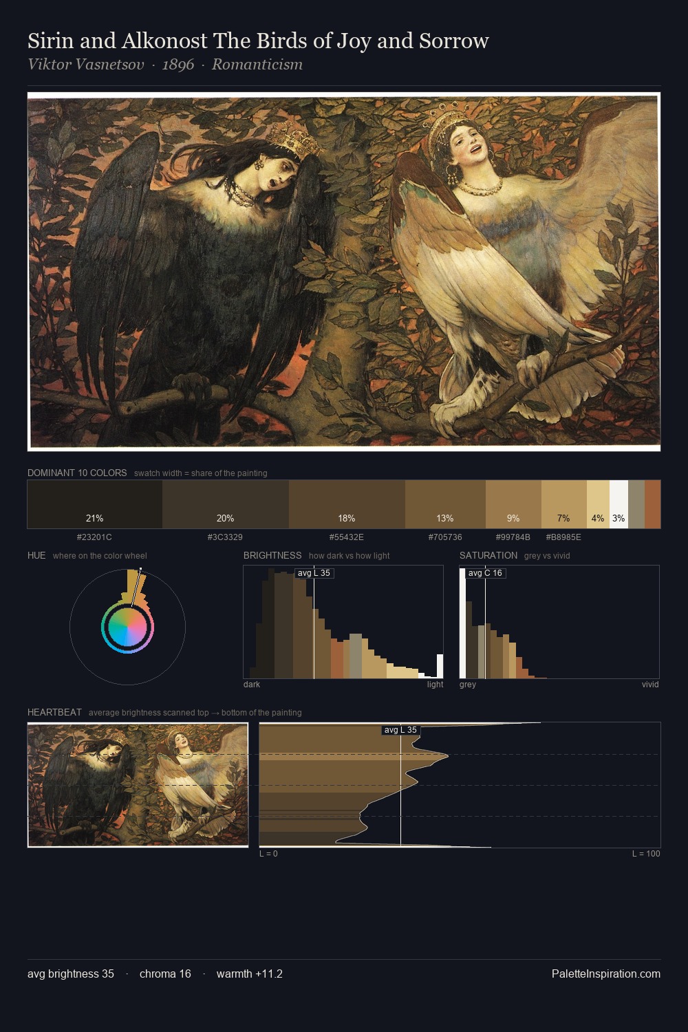
Grace Cossington Smith occupies the comfortable middle of the value scale, avoiding both extremes to hold the eye in a sustained middle grey. Grace Cossington Smith keeps warm and cool in parity, a balance that lends the work a perceptual shimmer. Mid-range chroma keeps the palette grounded - colourful but not strident. The highest-chroma note - #C5BB86 - appears at just 3.9%, deployed as a precision accent against the quieter ground. At 50 units across the value scale, the palette keeps contrast readable without letting it dominate. The palette reads as an Impressionist one - light-biased, chromatically direct, and built on temperature contrast rather than value opposition. In the context of Grace Cossington Smith's full range of palettes, group 2 represents one movement in an ongoing chromatic dialogue.
Example use cases
- interior design
- furniture brands
- cookbook publishing
- wine & spirits
- food packaging
I Love This!
Copy, export, or download for your project