Giovanni Battista Tiepolo Palette 1
Pale Ecru
Pale High-key and low-chroma - delicate, bleached, washed with light.
Ecru Unbleached linen - warm mid-neutral, slightly grayed, raw and natural.

Palette Analysis
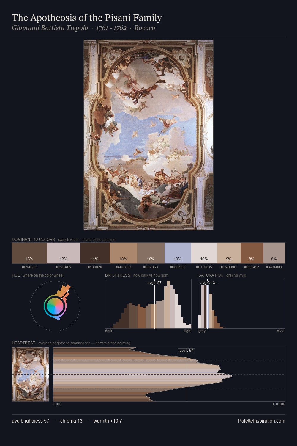
Light floods Giovanni Battista Tiepolo; the palette keeps values pale and airy across its range. The dominant temperature is warm, with earth tones and fire-hues setting the emotional key. All colours lean toward grey, building depth through value rather than colour punch. #B79372 delivers the chromatic peak at only 8.9% - a small shot of colour with outsized visual impact. 56 units of value range underpin the palette's structural clarity: the eye always knows where light falls. Giovanni Battista Tiepolo's palette 1 carries its own internal logic while remaining in conversation with the artist's broader colour intelligence.
Example use cases
- ceramics & pottery
- boutique hospitality
- menswear
- heritage food brands
- craft & artisan brands
I Love This!
Use This Palette
Copy, export, or download for your project
Copy, export, or download for your project
Copy:
Download:
Share: