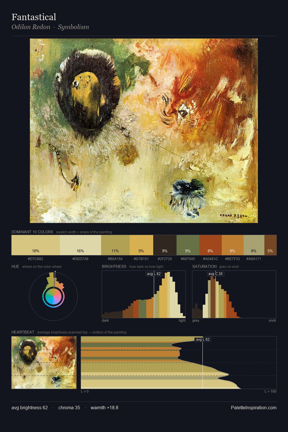
Gilbert Stuart Palette 5

Palette Analysis
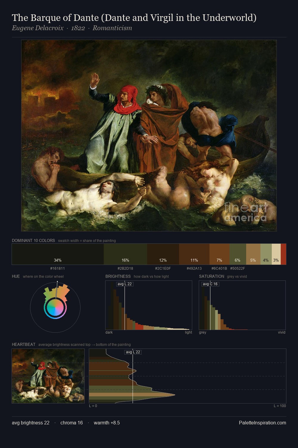
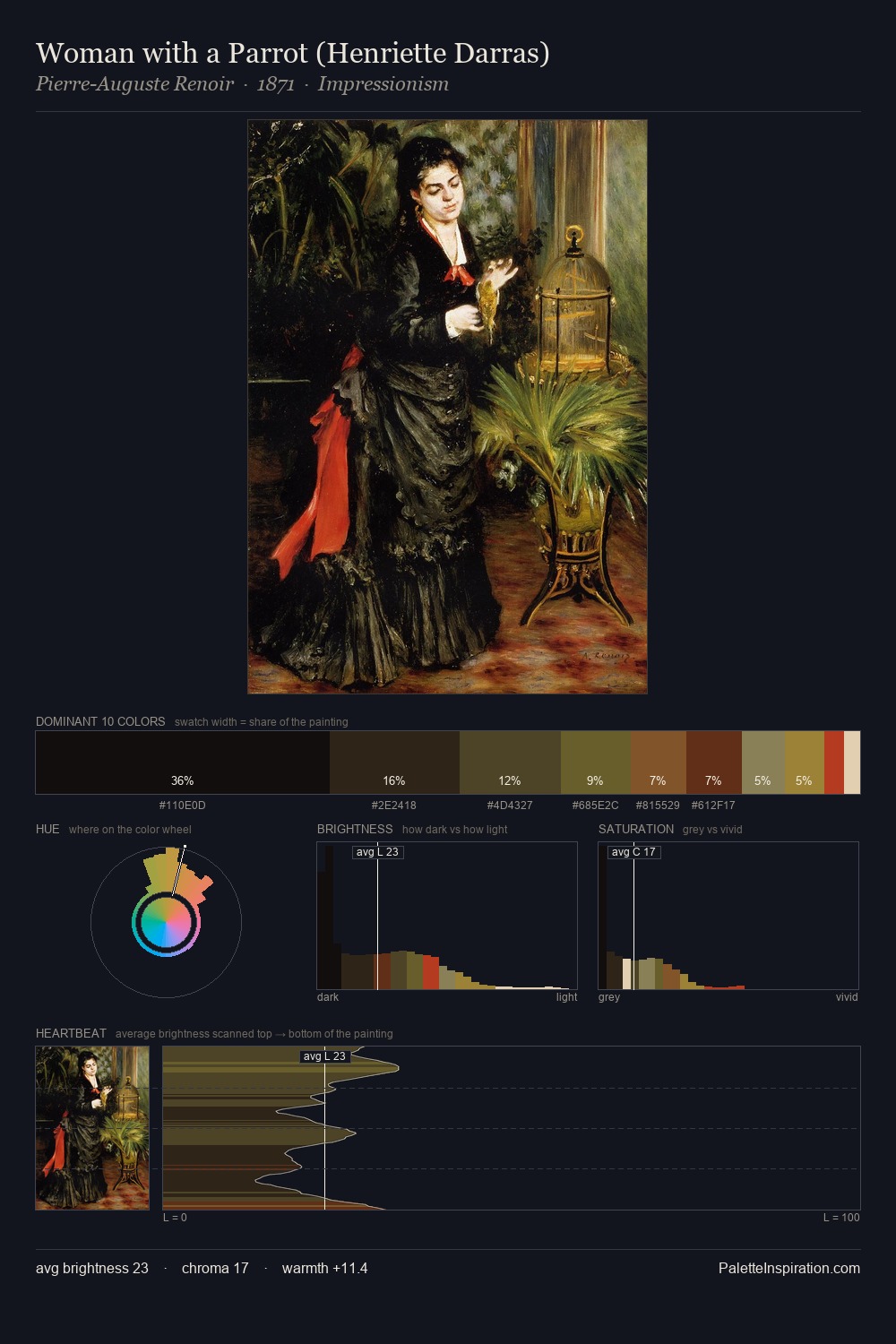
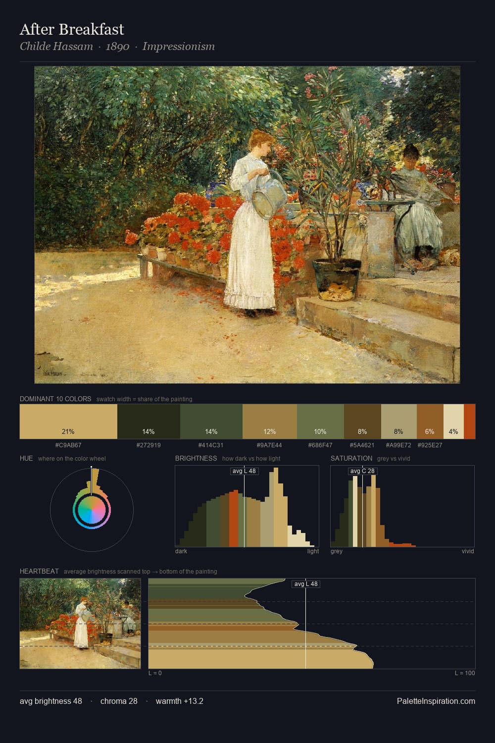
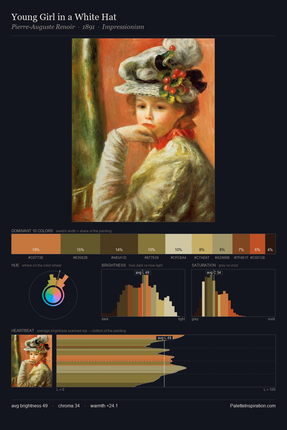
Gilbert Stuart distributes its values across the middle register, creating harmony without high contrast. Blues and teal-greys govern the palette, lending it an aquatic or atmospheric quality. Mid-range chroma keeps the palette grounded - colourful but not strident. #7F9470 at 37.0% of the palette: an overwhelming presence that pulls all other colours into its gravitational field. #564829 functions as the palette's exclamation mark: highest chroma, lowest percentage (6.2%). A value spread of 63 units gives the palette both depth and air - shadows are genuinely dark, lights genuinely light. High luminosity and cool temperature suggest the plein-air condition: unfiltered daylight and open sky. Gilbert Stuart's palette 5 carries its own internal logic while remaining in conversation with the artist's broader colour intelligence.
Example use cases
- publishing
- corporate identity
- consumer apps
- hospitality
- design agencies
I Love This!
Copy, export, or download for your project