Gian Lorenzo Bernini Palette 2
Muted Tawny
Muted Deliberately desaturated - chroma pulled toward gray, the restraint of tonal painting.
Tawny Warm orange-brown - a traditional term for the color of tanned leather or lion fur.

Palette Analysis
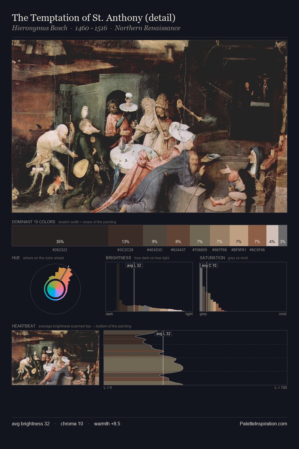
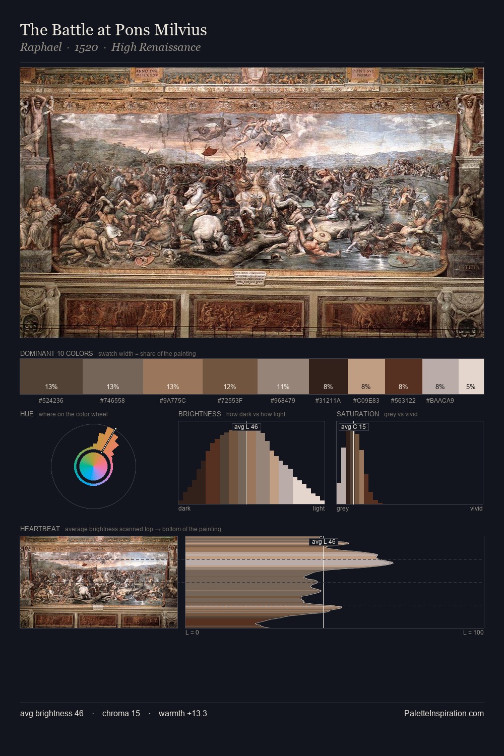
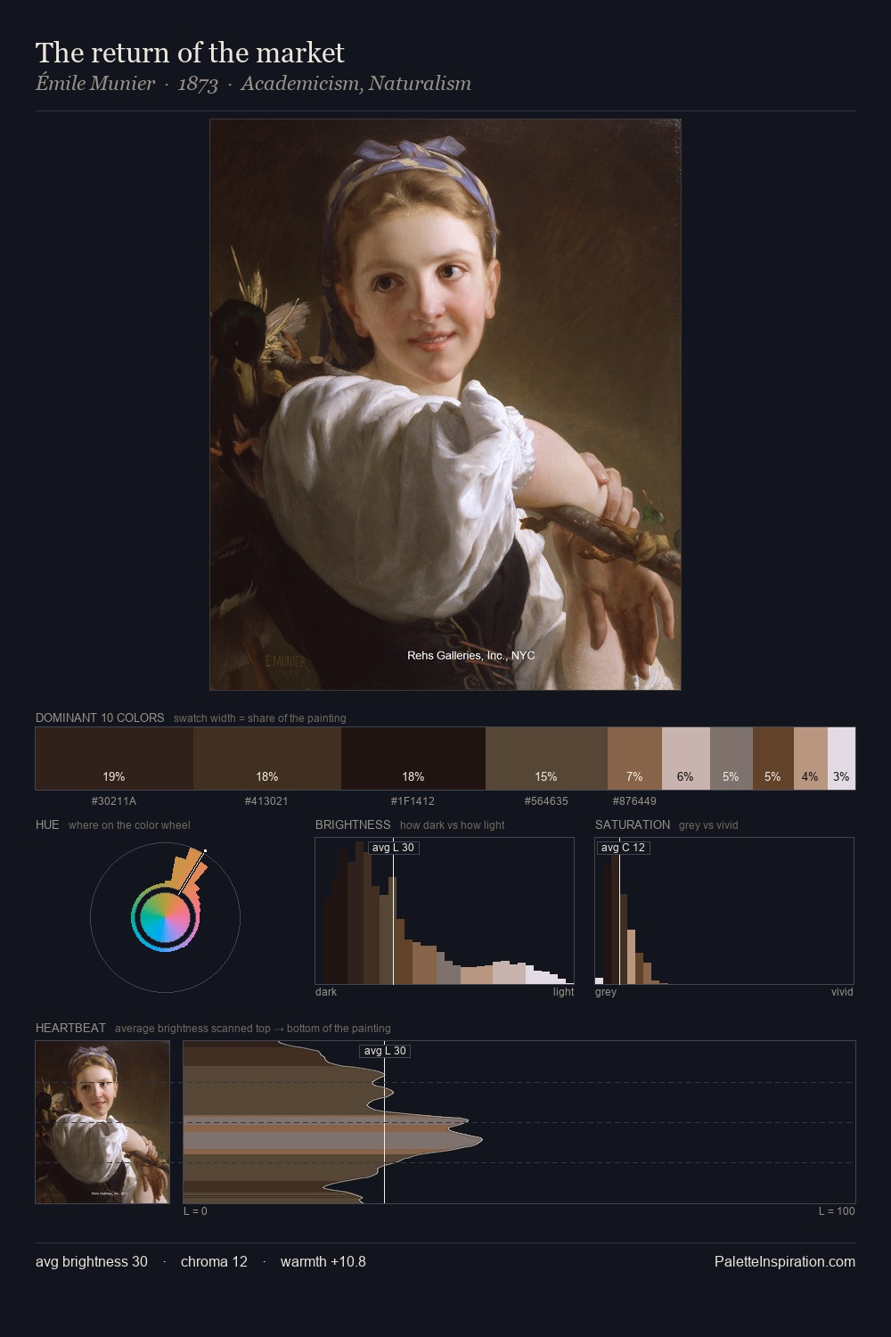
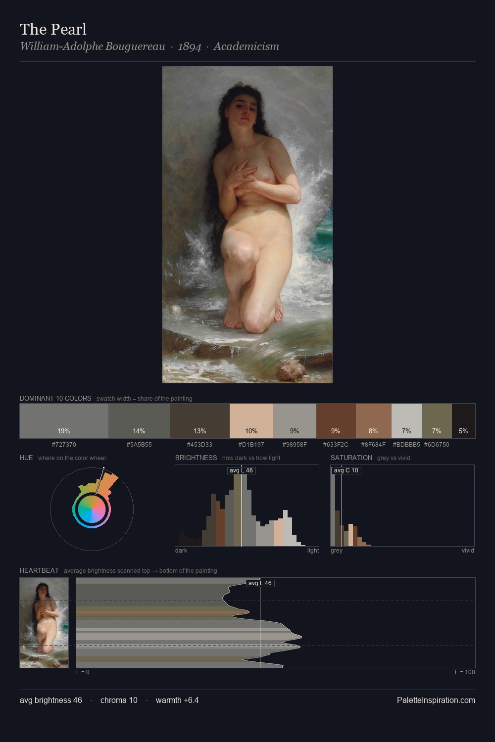
The value structure of Gian Lorenzo Bernini is mid-key: quiet, controlled, and cohesive. Warm and cool are kept in productive tension, creating the kind of chromatic harmony that sustains the eye. The absence of saturated colour is itself an expressive choice: this is a palette of restraint and atmosphere. #7A7B7B at 27.8% of the palette: an overwhelming presence that pulls all other colours into its gravitational field. The most saturated colour, #5B3D2B, is reserved to 9.1% of the surface, where it acts as a focal punctuation. At 54 units across the value scale, the palette keeps contrast readable without letting it dominate. Palette 2 sits within the larger chromatic argument that Gian Lorenzo Bernini's complete body of work advances.
Example use cases
- exhibition design
- foundation branding
- estate management
- art education
- museums & galleries
I Love This!
Use This Palette
Copy, export, or download for your project
Copy, export, or download for your project
Copy:
Download:
Share: