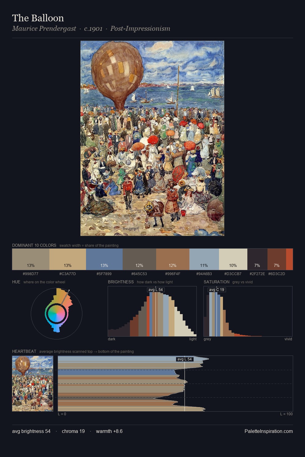
Giambattista Pittoni Master Palette
Shadowed Tawny
Shadowed Low-key - values weighted toward shadow, the palette of dim interiors and overcast skies.
Tawny Warm orange-brown - a traditional term for the color of tanned leather or lion fur.

Palette Analysis
Giambattista Pittoni sits in the centre of the value range, lending the palette a sense of even, sustained light. Warm and cool are kept in productive tension, creating the kind of chromatic harmony that sustains the eye. The absence of saturated colour is itself an expressive choice: this is a palette of restraint and atmosphere. At 1.8%, #DC7966 carries the palette's sharpest chromatic charge: an accent that earns its place precisely because it is withheld. A value spread of 62 units gives the palette both depth and air - shadows are genuinely dark, lights genuinely light. These proportions encode Giambattista Pittoni's instinctive sense of how much of each quality the eye can hold.
Example use cases
- theater design
- jewelry brands
- tobacco-adjacent retail
- event branding
- film & entertainment
I Love This!
Use This Palette
Copy, export, or download for your project
Copy, export, or download for your project
Copy:
Download:
Share: