Giacomo Quarenghi Palette 4

Palette Analysis
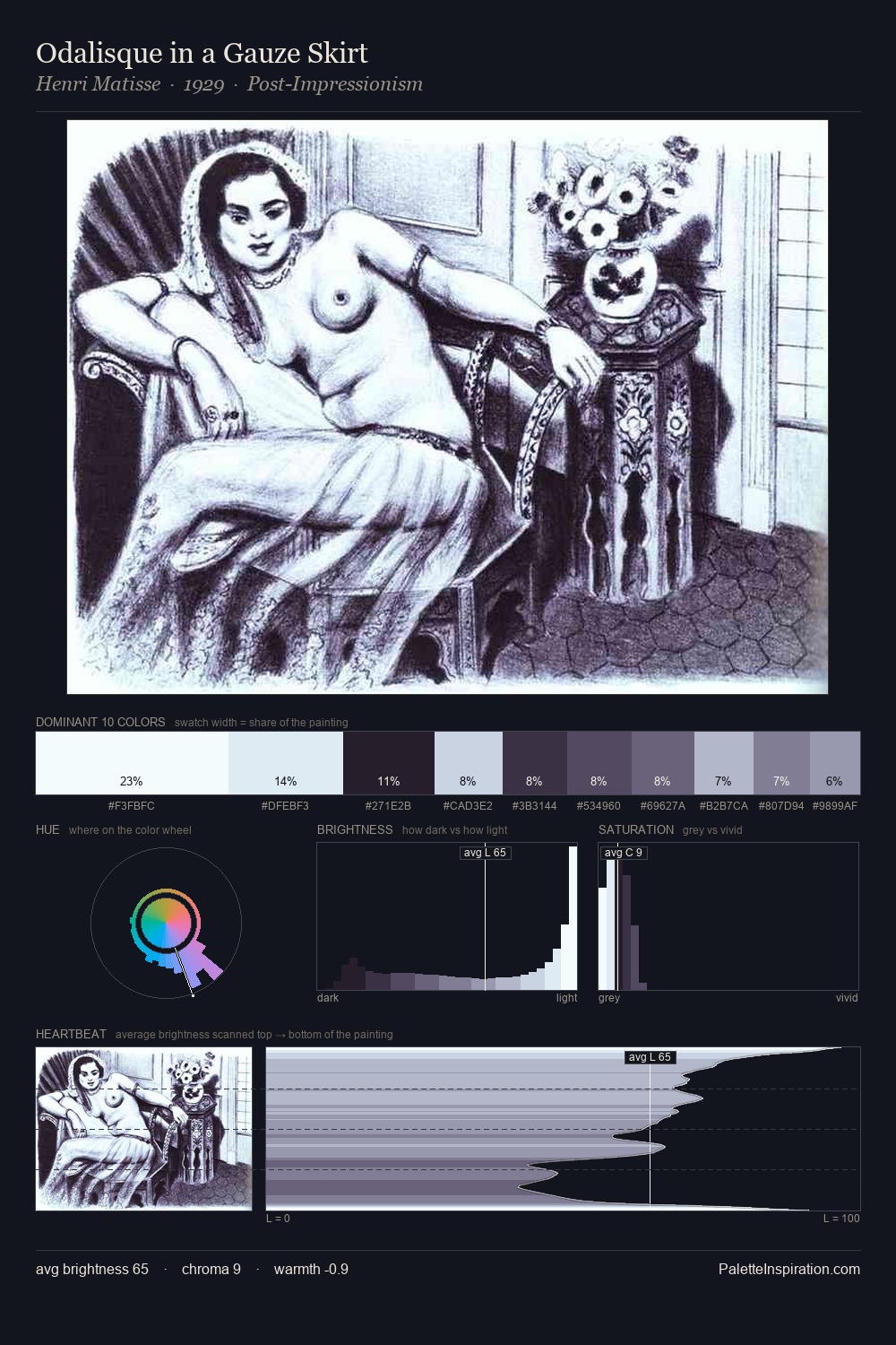
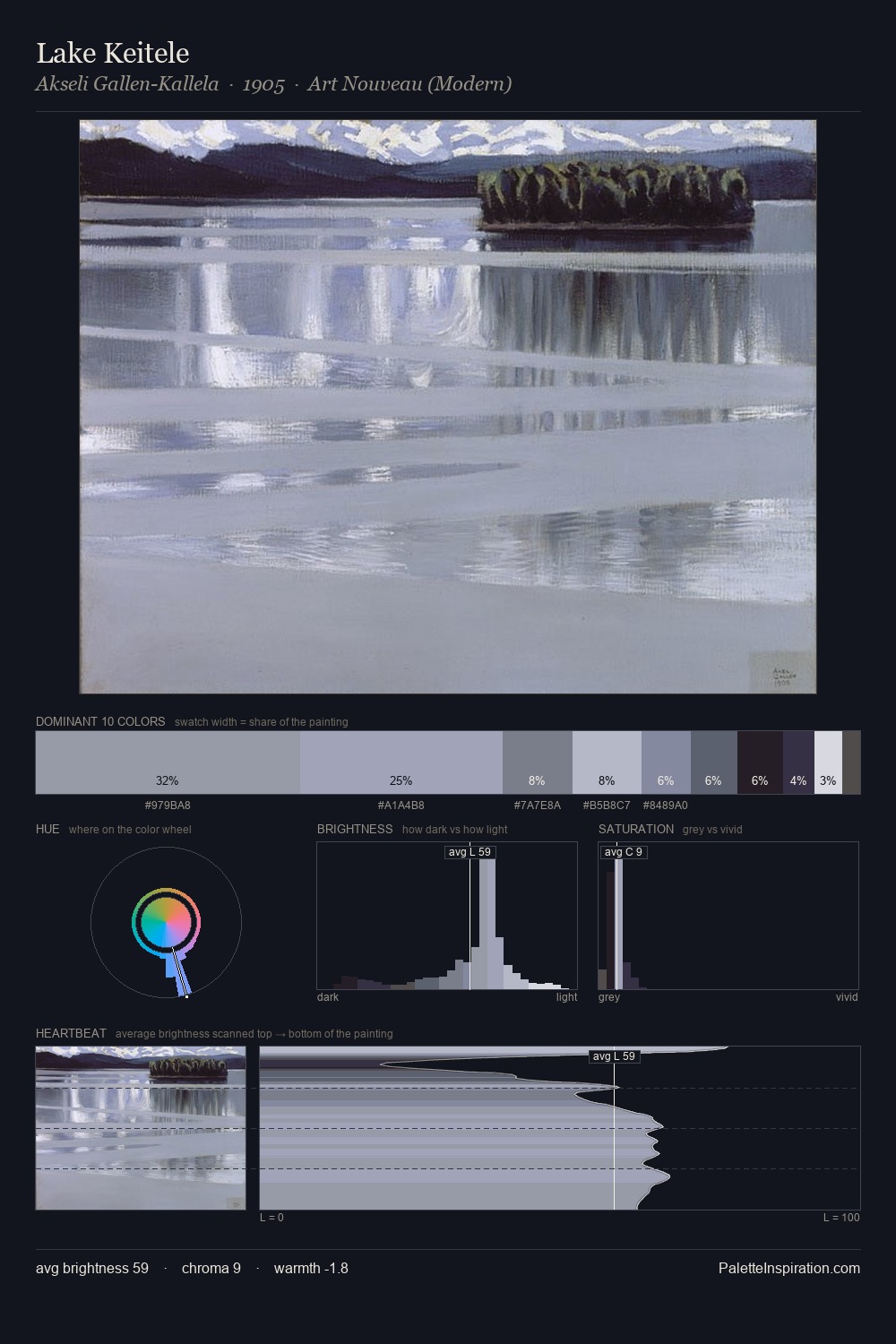
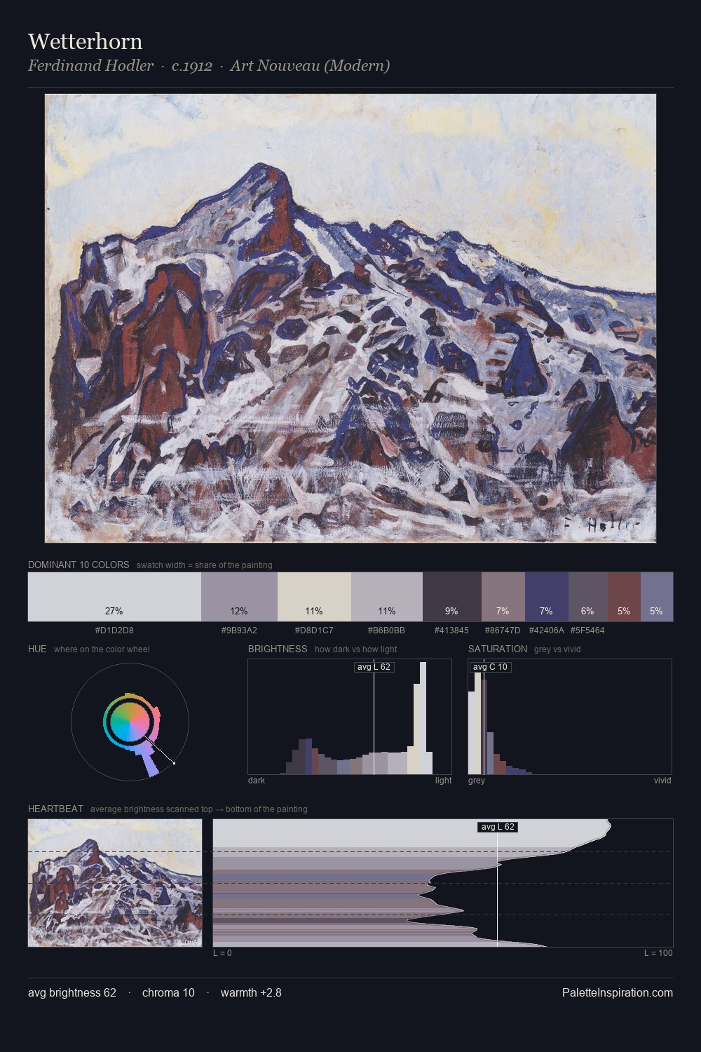
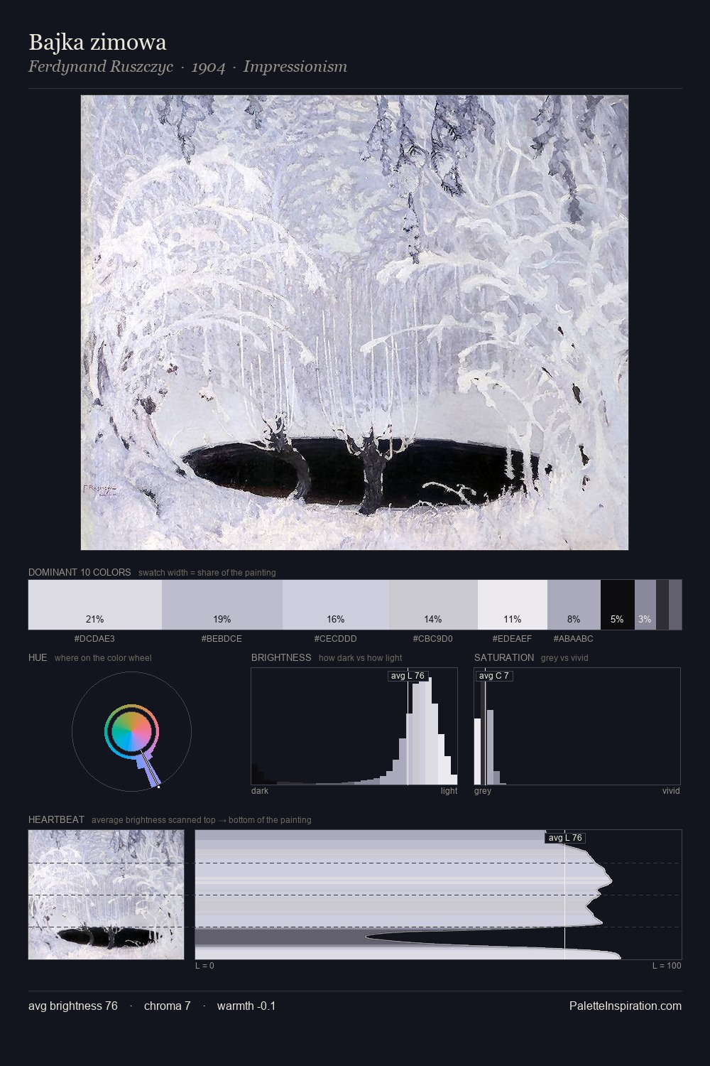
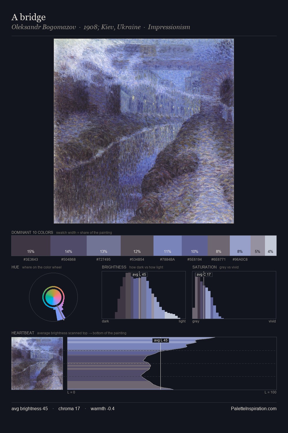
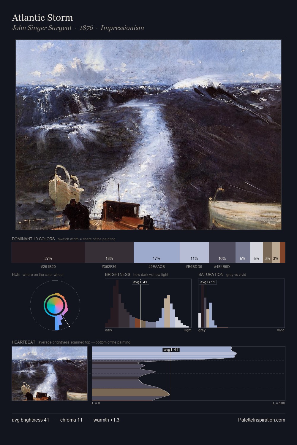
The value structure of Giacomo Quarenghi is mid-key: quiet, controlled, and cohesive. Giacomo Quarenghi tilts toward cool - blues and silver-greys carry the structural weight. The absence of saturated colour is itself an expressive choice: this is a palette of restraint and atmosphere. Only 6.7% is devoted to #B2BBCD, yet that small allocation delivers the palette's entire chromatic tension. From deepest dark to palest light, the palette traverses 59 units of the value scale - a span that creates natural depth. The mid-to-high key, cool bias, and moderate chroma point to outdoor observation - sky and diffused daylight as the dominant light source. Palette 4 sits within the larger chromatic argument that Giacomo Quarenghi's complete body of work advances.
Example use cases
- exhibition design
- foundation branding
- estate management
- art education
- museums & galleries
I Love This!
Copy, export, or download for your project