Giacomo Quarenghi Palette 1
Gleaming Ivory
Gleaming Bright and polished - high-key, often warm, suggesting reflective or luminous surfaces.
Ivory Warm creamy white - the color of natural ivory, warmer than pure white.

Palette Analysis
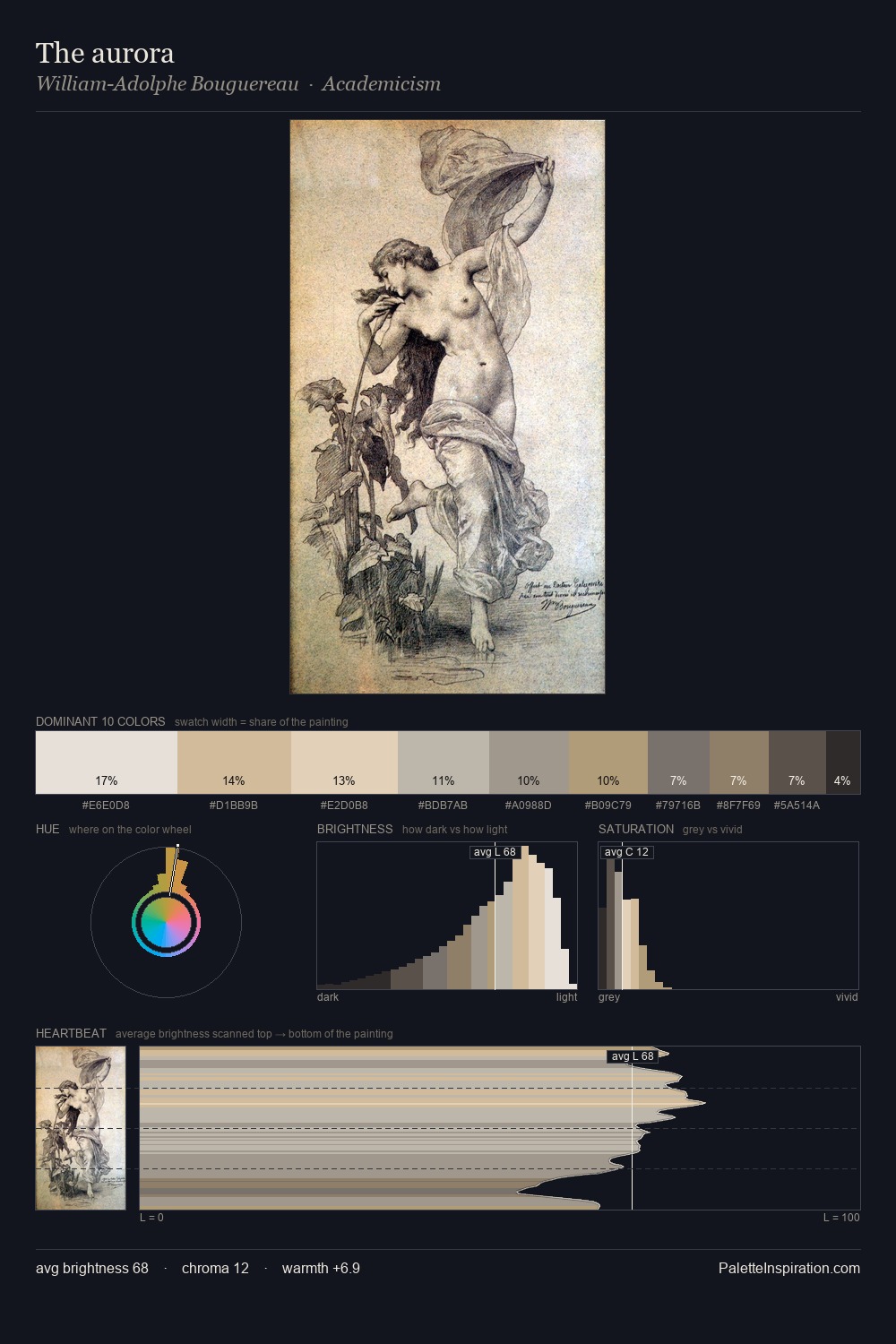
The high-key values of Giacomo Quarenghi give it an effulgent, almost bleached quality. Cool tones set the register here - the blues and greens easily outweigh any warm accents. All colours lean toward grey, building depth through value rather than colour punch. The saturated accent, #AB9873, registers at 2.3% - sparse enough to feel like a deliberate surprise. Value range is moderate at 46 units - enough contrast for legibility, not so much as to fragment the tonal unity. The mid-to-high key, cool bias, and moderate chroma point to outdoor observation - sky and diffused daylight as the dominant light source. Palette 1 sits within the larger chromatic argument that Giacomo Quarenghi's complete body of work advances.
Example use cases
- florist branding
- event design
- real estate
- jewelry retail
- hospitality branding
I Love This!
Use This Palette
Copy, export, or download for your project
Copy, export, or download for your project
Copy:
Download:
Share: