Gheorghe Petrascu Palette 1

Palette Analysis
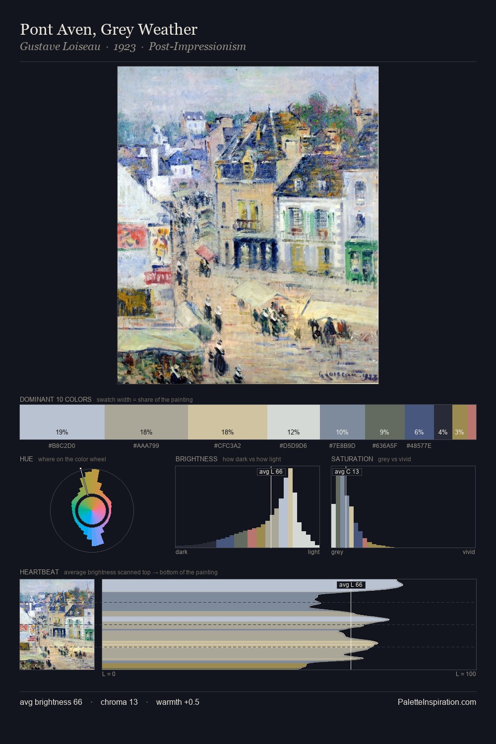
Gheorghe Petrascu works in the upper reaches of the value scale, creating an atmosphere of brightness and expansiveness. Gheorghe Petrascu tilts toward cool - blues and silver-greys carry the structural weight. Every colour is desaturated; the palette proceeds through near-neutrals and gently-coloured greys. The dominant colour, #94C7DA, takes 32.9% of the total area, establishing the overall mood before any other hue is introduced. #946A4E delivers the chromatic peak at only 3.6% - a small shot of colour with outsized visual impact. At 64 units of value range, the palette has the tonal breadth to sustain complex spatial readings. High luminosity and cool temperature suggest the plein-air condition: unfiltered daylight and open sky. Gheorghe Petrascu's palette 1 carries its own internal logic while remaining in conversation with the artist's broader colour intelligence.
Example use cases
- garden centers
- natural beauty
- park & rec design
- sustainable fashion
- sustainability
I Love This!
Copy, export, or download for your project