George von Hoesslin Palette 2
Nocturnal Umber
Nocturnal Night-register palette - very low values, the world after dark.
Umber Dark earthy brown - raw or burnt umber, a foundational old-master earth pigment.

Palette Analysis
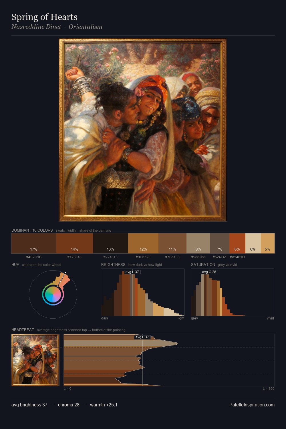
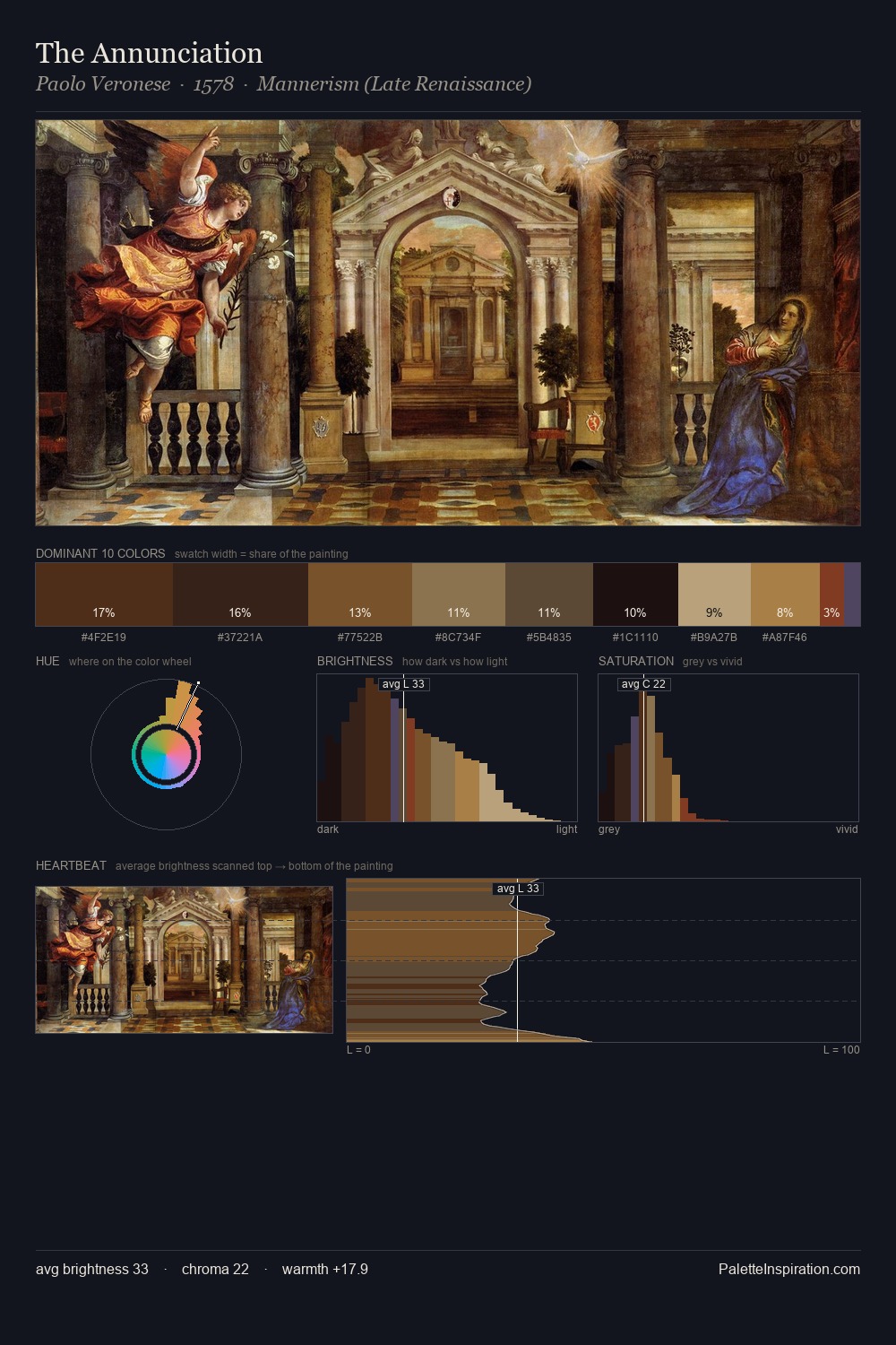
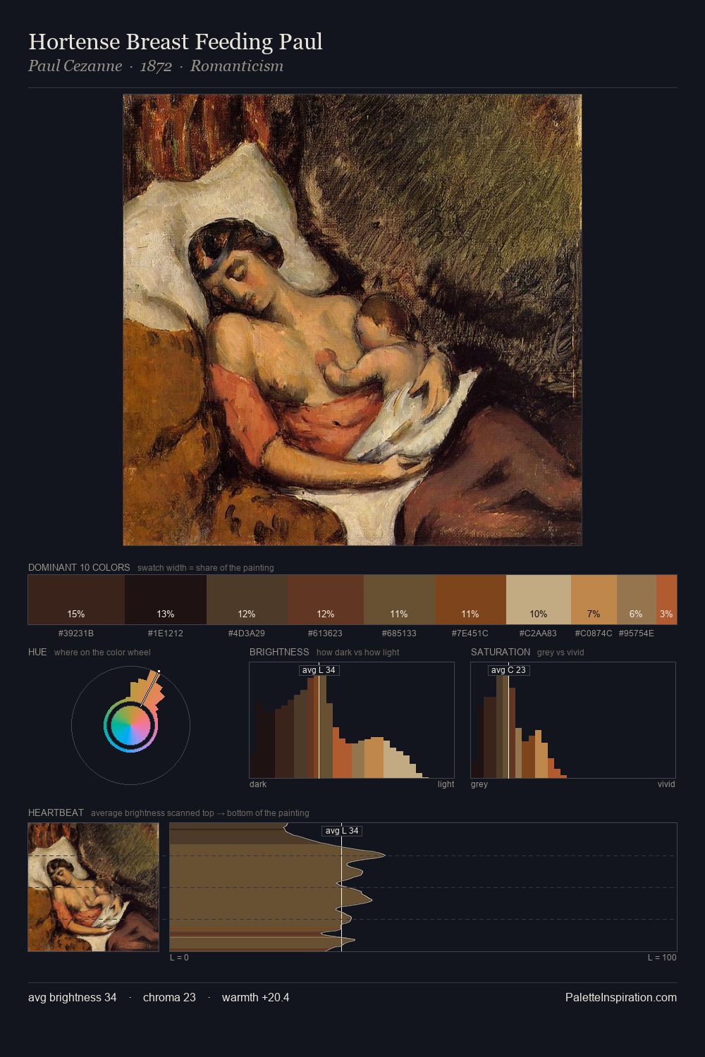
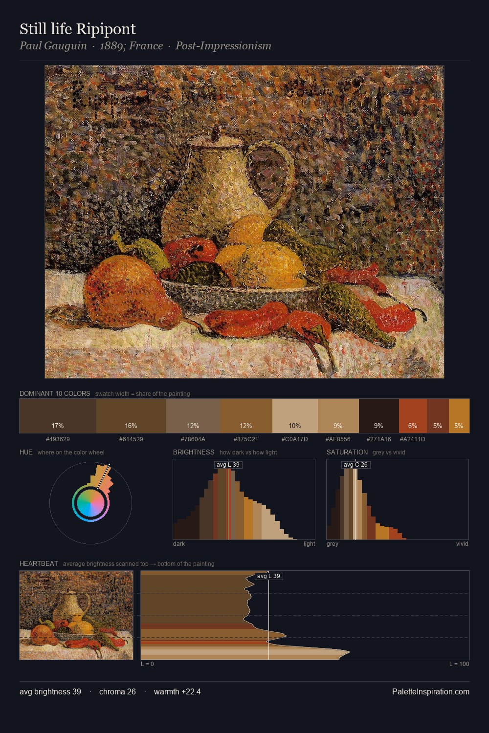
The value structure of George von Hoesslin is mid-key: quiet, controlled, and cohesive. George von Hoesslin orchestrates warmth above all else - reds, ambers, and siennas take the lead. The absence of saturated colour is itself an expressive choice: this is a palette of restraint and atmosphere. #734E25 delivers the chromatic peak at only 6.0% - a small shot of colour with outsized visual impact. At 52 units across the value scale, the palette keeps contrast readable without letting it dominate. Palette 2 sits within the larger chromatic argument that George von Hoesslin's complete body of work advances.
Example use cases
- theater design
- jewelry brands
- tobacco-adjacent retail
- event branding
- film & entertainment
I Love This!
Use This Palette
Copy, export, or download for your project
Copy, export, or download for your project
Copy:
Download:
Share: