George Barbier Palette 3

Palette Analysis
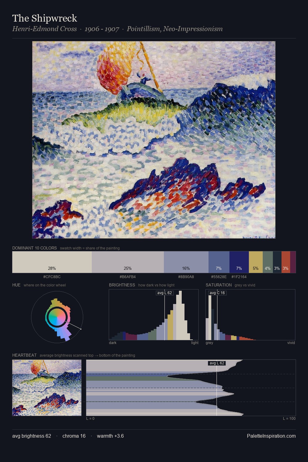
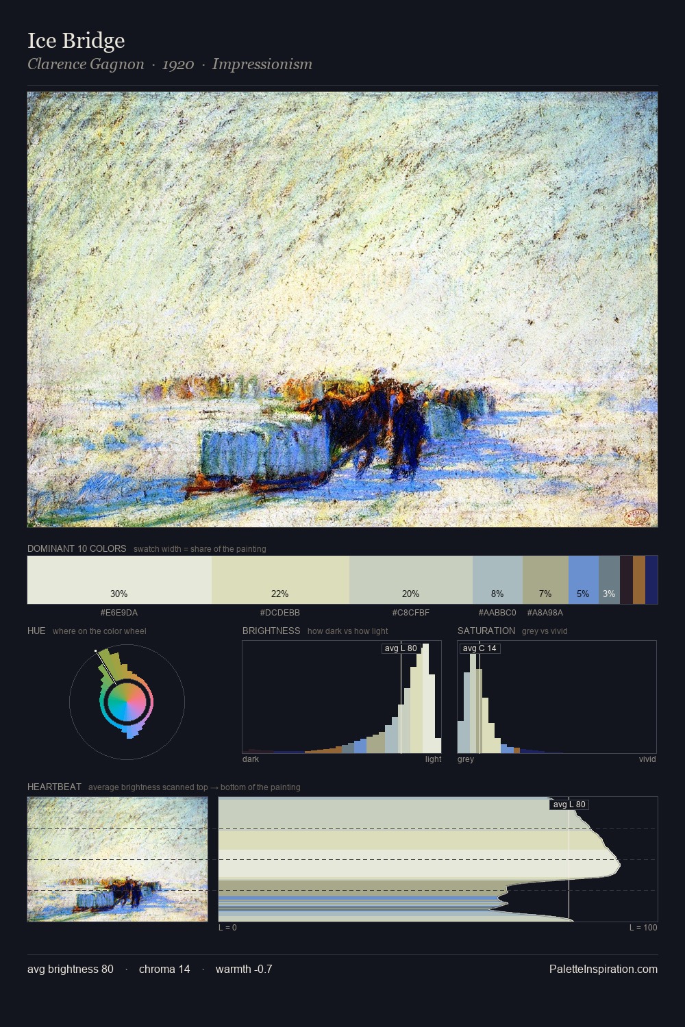
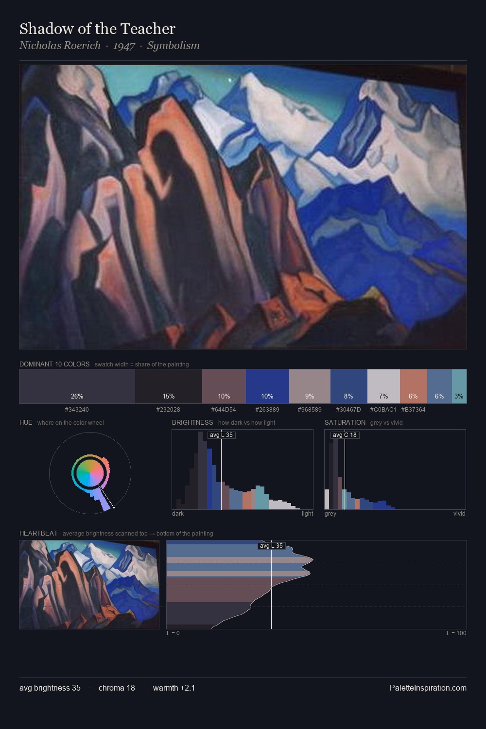
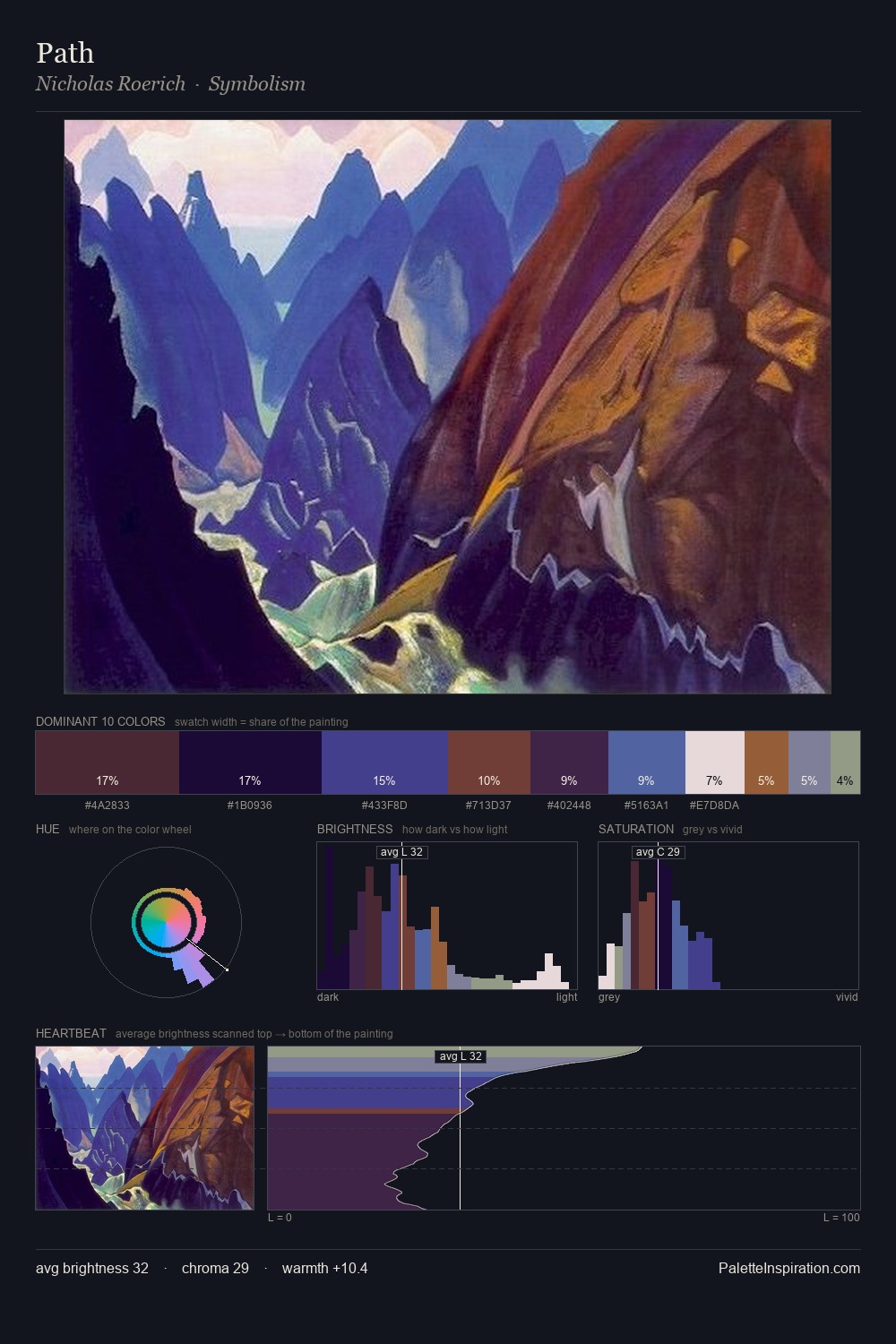
George Barbier occupies the comfortable middle of the value scale, avoiding both extremes to hold the eye in a sustained middle grey. Cool hues prevail: blues, greens, and greys anchor the palette's emotional temperature. Mid-saturation across the board: the palette has colour character without chromatic excess. The chromatic peak belongs to #291367, and at 31.7% it dominates, not decorates. 62 units of value range underpin the palette's structural clarity: the eye always knows where light falls. The palette has the character of outdoor light: cool, mid-bright, with colour rendered faithfully rather than expressively. George Barbier's palette 3 carries its own internal logic while remaining in conversation with the artist's broader colour intelligence.
Example use cases
- publishing
- corporate identity
- consumer apps
- hospitality
- design agencies
I Love This!
Copy, export, or download for your project