George Barbier Palette 2

Palette Analysis
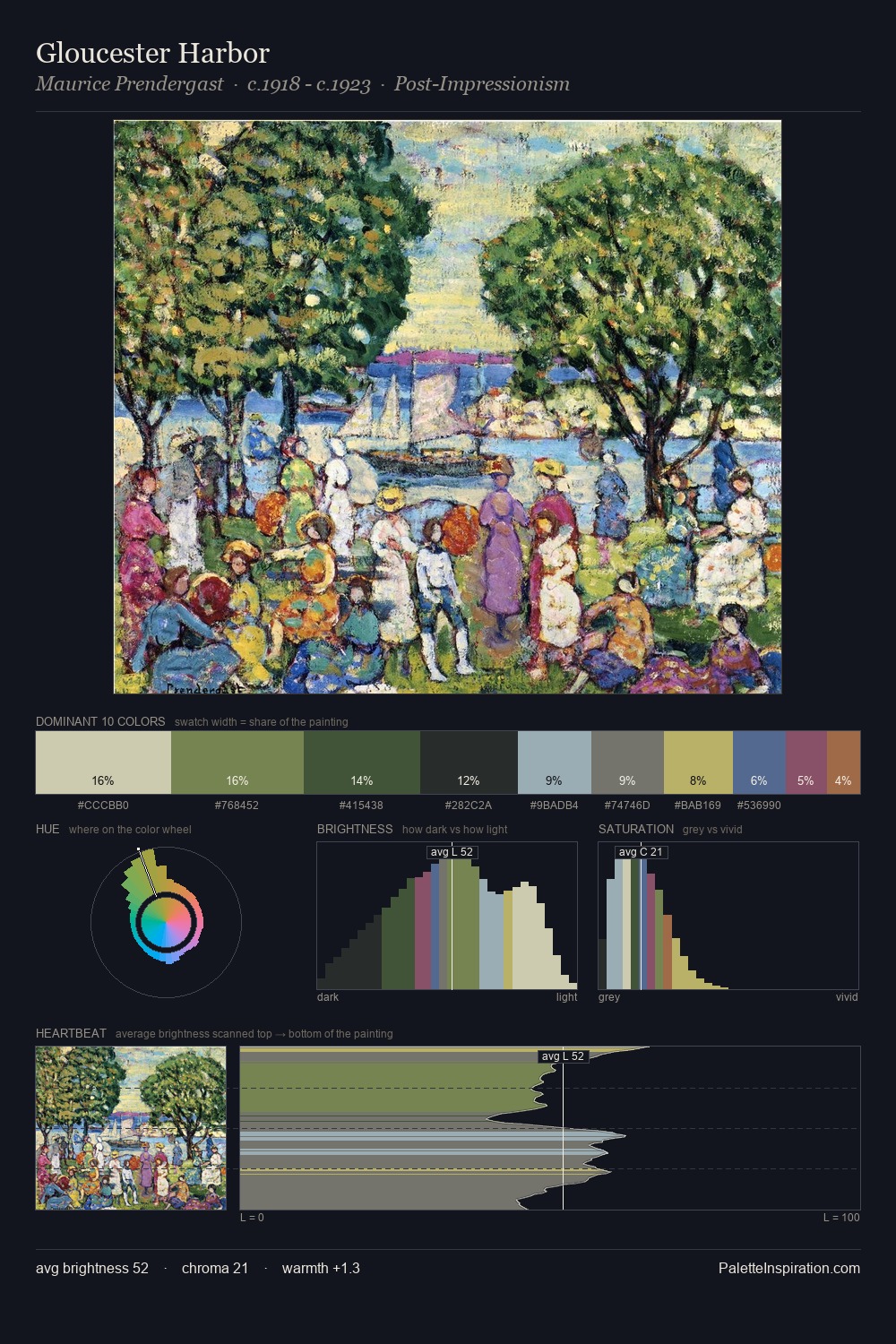
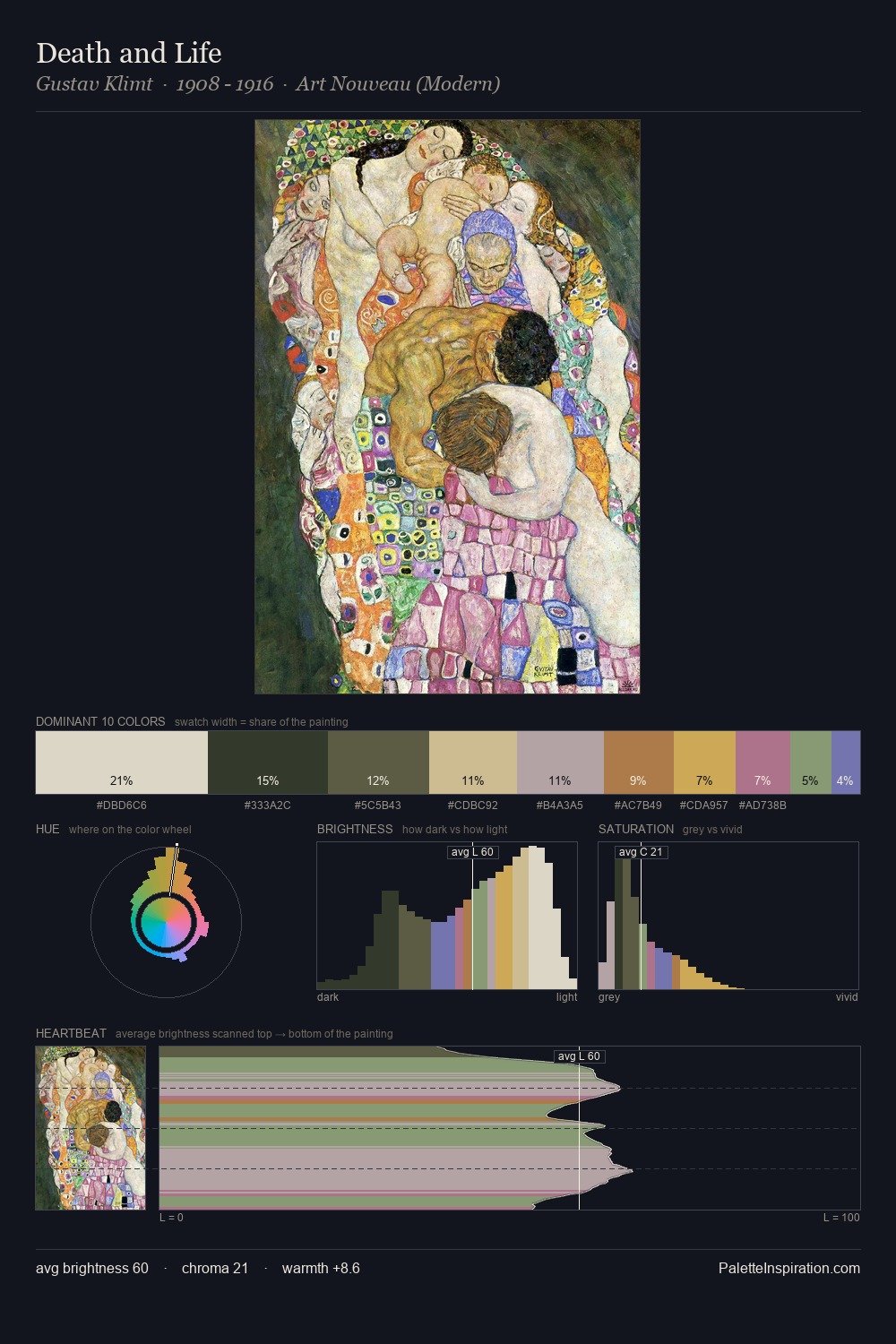
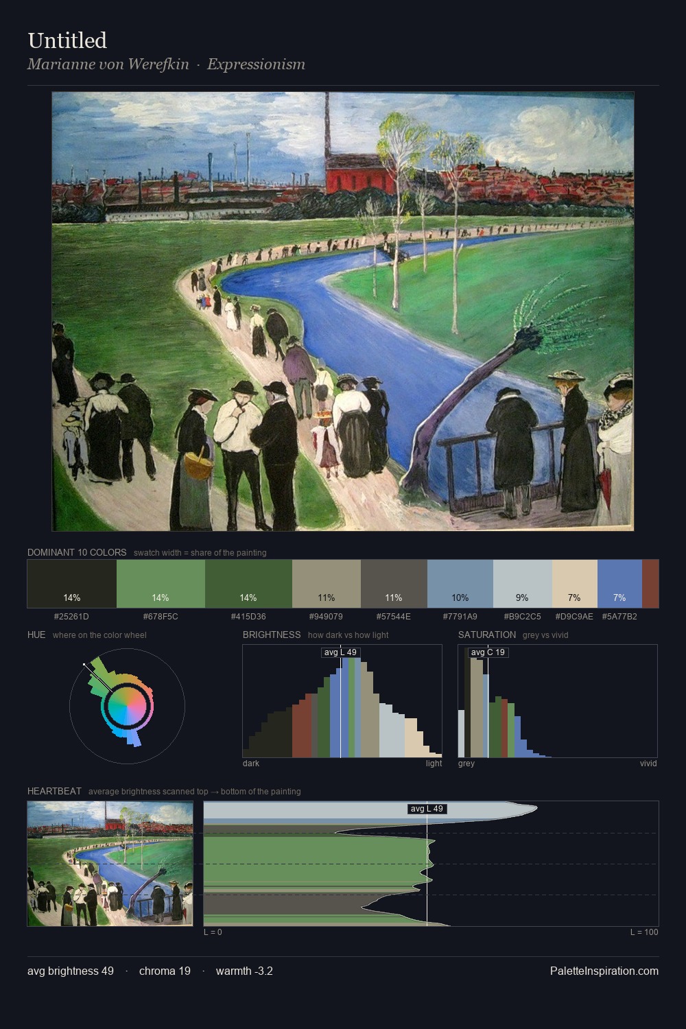
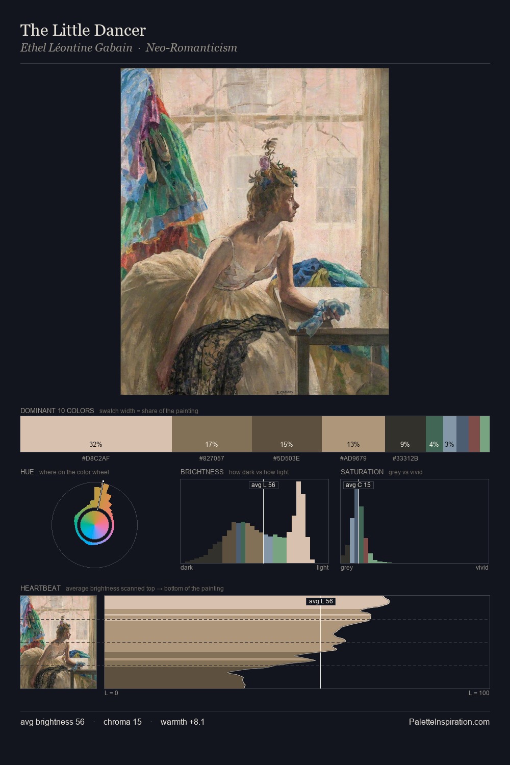
George Barbier is strongly light-biased - shadow is suggested rather than declared. Cool hues prevail: blues, greens, and greys anchor the palette's emotional temperature. Chroma hovers near zero; colour declares itself through subtle shifts in hue rather than outright saturation. 53.2% of the palette belongs to #F6DEB6, a concentration that makes it the unmistakable visual centre. The highest-chroma note - #954D6A - appears at just 1.1%, deployed as a precision accent against the quieter ground. From deepest dark to palest light, the palette traverses 57 units of the value scale - a span that creates natural depth. The mid-to-high key, cool bias, and moderate chroma point to outdoor observation - sky and diffused daylight as the dominant light source. In the context of George Barbier's full range of palettes, group 2 represents one movement in an ongoing chromatic dialogue.
Example use cases
- publishing
- corporate identity
- consumer apps
- hospitality
- design agencies
I Love This!
Copy, export, or download for your project