Georg Friedrich Kersting Master Palette

Palette Analysis
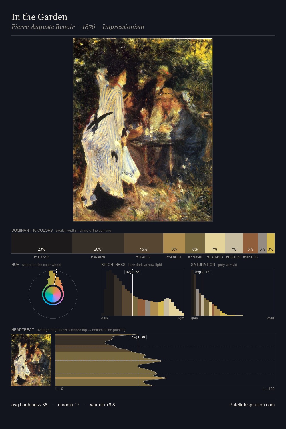
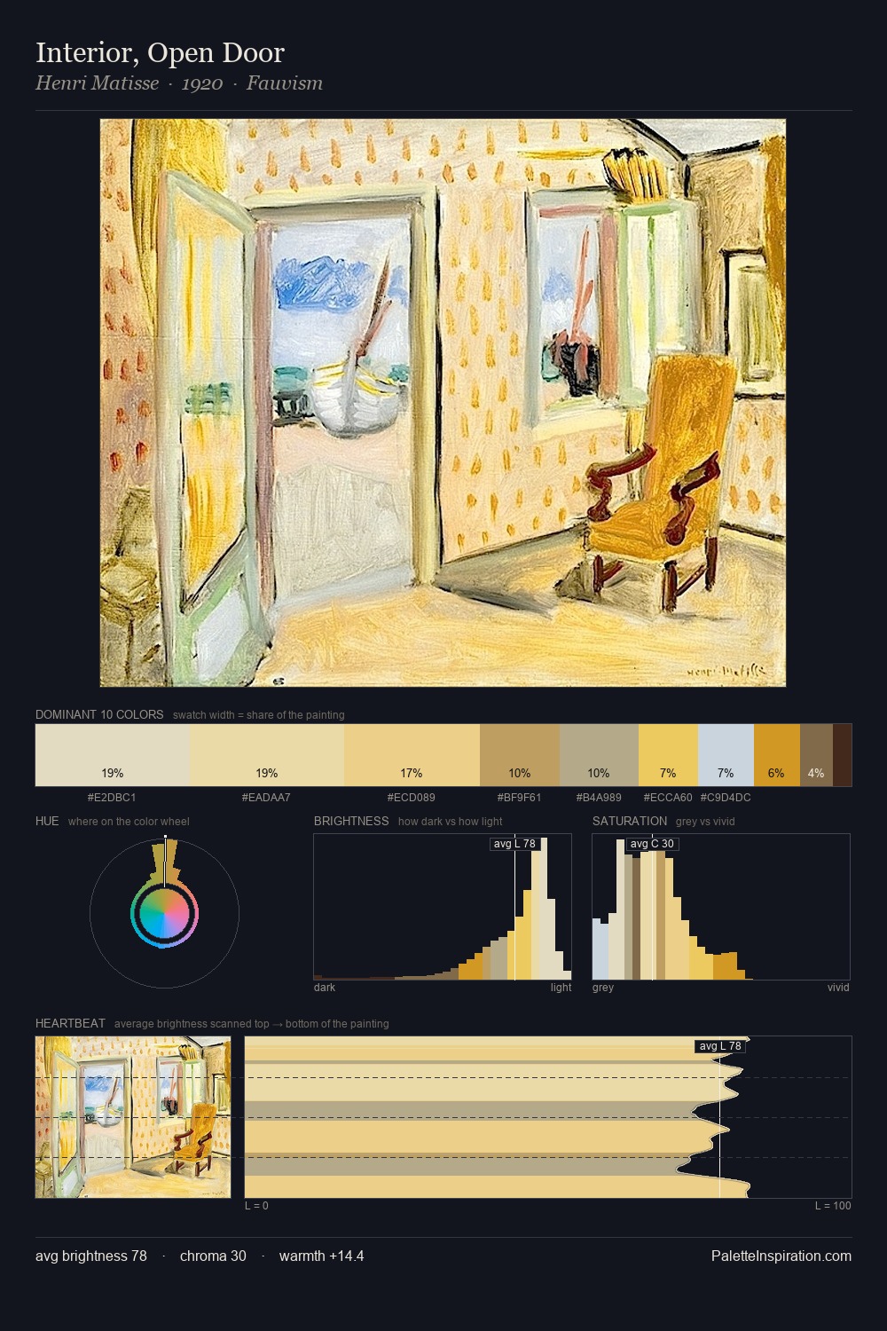
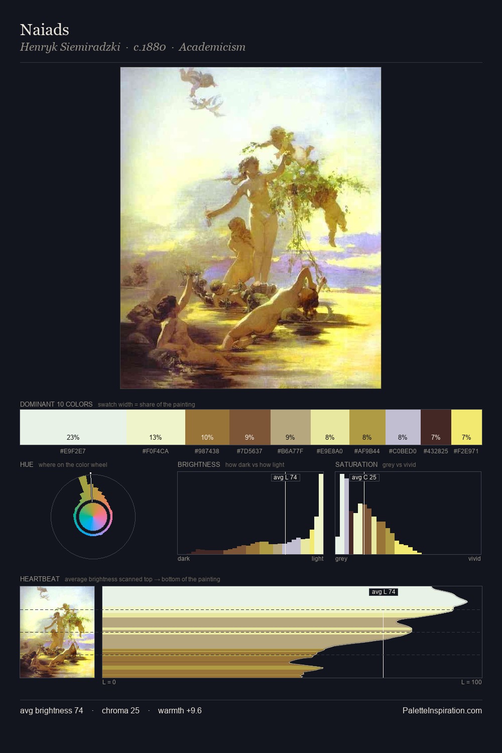
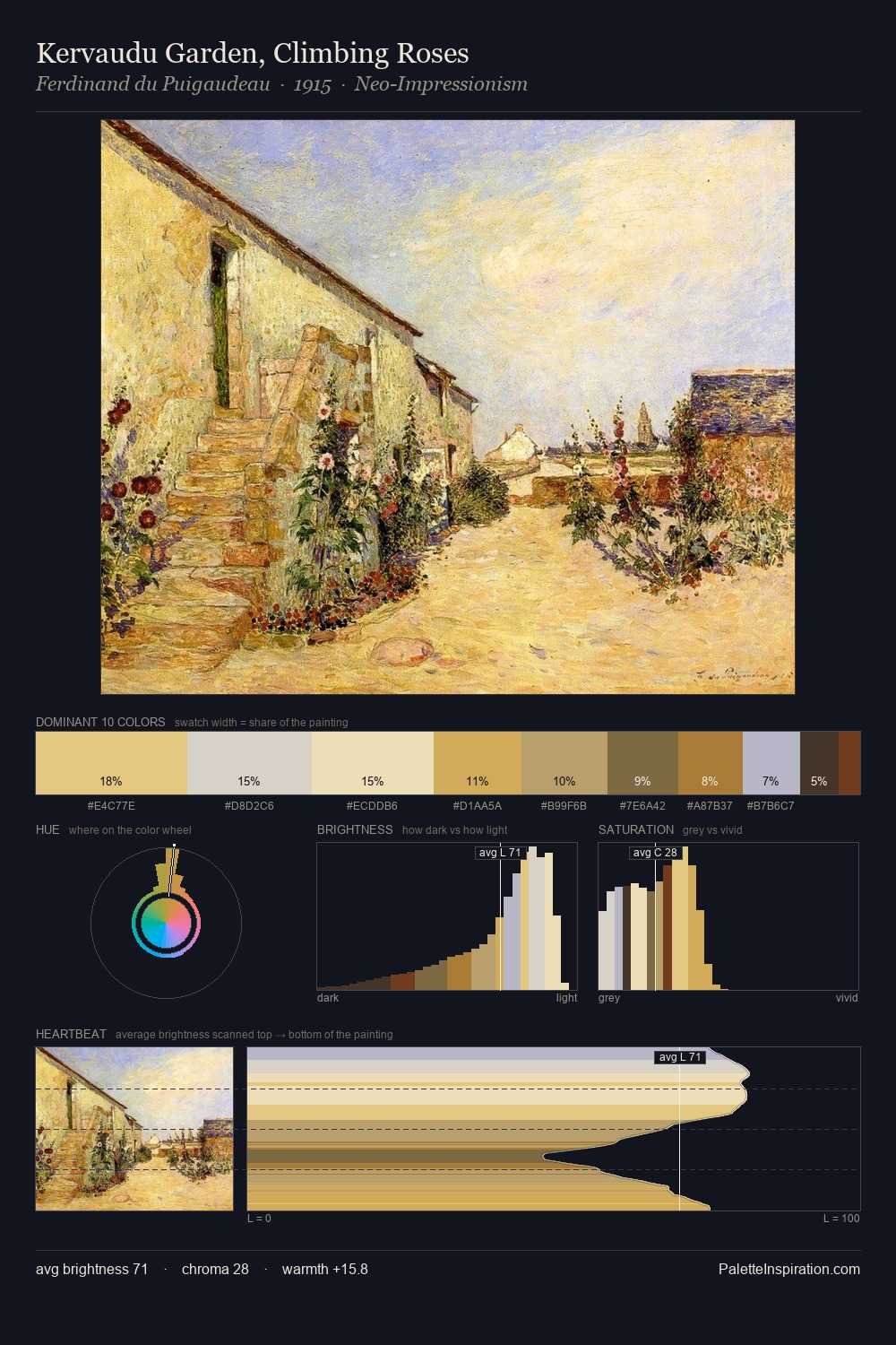
Georg Friedrich Kersting distributes its values across the middle register, creating harmony without high contrast. Georg Friedrich Kersting keeps warm and cool in parity, a balance that lends the work a perceptual shimmer. Colours are neither washed out nor blazing; they occupy the productive middle ground of the chroma scale. Georg Friedrich Kersting gives 25.0% of the composition to a single #3E372E - a decisive chromatic anchor. #D4AD4E functions as the palette's exclamation mark: highest chroma, lowest percentage (5.0%). The full value range is 58 units: broad enough to build convincing three-dimensional form. The palette reads as an Impressionist one - light-biased, chromatically direct, and built on temperature contrast rather than value opposition. The palette is recognisably Georg Friedrich Kersting's own: particular in its temperature, chroma, and the economy of its brightest note.
Example use cases
- ceramics & pottery
- boutique hospitality
- menswear
- heritage food brands
- craft & artisan brands
I Love This!
Copy, export, or download for your project