Geertgen tot Sint Jans Palette 1

Palette Analysis
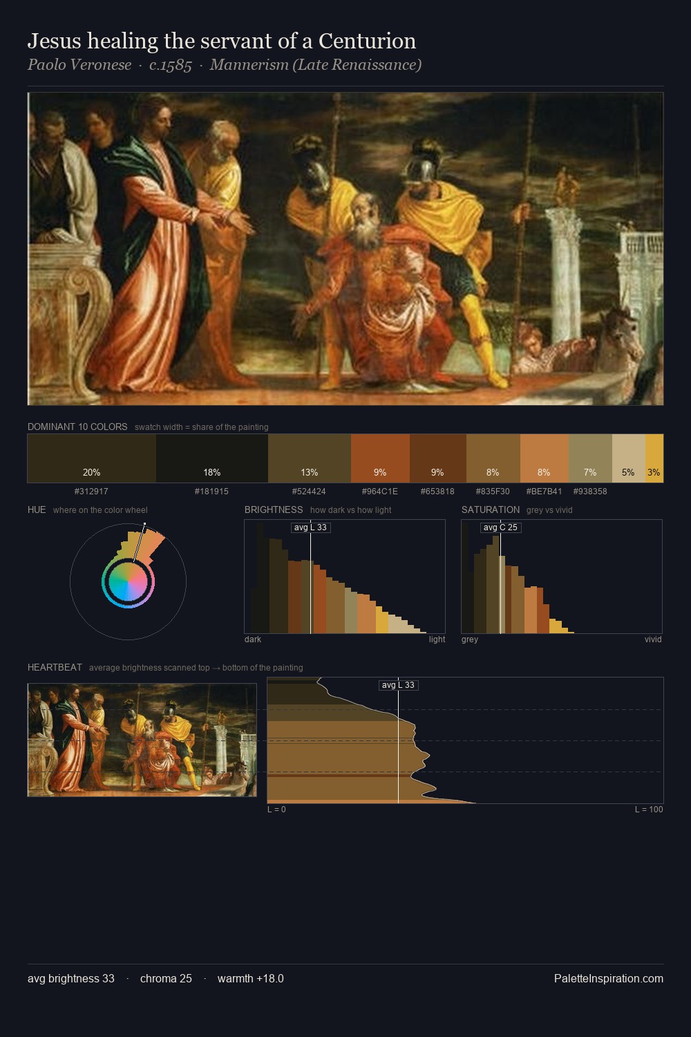
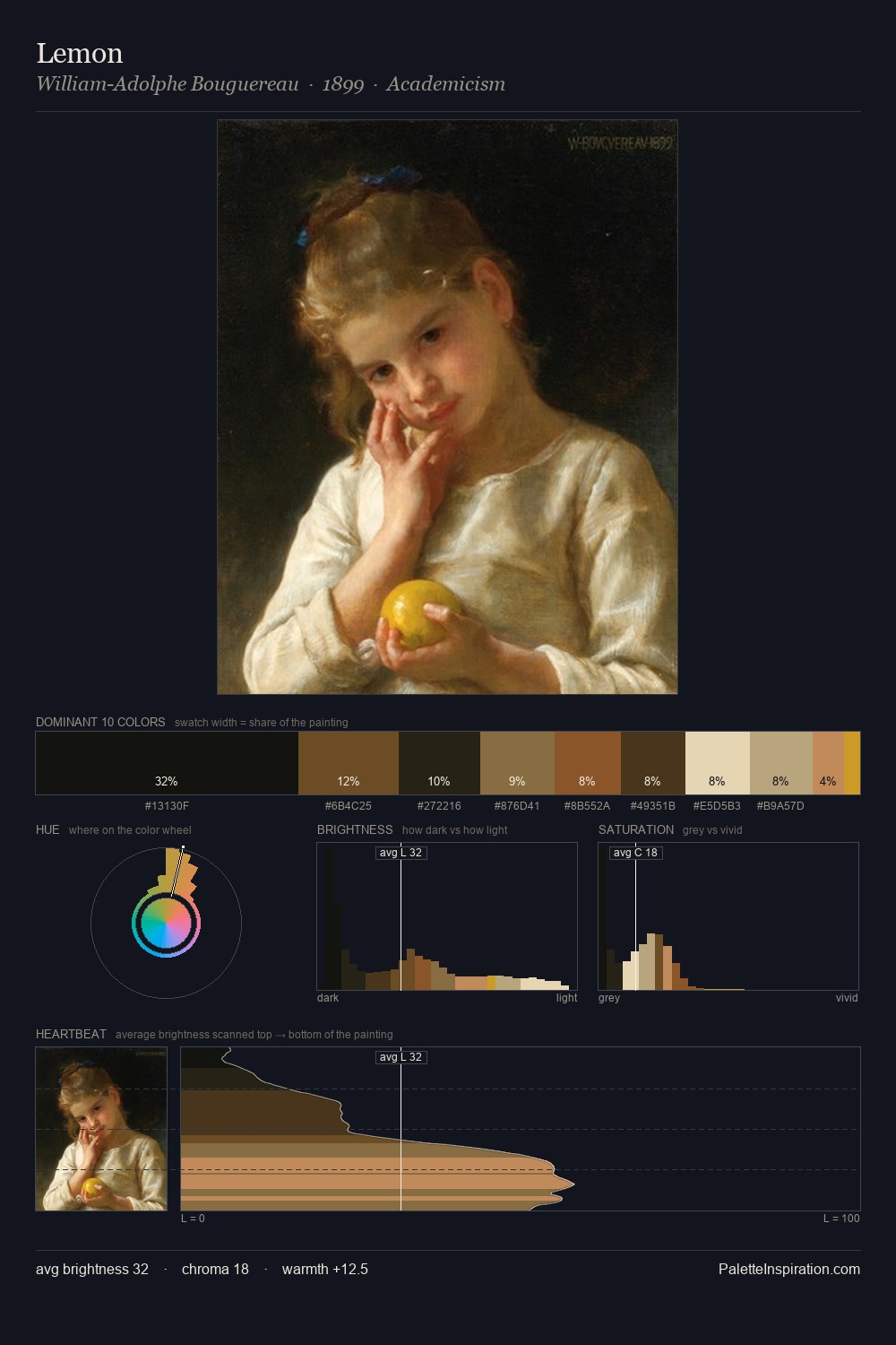
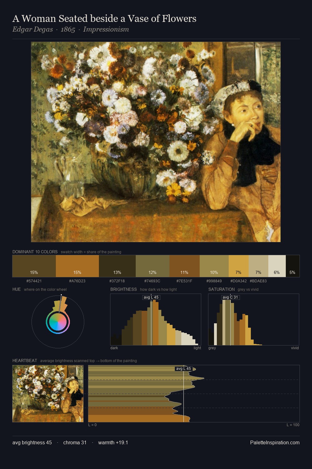
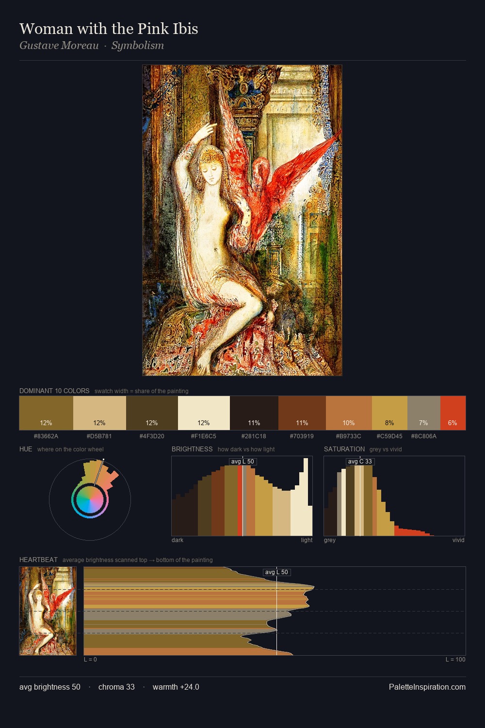
Values in Geertgen tot Sint Jans rest in the mid-range - neither dramatically lit nor steeped in shadow. Cool hues prevail: blues, greens, and greys anchor the palette's emotional temperature. Mid-saturation across the board: the palette has colour character without chromatic excess. Only 8.9% is devoted to #803E22, yet that small allocation delivers the palette's entire chromatic tension. From deepest dark to palest light, the palette traverses 67 units of the value scale - a span that creates natural depth. High luminosity and cool temperature suggest the plein-air condition: unfiltered daylight and open sky. In the context of Geertgen tot Sint Jans's full range of palettes, group 1 represents one movement in an ongoing chromatic dialogue.
Example use cases
- theater design
- jewelry brands
- tobacco-adjacent retail
- event branding
- film & entertainment
I Love This!
Copy, export, or download for your project