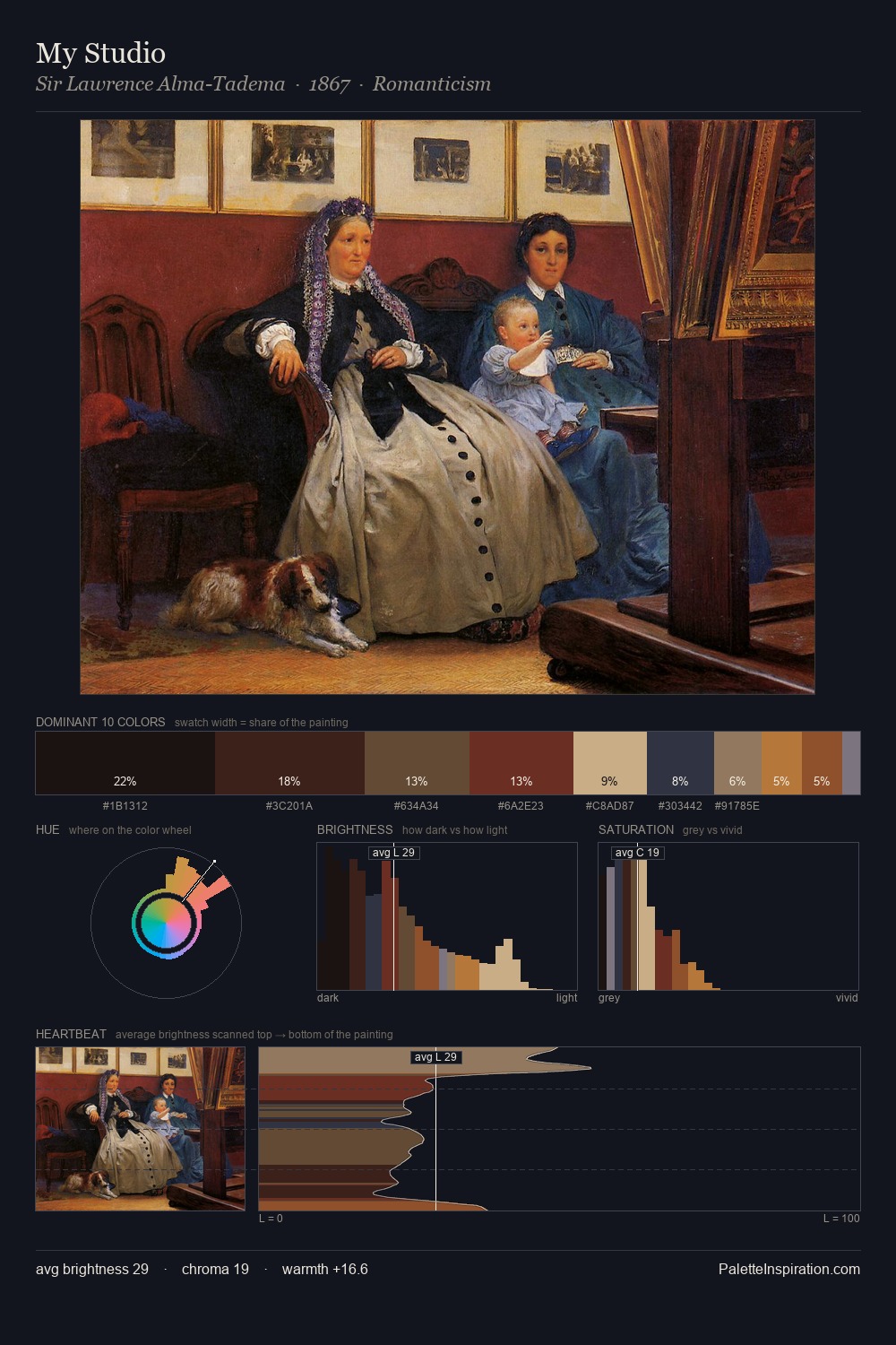
Gaspare Diziani Master Palette
Shadowed Caramel
Shadowed Low-key - values weighted toward shadow, the palette of dim interiors and overcast skies.
Caramel Warm mid-brown - the color of cooked sugar, smooth and amber-toned.

Palette Analysis
Gaspare Diziani distributes its values across the middle register, creating harmony without high contrast. Yellow, ochre, sienna: warm hues that Gaspare Diziani deploys as the palette's primary energy. Chroma is moderate: colours carry enough saturation to be read as colour, but the palette stops well short of garish intensity. The most saturated colour, #C78429, is reserved to 3.3% of the surface, where it acts as a focal punctuation. 51 units of value spread create a palette that is varied but unified - contrast in the service of harmony. These proportions encode Gaspare Diziani's instinctive sense of how much of each quality the eye can hold.
Example use cases
- theater design
- jewelry brands
- tobacco-adjacent retail
- event branding
- film & entertainment
I Love This!
Use This Palette
Copy, export, or download for your project
Copy, export, or download for your project
Copy:
Download:
Share:
 Palette 5 - Shadowed Caramel")


