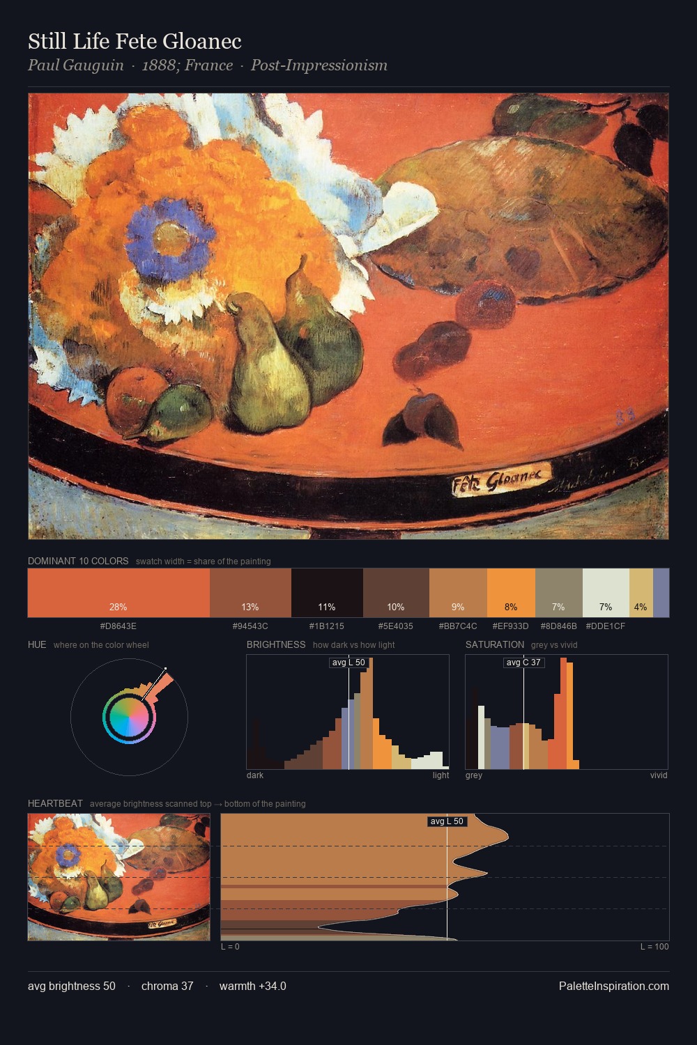
Galileo Chini Master Palette

Palette Analysis
Values in Galileo Chini rest in the mid-range - neither dramatically lit nor steeped in shadow. Galileo Chini keeps warm and cool in parity, a balance that lends the work a perceptual shimmer. Chroma is moderate: colours carry enough saturation to be read as colour, but the palette stops well short of garish intensity. Only 10.0% is devoted to #6B4539, yet that small allocation delivers the palette's entire chromatic tension. At 56 units of value range, the palette has the tonal breadth to sustain complex spatial readings. The palette reads as an Impressionist one - light-biased, chromatically direct, and built on temperature contrast rather than value opposition. Galileo Chini arrived at this balance through long practice; the palette carries the weight of that experience.
Example use cases
- ceramics & pottery
- boutique hospitality
- menswear
- heritage food brands
- craft & artisan brands
I Love This!
Copy, export, or download for your project